Evidence #66: A Possible +5.5% To Sales From An Extra Checkout Step
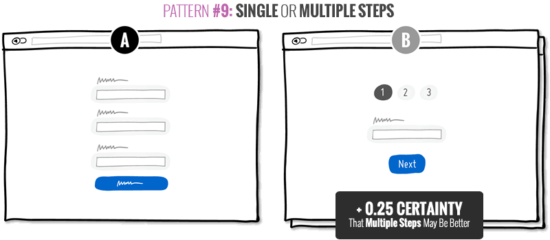
A big thanks to Claire Vignon Keser from Widerfunnel.com for sharing Evidence Test #66. The key change of this experiment was a switch from a 3 step checkout process into a 4 step one. From this test we were also able to derive +0.25 certainty points favoring multiple steps (relating to Pattern #9).
What Can We Learn From This Test?
We think it's a really good one. It very much focused on a key change - the break up of a checkout step into 2 separate ones. There are some additional changes which were part of the variation, but I'm guessing they are rather minor in comparison. This test turned out to pay off as was measured by a meaningful and deep metric of additional +5.5% sales. Although the effect range was a little wide (ranging between -0.89% to 12%), the number of conversions was well over a 1,000 for each variation which was good. I definitely see how this could have been implemented as a winner - benefiting their client.
Taken together, to be fair and consistent, we derived a smaller certainty count of +0.25 from this test in favor of multiple steps instead of single ones (and updated our view of Pattern #9).
Claire's Thoughts
"Variation B was designed with the same information as the control except spread across 4 steps (instead of 3). The rationale was that each step would be shorter and less overwhelming for the user. The variation that had more steps increased conversion rate by 5.5% (which is pretty significant when you are that far in the process)."
List Of Changes & Potential Causes Of Effect
-
One Additional Checkout Step [Key Change]
The shopping cart and billing details were separated into 2 steps.
-
Separation of Addons From Cart
The addons were moved to a separate section further down from the cart section.
-
Higher Contrast Buttons
The "Checkout" button was consistently colored green like all the other buttons on the screen.
-
Consistent Axis of Completion
All calls to actions and addons were right aligned.
-
Consistent Button Labels
The second button at the bottom was renamed from "Continue" to "Checkout" for greater consistency.
-
Less Prominent Progress Bar
The progress bar was slightly restyled to a circular & more traditional one.
.
Get The Complete Conversion Pattern #9 Along With Many Others
Posted by  Jakub Linowski on Nov 11, 2016
Comments
Darius 7 years ago ↑1↓0
This is great to see, thanks for sharing and reassuring us that separating complex forms into multiple steps is a increases conversions. Although the other changes (ie. CTA button color and placement) also must have a strong influence. It would be helpful to have two other variations: one which just changes the other elements, and another that just separates the form into more steps. Thanks!
Reply