How Normanrecords.com Replicated The 'No Coupon Fields' Pattern With A Twist
Normanrecords.com, an e-commerce records store (LPs), while working with us decided to try and copy-paste a simple Fastforward pattern. The pattern was backed by multiple past tests and was a solid candidate for an experiment.
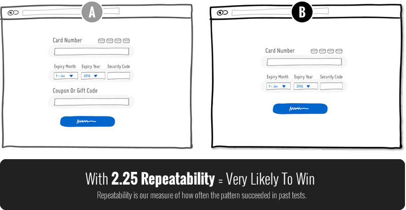
The Pattern: #1 No Coupon Fields
We typically start off conversion projects by looking through what we already known in the form of patterns (including their win probabilities and predicted effects from past tests). One such pattern that stood out ripe for testing on the Norman Records' checkout screen was No Coupon Fields. The pattern suggests to remove coupon fields or make them less prominent as they might send people away in search for discounts on other sites (or make them feel like others are receiving discounts while they are not).
Based on numerous tests backing this pattern with a repeatability score of 2.25 we estimated a very likely chance to win (the more positive tests we have in favor of a pattern, the higher this score, and the higher we prioritize a test idea).
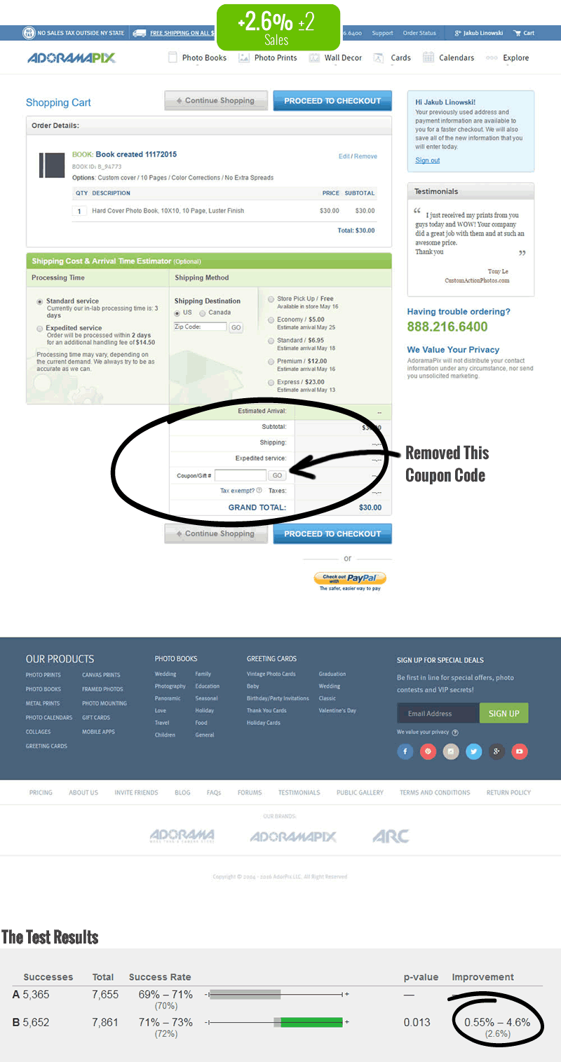
The Pattern Also Worked In A Very Similar Test On Adoramapix.com
It's interesting (and profitable) to compare similar tests together. Before the Norman Records test was even started, we already had data from a very similar test that ran on Adoramapix.com where it generated 2.6% more sales. Both tests ran on checkouts. Both tests were e-commerce sites. Both tests had a similar conversion baseline of around 70%. We had our prediction in place.
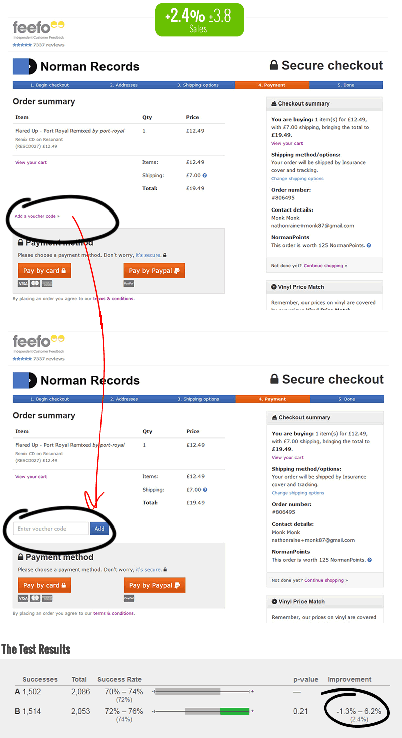
The Test Replicated On Normanrecords.com Nicely
With positive past data backing the experiment, Normanrecords.com set up their own test within a day (patterns enable experiments quickly). Interestingly, they didn't just remove the coupon field, but instead tweaked the pattern slightly to their own needs. In the variation, the coupon field was replaced with a "add a voucher code" link which upon clicking would show the coupon field. This made the coupon field less visible without completely removing it.
Some weeks later they called the test positive and shared the results with us. We were glad to see another positive prediction (not all tests win by the way). More so, the effects were also very similar between both comparable tests. The Adoramapix.com test had a 2.6% relative increase to sales, and Normanrecords.com detected a 2.4% increase (slight wider confidence interval). They decided to implement it from additional positive metrics aligning with this observed effect (ex: even greater revenue gains).
The Key Takeaway: Patterns Can Be Tweaked In Creative Ways
Aside of patterns helping in predicting tests, I think the key insight here is that patterns can be modified in creative ways. When looking at past test data it might feel as if there isn't much room for other creative solutions - this is false. Creativity, interpretation and building on existing patterns is more than possible. For every AB test there is are CDEFG ideas just around the corner. Patterns can also be mixed and matched in creative ways. And replication story is just one subtle indication of this openness to vary an idea beyond what it originally was.
Next Steps: Test Patterns On Your Site
- See Which Conversion Pattern Are Relevant For You
I encourage you to run a/b tests. We continuously identify conversion patterns for you to test with on GoodUI Fastforward. Many have positive data, and some have negative effects as well (members get to see all tests for given patterns so that the chances of replication increase). - Get An A/B Testing Tool Such As VWO
To test your ideas/patterns you need a good testing tool such as VWO (our recommendation if you don't have a tool yet) that won't hurt your wallet. Some pattern ideas are really simple and can be setup in minutes or hours.
Posted by  Jakub Linowski on Feb 02, 2018
Comments
Arunas 6 years ago ↑1↓0
Hi there. First of all, it's important to understand that whatever works on one product, would not necessarily work on the others. Not only the products are different but also the users. This especially applies to the cases like pricing and discounting. Without understanding the users better, we can't make any assumptions that something would work. From the description above, I see no information about the current user behavior of this particular website and how would you like to improve their experience. This suggest me that there was no strong hypothesis behind this test. What if users of this particular website are very price/discount sensitive? Also did you track the impact on the support tickets? Maybe it helped the majority of the users (the test results say so) but negatively impacted those using the discounts?
Also besides the above, I would discuss the position of the field. Having it on the payments step might keep discount sensitive users wondering when they would have a chance to enter the coupon code. So my recommendation here would be to step back, understand the users better and only then start the testing (reconsidering coupon field placement and the design (collapse/expand) might be one of the first steps for example).
Reply
Jakub Linowski 6 years ago ↑0↓0
The main point (with supporting evidence) is actually that what worked on one site, worked for another (further extending the general nature and predictive strength of the pattern).
Reply
Zoe 6 years ago ↑0↓0
Just to add an alternative, ive had significant uplift from expanding the voucher code field to make it MORE prominent. Probably worthwhile mentioning the context has to be correct, a lot of students use my clients site and can generate a code. So if we were to remove the field would likely cause confusion, frustration and increase in exits.
Reply
Jakub Linowski 6 years ago ↑0↓0
Hey Zoe. Such alternatives, edge cases and extra situations make for a fuller story. Could you share your test results with us to publish?
Reply
Rob Greer 6 years ago ↑0↓0
I agree that removing the coupon code field can result in an uptick in sales. However, for companies who need to offer that coupon code to some customers, where and how can that field be presented to those customers who need to enter their coupon code without causing the inevitable percentage of shopping cart abandonment?
Reply
Jakub Linowski 6 years ago ↑1↓0
Rob. That's exactly what Norman Records did - instead of completely removing it, they minimized its visibility with an inline link. The screenshots show this. :)
Reply
Rob Greer 6 years ago ↑0↓0
So I wonder if the wording for the hyperlink also makes a difference. For example, using "voucher code" versus "discount code" versus "don't look here, nothing to see here."
Reply
Jakub Linowski 6 years ago ↑0↓0
Could be :)
Reply