Pattern #31: Instant Results - Increased Leads For Vivareal.com.br
Not all patterns will have a strong (+10%, +20% or +30%) effect and that's good to know. We observed such a small effect from using instant filters that would show results instantly after each filter change (instead of requiring an additional search button click).
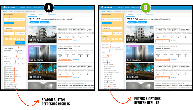
We tested this little change recently with Vivareal.com.br, a real-estate site in Brasil in one of our mentorships. It was Rodrigo's idea to remove the button and update search results instantly after any filter change. After all, it's a popular belief that making people wait less and providing them with results sooner might be a good thing. And so here is the actual A/B test which explored instant filters:
The Result
This change boosted Leads by 1.6% with a sizeable margin of error (+/-2.1%). That's not much at all, but the fact that it might have a small effect means it's worth testing further. So, we turned this test into a pattern.
This is how most of our conversion patterns start. At first it's just a single test. But then we collect other data to see if the effects repeats across different types of sites and industries.
Here's Pattern 31: Instant Results
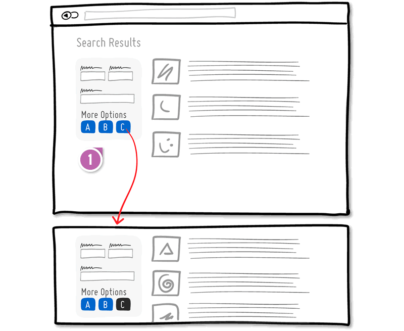
- Instant Update
Search results should update instantly after each change to a filter. Not much to it.
Let's Discuss This Pattern
What are some situations that might pose a challenge to this pattern?
What if search results cannot be shown quickly due to elaborate calculations? Is that an indication that the calculations themselves should be simplified?
How do we deal with text input fields? It may be feasible to update the results in real time, as the user types. But what if the process is expensive for the back end and confusing to the user? After all, it may be distracting to see all the interim matches as I type. Still, lots of sites do it well, like Netflix.
Should we have a small submit button next to text input filters? Should inputs show Autocomplete suggestions underneath, which is less distracting because it's plain text and we are all familiar with it.
We'd love to hear your suggestions. And if you want to test this pattern or adapt it to your needs, we want to help you run it as a test along with many other improvements backed by data as well.
Posted by  Jakub Linowski on Oct 06, 2017
Comments
Mohammed Mansoor 7 years ago ↑2↓0
The experience of using a filter WITHOUT a button may get choppy and not smooth if the internet speeds are slow and the app remains unusable while fetching the data every time a filter is applied or removed.
Reply
Vlad Malik 7 years ago ↑0↓0
Good point. I put some guidelines for this on my blog. I now added "Do not freeze"and "Cache" guidelines to reflect your feedback i.e. fetching data should not block further filtering and disabling a filter should not force user to wait in order to apply other filters. Also, it's a good idea to cache previous search, so it's easy to undo filters and show results instantly. And if a data lookup is really complex, instant results may not be the best thing. Sometimes you inadvertently click a filter and it takes a while to undo it.
Reply
Felipe 7 years ago ↑0↓0
I'm actually not too sure if this exact ui should be ab/tested like that.
The search area is very similar to booking.com including color, it's a pattern that people are very familiar with, not reinventing the weal, which means that it's a good pattern that doesn't ask much of learning
I believe that ab/test is to improve something that is not satisfying our goals, in this case, it's just the button that is stoping people from doing what they have to do or is the whole search ui?
As this ui pattern is very well defined on the web already, aka, in case you have searched for hotels anywhere on the web you already know how to use it, I don't see the button as the issue.
Maybe trying a different search ui together with and without the button might give better results. Netflix works because there's no filter, is just that straight forward field and it's easy to assimilate what it's doing. I'd be keen to see a test with a different search pattern than this tho, might be interesting.
Reply
Vlad Malik 7 years ago ↑0↓0
Agreed, there are bigger problems on a site to fix, and I guess this test result supports that. However, there are many implementation choices. Which is best for you? If the effect is real in this case (IF), then it's possible that faster search results could pique people's interest in something, make it more likely they will continue. There are for instance always a few that will click a filter and then not submit and just leave. Or there could be another explanation. If it's only a 0.5% lift, but it's still worth $200,000 for you in leads, then it's good to know.
Reply