Redesign: Booking.com Room Table
Booking.com offers guests a wide range of trusted hotels, apartments and villas to choose from, for shorter duration stays. As great as the service is, they do however have one particular screen that could benefit from some extra UI love. Specifically, it's the room selection table which occasionally becomes complex and so we redesigned it. Here is a best shot sketch with a number of applied GoodUI ideas:
Before & The Current Room Table
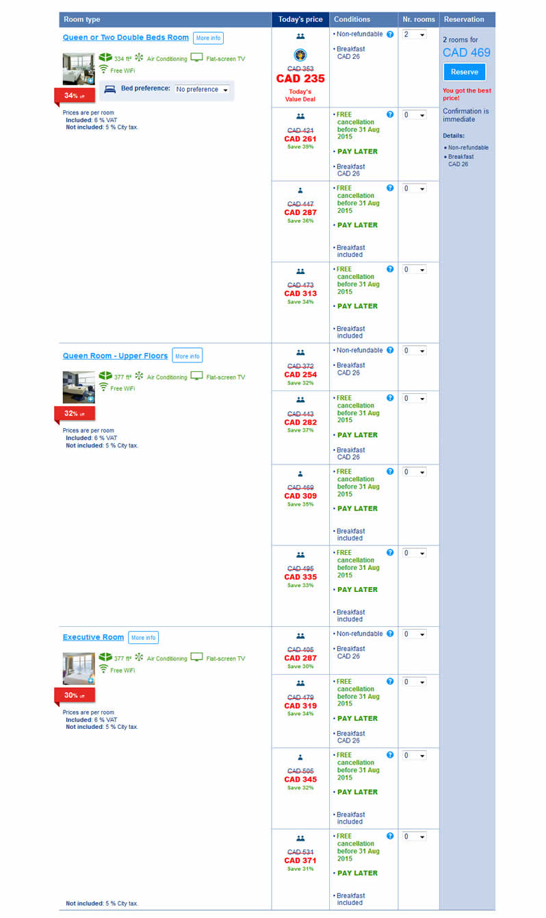
The existing room table selection appears mid page when users open a specific hotel page. For the most part, these room tables are quite simple, with fewer choices. In other cases, as higher number of guests and separate room preferences are chosen, the tables do become quite long (as seen above).
After & What Could Be
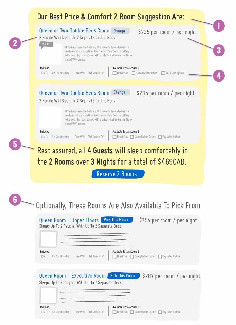
A number of conceptual improvements have been sketched out based on some of the GoodUI ideas already explored. These include: 1 A more reassuring headline to recommend the best room grouping, instead of just having a long list of equal room options. We assumed that guests wish to be reassured of being able to sleep comfortably for a number of nights, in a number of rooms, and see the best combination right away. 2 Various room options (such as pay later, breakfast, etc) were also collapsed into single blocks. Therefore the sketch reinforces the conceptual model of one room being visually represented as a single block - simpler. The room name is then followed up with a sub-headline showing how many people will sleep in that room (making the relationship between rooms & people stronger). 3 Having a single price per room was further clarified with explicit copy such as "$x per room / per night". Although that is the standard pricing, there are some cases where rooms are priced per person. 4 Each room now has two sets of options - ones which are included as part of the price, and ones which can be added for an additional fee. The additional benefit of horizontally spacing these options out is that it makes their position easier to predict and therefore compare across rooms. As these additional room options are now actually optional as checkboxes, the complex multi dimensional decision making (of rooms and options) disappears. 5 At the very bottom of the room recommendation, the primary call to action is then summarized and made clearly visible. 6 The remaining rooms have been separated out as clear alternative choices to pick from at the very bottom.
We do offer Rapid Advice where we'll apply UI design best practices to any of your key business pages.
Posted by  Jakub Linowski on Aug 24, 2015
Comments