Seeing & Using Chart Patterns In A/B Tests
Determining if an effect of a test is real or not, to what degree and with what probability is typically answered with statistics. Surely we can use detailed conversion data such as sample sizes, effect ranges, priors, p-Values, and confidence intervals to gauge if B is really better than A. The way I understand it is that statistics will typically flatten data across a time frame into a summed up view while trying to provide answers. With this, I’m also beginning to wonder if perhaps there is valuable information stored in time based charts in the form of interesting patterns before they are flattened. Here are a few patterns that we’re beginning to see and use as we run our own a/b test projects.
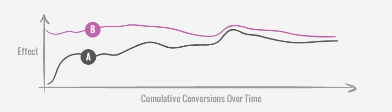
The Emergent Stability
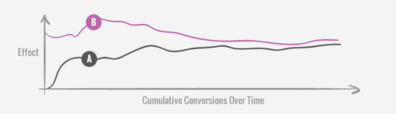
The effects of the control and variations will fluctuate more in the beginning than later on in a test. As effects regress to the mean they get closer to what they really are with time and this is visible on any cumulative graph. One possible implication of such a pattern might be to delay a test from being stopped prematurely until greater stability is first visualized. More concretely, one example of this might be to withhold from stopping a test as the effect lines are still converging or diverging strongly, until they become more stable and horizontal.
The Drop
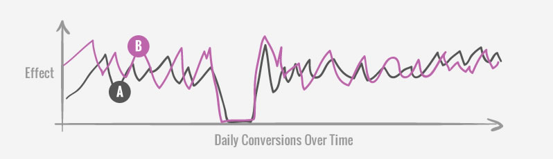
Occasionally, it’s possible to see conversions drop to a zero on any given day (in a day chart of course). On some projects this might be quite normal due to just lower traffic or a lower conversion rate. When this pattern does show up on a test with a high traffic scope, it may be a signal to double check the quality of the test setup, as something might have broken. This can in turn be a QA check during a live test.
The Winning Streak
Things get lucky due to chance and that includes tested variations that show winning streaks. Such a pattern may manifest itself on a day chart of an a/b test in the form of a multi day success rate or a higher than usual spike. The way we might use a pattern such as this is once again to delay a test from being stopped prematurely. We know that a successful streak will typically follow with a more realistic effect due to regression to the mean. Because of this, before we stop a test we might want to let the test run a bit longer until “the peak” is not the ending point, or that we see multiple peaks across a test that are more balanced.
The Bump
When all variations (including the control) are affected somewhat equally on a cumulative graph, we might call that a bump pattern. This is especially true when the effect begins to stabilize and surprisingly everything shifts up or down when it really should be more stable. When we see such a pattern it might have been caused by an influx of new or irregular traffic which signals for further investigation. On one recent project for example, this pattern was caused by an atypical mass email campaign which not only pushed our overall effect higher, but also blurred the effects between our variations within the test. For this reason, we decided to remove the 3 days of data around the bump (can be read up in detail in Datastories Issue #20).
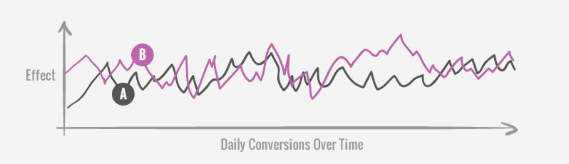
The Random Dance
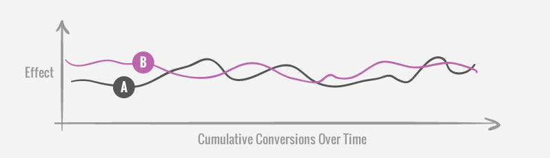
When a cumulative graph is showing A and B dancing around each other, it might be an indication that the test will probably need a long time to reach strong or significant results. When we see patterns like these, we might re-estimate the testing duration and figure out if we even have the required time to detect the effect. Seeing this pattern might also be an indication that the effect is just too small, or that we over-estimated our test, and definitely that the test is not ready to be stopped.
What Do You Think?
There is definitely room for statistics, proper stopping rules, and test estimations. In no way do I see these graph patterns and intuition replace the former. But once we remove the granularity of data over time, some things maybe get lost - which I’d like to not lose sight of. What’s also quietly being implied by these patterns is the idea that looking at live tests may have some benefits as it complements statistics. What do you think? Have you ever used patterns such as these, or any other ones while running your own a/b tests? Please share in the comments.
Learn From How We Optimize & Run Detailed Tests
Each month we write about and share a detailed and exclusive optimization story for you to learn from.
Posted by  Jakub Linowski on Dec 08, 2015
Comments
Brian 8 years ago ↑0↓0
Thanks Jakub,this is handy!
I've run into Emergent Stability before and been perplexed. High traffic and time seem to help increase assurance when weighed against these types of charts.
Reply
Marek Cais 8 years ago ↑0↓0
Exactly what I was thinking about when VWO discontinued their chronological graph of conversion rate. I did look for the "stability" pattern (along with the usual metrics of course) to assess the quality of the results. If I saw the CR criss-crossing later into the test, I would run it a bit longer than what was calculated as neccessary.
Reply
Michael Aagaard 8 years ago ↑1↓0
I like to think of these graphs as supplementary data visualization. I'd never draw conclusions based on these graphs in isolation without the detailed dataset.
I find "The Drop" and "The Random Dance" helpful. "The Drop" is an indication that your test is broken. "The Random Dance" is an indication that you are testing something that does not have enough impact to really shift behaviour.
- Michael
Reply
Ruurd Pels 8 years ago ↑0↓0
No, correlation does not equate to causation. However, measuring per sé and measuring A/B testing is already much better than just a bit of random guessing if you ask me.
But still it makes me think if it would be a good thing to just have two/three/more versions of the same interaction at any given time. How would that compare to always having a single interaction method for a certain function?
Reply
Chris Stucchio 8 years ago ↑0↓0
I don't recommend putting too much stock in any of these patterns, beyond perhaps "The Drop". The Drop is a good way to detect if you broke something, particularly if it's such a sharp drop all the way to zero.
But most of these other patterns can easily occur by random chance. We humans are born pattern matchers - we see clouds shaped like elephants, the virgin mary in a piece of burned toast, and a nearly perfect correlation between "Per Capita Cheese Consumption" and "Number of people who died by becoming tangled in their bedsheets".
Tyler Vigen has a great page about looking for patterns in timeseries - I highly recommend taking a look: http://www.tylervigen.com/spurious-correlations
Reply
Jakub Linowski 8 years ago ↑0↓0
Hi Chris,
I’d like to think that they provide a richer picture.
I also believe that you are referring to the problem of correlation vs causation, https://en.wikipedia.org/wiki/Correlation_does_not_imply_causation, which applies not just to time based graphs but to any statistics and findings in general. I think it's implied and assumed that when testing something we ground our hypothesis in qualitative understanding at first, as opposed to seeking random correlations. Fair?
Reply
Chris Stucchio 8 years ago ↑0↓0
I'm not simply saying that correlation doesn't imply causation. I'm saying that the human mind is primed to find patterns even when none are present.
Here is another article which discusses the phenomenon: http://www.wired.com/2012/12/what-does-randomness-look-like/
In short, randomness often doesn't look random to us. Unless we are very careful (read: do some statistics), we are highly prone to being fooled by randomness and seeing things that aren't there.
Reply