UI Challenge: What Should We Change On Any Of These 3 Screens For More Signups?
We are starting an exciting optimization project and need your ideas to achieve lift, together. We know that there is immense knowledge, wisdom and experience in each and every one of you, and if tapped into, will make for a greater impact. We are also super interested to see what kind of optimization ideas surface to the top that will move us a little outside the box. Join us in this experiment by sharing your ideas for improving the following 3 screens.
About The Optimization Challenge
A SaaS business with an online version of the pomodoro technique (time management technique with 25 minute task intervals) would like to optimize for more signups as their primary metric. Below are three consecutive screens which are part of the signup funnel. We're looking for your ideas, which we'll then test, and share the findings in a future blog post and Datastory issue. Authors will be given full credit for any winning ideas. Ready? Tell us how we can improve the following screens:
In More Detail, Here Is What We Need From You
- For each UI improvement that applies to any of the screens below (1, 2 or all), share it as a comment
- Multiple comments are fine, but please try to keep each comment tied to 1 idea for easier prioritization
- Vote on your own or other people's ideas and let's try to surface the best ones to the top
- Primary metric to focus on are any signups for any of the plans (free is fine)
- Secondary metric will be users that become paying customers (might not have enough sensitivity)
- Based on your input, we'll design the a/b test or number of tests
Winners
- The authors of the ideas that generate significant wins in the A/B test will receive any single Datastory of choice along with full credits.
- The top 3 idea authors with the most upvotes will also receive a freebie GoodUI Fastforward template.
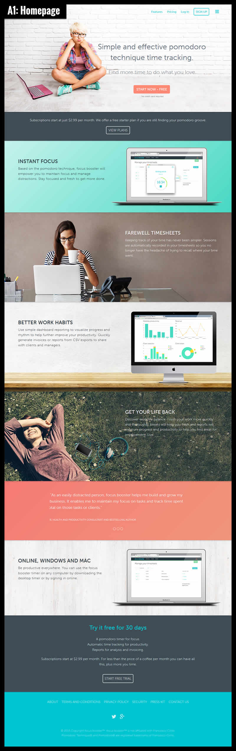
The Homepage
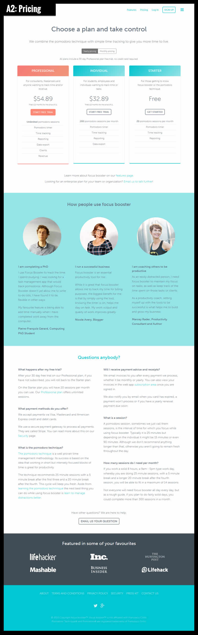
The Pricing
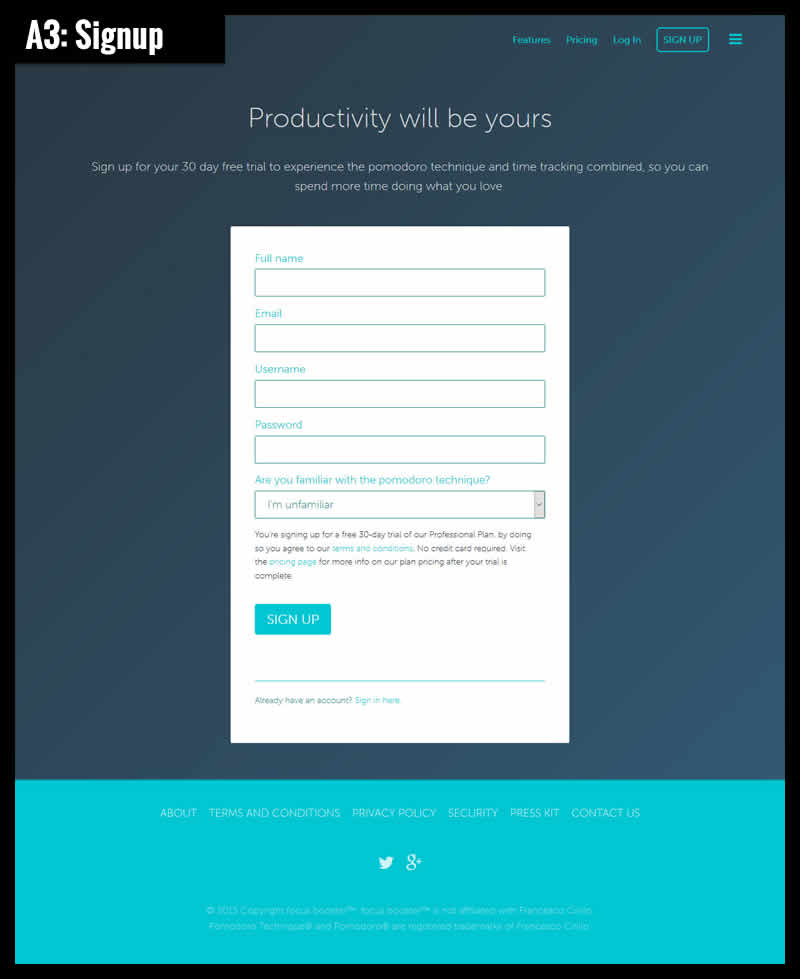
The Signup
Share Your Ideas For Improving Signups + Vote On Other Ideas
Please share your ideas on how we can increase signups on any of the screens above. Just a reminder, please keep 1 comment to 1 idea. Let's do this and leave your reply.
Update [Feb 9]: Here Is What We Will Test
A huge thanks for sharing all the amazing feedback! We took your ideas and came up with these concept variations which we will be testing. We'll probably need a few weeks to get this built + 1 month to get it tested. Any final suggestions? Again, thanks so much for making this possible.
Follow The Results In A Future Datastory
Posted by  Jakub Linowski on Jan 15, 2016
Comments
Thomas 8 years ago ↑0↓0
Saw the video based on your email. Thank you for making great work!
Here are a couple of variations for V1. ( I prefer v1 )
Something along the lines of the end game and how people see time from different points of view:
* If, get your time back is: I wasted my time before, I can do better now, then:
• Charge up your time (make my time do greater things )(goes well with booster?)
• Your time, now in XXXL size (my time is now abundant)
• Bulletproof vest for your time, or the safest place for your time (my time needs to be protected)
Reply
DA Holman 8 years ago ↑0↓0
The whole premise of this post is rather bold. Why would a UX (or design) professional solve a problem for free when the requesting party is being paid for the service?
Reply
Jakub Linowski 8 years ago ↑0↓0
@DA. We're not getting paid for our optimization work if you're curious. We decided to do it for free. We think it's super interesting that so many people expressed their feedback.
Reply
Rachael 8 years ago ↑0↓0
Is this challenge still ongoing?
Reply
Jakub Linowski 8 years ago ↑0↓0
Hi Rachel. I just updated the blog post. Thanks for asking :)
Reply
Adam Preece 8 years ago ↑0↓0
On Page 1 - Use a darker font on navigation, bringing not only the navigation bar but sign up button into a sharper focus, I think a dark navy blue would work here.
Page 2 - remove it, see below
On Page 3 - Implement social sign up, automatically setting them up with a free plan, show them pricing plan on first login
Reply
Jene 8 years ago ↑0↓0
A2: I think it should change the order of the blocks (from left to right: the starter; individual, professional) and highlight of an individual, as an illustration of the golden mean in the selection.
Reply
Dave Nielsen 8 years ago ↑0↓0
A1: Change approach from "SaaS based on Pomodoro" to "a successful individual sharing a tool he/she built for themself, which was vital to their success".
Reasoning: Anyone who understands what pomodoro is (and most will look it up before purchasing) is more likely to choose a free smartphone app or browser extension instead of subscribing to a service. The pomodoro functionality isn't a strong selling point. If you sell the service with an owner-based testimonial -- "I am successful because of this system, and if you use it you'll be successful" -- it's more compelling. It also implies that the price is reasonable -- if the owner is already successful, visitors are willing to buy into the idea that the owner doesn't need to profit, so can afford to sell this service at a great price as a gift to the world.
Reply
Vic 8 years ago ↑0↓0
An unlimited trial period is more convincing. A label like "Start now, first month is on us". After the trial is over, the user should be presented the pricing options.
Reply
Vic 8 years ago ↑0↓0
Put an e-mail box on the first page, near the Start Now - Free button. People tend to be discouraged when many steps are required to sign up.
Maybe make it visible/sticky while the user scrolls down. The pricing page should be accessible only if the user specifically clicks Pricing.
Reply
Rafael Rodrigues 8 years ago ↑0↓0
A1: INSPIRING PHOTOGRAPHY
Use a Photo of someone enjoying free time granted for using
pomodore service. Insted of a sad girl.
"People buy improved versions of themselves insted of features or problem solved by them."
Reply
Rafael Rodrigues 8 years ago ↑0↓0
A2: FORTUNE/FAMOUS/POWERFUL/INFLUENTIAL PEOPLE TESTIMONIALS
Bill Gates, Mark Zuckerberg and Obama and Elon Musk
Reply
Rafael Rodrigues 8 years ago ↑0↓0
A2: TRUST CLIENT FIRST
Satisfaction Garanteed or all your money back. No questions asked.
Reply
Rafael Rodrigues 8 years ago ↑0↓0
A3: FEWER FIELDS
Ask only for: Name and E-mail.
Configure the other things later.
Reply
Rafael Rodrigues 8 years ago ↑0↓0
A1: GRADUAL ENGAGEMENT
Pick one of your real tasks and try us now
Reply
Rafael Rodrigues 8 years ago ↑0↓0
A2: RECOMMENDATION
Tell them what is the Best "Cost X Benefit" plan.
Reply
Rafael Rodrigues 8 years ago ↑0↓0
A2: SMALL "SASS" IDEA
How many hours/week you work in average?
[ you awnser ]
How many types of activities are you involved with? ( Coding, Cooking, Dog Walking etc.)
[ you awnser ]
CALL TO ACTION: [ Find the best plan for Me ] or [ Free Starter Plan, please ]
Subscriptions start at just $2.99 per month.
Reply
Rafael Rodrigues 8 years ago ↑0↓0
A1: COPY IMPROVEMENT
We help you avoid wasting time in every task you make.
Recover your wasted time back with laser focus.
Use Pomodoro Online anywhere to help you find more time to do what you love.
• Become a more focused and productive so you can achiev all your goals
• Recover your life with better Work-Life balance
• No more Paper or Timesheets
• Build up Better Work Habits
CALL TO ACTION: [ I Want to Start Becoming More Productive Now - Free ]
We use a PROVEN Productivity Technique Known as Pomodoro - Time Management (R)
93K+ people trust Pomodoro Online
to recover their wasted time.
What are you waiting for? Tic-Tac...
-----
YOUR TIME WASTED CLOCK | 24:39...24:28...24:27
CALL TO ACTION: [ Stop this clock! signing up NOW ]
---
Reply
Diane C 8 years ago ↑0↓0
Re: All pages - could give us a bit more information without breaching any confidentiality agreements you have with your client?
Questions:
Is client the software designer or a customer (tenant) of software designer?
Or is client the end user company of tenant (subtenant) who is offering the software to individuals?
Does client have resources to do a few extra things such as, (for instance), changing brand colors (if those are brand colors)?
----------------------------------------------------------------
(5) New UI Suggestion: Don't speak to all possible end users at once.
Can Client market more specifically by speaking to men and women separately, for instance, on subdomain pages that show up as the main domain url? (This is something I am working to do now with my own project).
Consider distinguishing older end users from younger ones; professionally licensed end users from those who are not required to be licensed; artistic/creative end users from, say, a person who is cleaning other people's homes for a living (or something like that).
Then visuals for each subdomain would be different and the language would be tweaked or "translated" into the speak (language) of the targeted subdomain group. It just seems to me that with a tiny bit more work, and a wee additional investment in the subdomains, the chance of more sign-ups would be multiplied considerably...or maybe not...
Reply
Diane C 8 years ago ↑0↓0
And finally,
(4) There are no shots of anyone actually deeply engrossed in work on the pages. There are some people who, when they put their head down to work, actually make one hungry to do the same. This website needs a photograph of that guy or gal.
p.s. i like the streamlined starkness of "Subud's" suggestion.
Reply
Diane C 8 years ago ↑0↓0
(3) A2 says "we are here to help." If client is not only just available to answer questions for prospective members but is also available to those who join, then they should emphasize that since it will help set client apart from what my extremely short study of this subject indicates is available without paying an arm and a leg.
.
Reply
Diane C 8 years ago ↑0↓0
2) Actually, a young lady such as the one on A1 could work very well if we can follow her progress
(a) she is shown rather "in need of client's product" on A1
(b) she is happier, less stressed, more productive (and probably dressed just a little bit more like a grown-up) three days after beginning to use the program
(c) we see her actually working and not simply drinking coffee in front of laptop which looks like a break,
(d) can client devise a contest? (I love this idea you guys had about a contest for us -- and for the record, I vote for me!) Contest could be described on a super short YouTube video embedded on client's web page. A2 could entice visitors to watch video to see how time management system works AND for information they need to enter the contest. The video should automatically bring visitor back to client page where they can register for contest.
(e) contest prize could be related to time-management consultation given by human -- say, a half hour concentrated telephone consultation within 10 days of winning contest.
Reply
Diane C 8 years ago ↑0↓0
(1) All 3 pages -
(a) darkest jet black lettering against a white background and the whitest white lettering against black or deepest charcoal.
(b) salmon and turquoise colors do not suggest "work" For me, those colors suggest ice cream and cake, baloons and confetti at a child's birthday garden party.
(c) one other color besides the three shades (black, white, charcoal) perhaps a blue, but a more grown-up blue like a robin's egg or royal"ish" blue? or maybe a brilliant rich emerald green?
(d) fonts a couple sizes bigger
Reply
Kevin Mamaqi 8 years ago ↑0↓0
Remove the sign-up page, just a modal is enough.
Reply
Kevin Mamaqi 8 years ago ↑0↓0
Reduce the front-page to 'one slide' and include customer reviews
Reply
Trevor 8 years ago ↑1↓0
A2: Remove Yearly/Monthly price toggle. Figure out how to show benefit of yearly subscription over monthly subscription without having to toggle. I had to use a calculator to confirm the yearly pricing was better, despite the "12 months for the price of 11" messaging.
Reply
Trevor 8 years ago ↑0↓0
A3: email and password only. The rest of the information can be gathered later. Drop username entirely or make it optional.
Reply
Mario Lurig 8 years ago ↑1↓0
A1/A3: CTA text change to: Save Time
(This replaces 'Start Now - Free' and 'Sign Up')
CTA should reinforce messaging
Reply
Daryl 8 years ago ↑0↓0
A2: Not a fan of having a control double as a header. When you toggle between yearly/monthly pricing, a redundant, prominent header clearly showing which you're looking at, just below the toggle but above the three columns, would be appreciated.
Reply
stockwet 8 years ago ↑0↓0
A3:
1) Eliminate "Username" and "Are you familiar ..." questions. They are unnecessary and would shorten the form. Email address can be used instead of "Username".
2) Add a password confirmation of some sort. The last thing you want is for someone to mis-type their password and then have to go through a frustrating password reset process their first time in.
3) Where's the opt-in/opt-out language?
Does that count as one idea, or three? :)
Reply
Byron Hathaway 8 years ago ↑0↓0
The lady on the homepage looks as if she doesn't believe the claim (which is unclear if you don't know what pomodoro is anyway). She also looks composed rather than burdened with time management problems and that is the crux of the problem with the very first takeaway when one comes to the home page. Is time tracking valuable for most people or is it a tool for managers to use so they can effect more efficiency from workers? If the product is for the average user, maybe calling the app "time management" might resonate more with the average visitor..
Reply
cora 8 years ago ↑0↓0
AI: Test the headline, you're assuming people know about Pomodoro technique; another test you can do for A1 is that you can bundle the features in one side, and focus on sign up boxes on top and bottom, makes a simpler landing page; A2: test if you can add some character to pricing such as amateur/newbie for starter, hustler for individual, and victor for professional (just suggestions); A3: usually email and password are usual path for easy onboarding, try to test that, and put the sign up button to the center
Reply
A 8 years ago ↑0↓0
A1: I would change The CTA Buttons colors and put >> to make it more visible to the users
A3: needs to cut the number of required fields
Reply
Lada 8 years ago ↑0↓0
A1: The first picture of the blonde with the notebook has been bothering me ever since I saw it. Now I know why. You are sending mixed messages. Your picture does not correspond with what you say. You don't want to say that something is simple and effective and have a person who is clearly pissed/confused right next to your message. I get that you want your message to be that if you just can't seem to manage your time, try this simple and effective technique called pomodoro. But the way you present it just does not work. Either rework/extend the text, or change the picture. And I really hope you choose the former because the expression of this particular girl causes emotions, so people are more likely to remember your particular website.
Reply
Lada 8 years ago ↑0↓0
A3: Similarly to my comment to A2, just leave out the question "Are you familiar with the pomodoro technique?" If the client got so far as to sign up, they probably have an idea of what it is Plus, you can always ask them later. For example, once they've signed up, you can ask them if they'd like to receive beginners' kind of emails to familiarize themselves with the technique and refine their knowledge.
Reply
Lada 8 years ago ↑0↓0
A2: I would like to agree with ReTox, the free option shold be featured on the left. I think that we, people using latin characters, process text from the left, so having the most expensive option is not the best idea. It might scare people.
Also, having option for recurrent billing happening once a month with an option to cancel any time would also be much smarter. 2.99 a month sounds so much more affordable than shelling out 32.89 in one go. The total sounds too expensive, especially if your demographic are students and even regular people. 2.99 a month simply sounds more palatable for a regular person. However, you do need to highlight that the user is getting one month for free. As for professionals, I think either or should go because 54.89 should not be a problem and they should see your services as an investment. However, to keep the format uniform, try to do the monthly price?
I would leae out the whole Questions anybody? section. It seems unnecessary. If the client go so far that they ended on this page, they should already posses some basic knowledge about the technique. Either leave it out, make it a separate page and link it on this page as an FAQ-type of page, or make it scroll out only when the client clicks on it.
Reply
Kwentin 8 years ago ↑1↓0
A1: My idea is to make the user more curious about Podomoro. For that:
- Change the image by a more engaging one with a smiling character doing an activity (sport for example) and a chat bubble explaining why the user should register. Something like "Thanks to Podomoro I was able to better organize myself and now sport is back in my day to day life".
- Update the button label to reflect the user's will. Something like "Find your own way to save time"
- Remove the pricing information ($2.99 ...) on the homepage. Wait for the registration before talking about money.
Reply
Luffy 8 years ago ↑0↓0
A2: We should make a bold at Free ticket, because even when user sees free trial from your site, they will consider the price, let user use your site free, after that if they see it work well, they will promotion it.
Reply
Luffy 8 years ago ↑0↓0
A1: Let take "Start now - free" button place at center of frame and can make it blinking>> It will attract user
Reply
Michael K 8 years ago ↑0↓0
A2:
- Change the order to Starter, Individual, Professional
- Remove the yearly pricing option and change to only monthly price instead (e.g. $2.99/m for Individual)
Reply
eva 8 years ago ↑0↓0
A2: Usually, the purpose of 30 day trial is attracting user to keep use and then paid after 30 days. But this page shows free mode’s function seems less than the other plan. So i confuse these options.
Reply
Christian 8 years ago ↑0↓0
A1: The contrast is quite bad for all the text on the images, especially at the hero image and the 3rd and 5th from the top (Farewell timesheets, Get your life back). Also the contrast of the navigation at the top could be better. Use darker colors, use dark overlays where the text ist, something like that.
Reply
Abhishek 8 years ago ↑0↓0
A2
move 'Featured in some of your favorites' section right below the pricing.
Reply
Abhishek 8 years ago ↑0↓0
A2
Reduce the font size of the prices and increase that of benefits and move the action buttons (start free trial) below the benefits.
Reply
Abhishek 8 years ago ↑0↓0
A3
Remove Twitter and Google+ links below the form and all the other links in the footer for a lesser bounce rate.
Reply
Abhishek 8 years ago ↑1↓0
A1
The nav buttons and Start Now button stand out equally right now. Start now should have more contrast and nav buttons should take a back seat with dark grey color.
Reply
prassik91 8 years ago ↑0↓0
A3: have the bottom most text appearing in an overlay on click of an oversized "conditions applied" text...
The overlay can have a header saying... The only conditions applied.... Or something more witty
Reply
Abhishek 8 years ago ↑0↓0
A1
Headline- Simple and effective time tracking technique for you.
'technique time tracking' is a mouthful.
Reply
prassik91 8 years ago ↑0↓0
A3: if the drop-down has just two values might as well have two buttons (of alternatives) doing the function of a radio button
Reply
prassik91 8 years ago ↑0↓0
A3: The user should be allowed to directly sign up using Gmail/Facebook or other such social platforms. Which would then, just require only for the drop down
Reply
prassik91 8 years ago ↑1↓0
A3: Instead of a typical form... We could have a more casual sign up.
Ex: My parents named me____. (watermark : full name)
I wouldn't want to disclose my name, so let's call me ______(username)
And so on...
Reply
Mukesh 8 years ago ↑0↓0
Add short horizontal Get Started form on homepage before start trial block.
Reply
prassik91 8 years ago ↑0↓0
A3: The text mentioning the 30 day trial ....is too long for a quick sign up (anything more than a single line is long)
This text appears twice in the same screen.
Reply
Salwa 8 years ago ↑0↓0
In the pricing page, Individual and Starter plans have the same colors and on first glance, it looks like it was duplicated by mistake. They should be differentiated.
The sign up form is too long. There is no need of a username or the "are you familiar with" dropdown? That data could be collected at another point.
Reply
LuYuChao 8 years ago ↑0↓0
Give a toast message for signup button,
Reply
fliptheu 8 years ago ↑0↓0
For A1: This applies to all nav, but maybe make color of nav items a light black and have the sign up ghost button that color to help it stand out.
Reply
fliptheu 8 years ago ↑0↓0
A3: Also pertains to any screen with a sign up. When user clicks sign up from button on any screen, can a modal with just a sign up with Facebook -or- email address so it gets users locked in right away with little time or info taken. From the A3 screen have same as proposed modal, on this page, or eliminate this screen for initial sign up, but convert this screen to if a user wants to give more info and be more invested.
Reply
Panda 8 years ago ↑3↓0
In the home page, rather than listing its features,they could have added a small demo of the product.Many people don't know what a pomodoro technique is,so try convincing your product first.
In the Pricing page, Free Plan - Individual plan - Professional plan.Displaying Monthly pricing initially would be better than Yearly. The testimonials should be short and conclusive. FAQ section solves every question but no point in displaying whole answers to all.Keep answers short and add "Read More" to each answers.
In the Sign Up page, too long form. Add Google+ and facebook signups.
**I didn't knew if any of these suggestions were mentioned early **
Reply
Adam Szabo 8 years ago ↑0↓0
"In the home page, rather than listing its features,they could have added a small demo of the product."
THIS. In the SaaS business, always show how the product works in a video. It's easier to see the benefits this way.
Reply
Misha 8 years ago ↑1↓0
A3 change button text to "START FREE TRIAL"
Reply
Misha 8 years ago ↑0↓0
Pricing by default should be on monthly still having same switch to annual on top.
Reply
Misha 8 years ago ↑1↓0
Homepage. increase size to at least double of both sign up buttons
Reply
Justin Noel Cudaihl 8 years ago ↑5↓0
GET YOUR LIFE BACK as headline. That will get my attention.
Reply
Sapioit 8 years ago ↑0↓0
A2:
Usually, it goes from free to the most expensive, from left to right. Sure, you might have something highlighted, for the ones with not enough experience to choose for themselves, but that's not to say that it should be the most expensive one, necesarely. Also, the red doesen't works with the blue. I'd have the blue prices' titles and border as grey and the red as blue, and the highlighted be the one in the middle, with the free on the left and most expensive on the right.
Also, I'd use the same system you use to choose between yearly and monthly price, to switch between the testimonials and faq, but that only if you really want to include them. Personally, I'd sum that down in up to 4 sentences about how to use the app, what it's used for, why it's better than the alternatives and back up the app by giving an example of with and without the product. The testimonials can go on "Features", at the bottom, in order to convince the people who are not convinced, while the FAQ should have their own page, in the menu.
Reply
Michael 8 years ago ↑0↓0
A3: Headline
Current - "Productivity Will Be Yours"
Change to >> "Increased Productivity is Here"
Payoff Sentence: "Sign Up For Your 30 Day........."
Change to >> "For a Limited Time - Take Advantage of Your 30 Day Free Trial........"
Reply
Sapioit 8 years ago ↑0↓0
I'd go with:
One Month Free
Limited Time Offer
Reply
Sapioit 8 years ago ↑0↓0
And the second line shall be at most the half of the first one.
Reply
John Hurst 8 years ago ↑9↓0
A1: show monthly pricing by default, not yearly. Smaller figures are more enticing!
Reply
Joe Thoron 8 years ago ↑2↓0
Idea #3: Skip the pricing page. It's not necessary. Plus it sends a confusing message about free trial vs free app. Obviously 20 sessions per month is not sufficient for real use, so why even offer it? Instead go straight to the signup page (that's what the button promised, after all) and get people using the app as fast as possible with as few decisions as possible. Of course, the headline and subhead of the signup page need to echo the headline of the first page.
Reply
Joe Thoron 8 years ago ↑2↓0
Idea #2: Change the headline. The current headline is too focused on pomodoro and the benefit of finding more time for the stuff you love is distracting. Why not stay focused on the direct benefits of focused work?
Suggested headline and subhead: Are you ready for a productivity breakthrough? Focus Booster helps you get more done in less time.
Reply
Veronica 8 years ago ↑8↓0
A2: Pricing causes confusion. The paid accounts have numbers like $xx.89 which makes the number look really big compared to the Free account, so looking at numbers alone I will definitely go for the Free account. On the other hand the highest price plan is highlighted, which seems to signify this is the recommended price plan.
To help with decision making, I would:
1. Use whole numbers without decimals. $59 _looks_ smaller than $58.89.
2. Either highlight the free plan, so now the decision is obvious, or keep the highlight on the expensive plan but also include other indicators that suggests this is the most "bang for your buck".
Reply
Joe Thoron 8 years ago ↑11↓0
Idea #1: Remove the picture of the sullen high school student. Replace with something a bit more inspiring.
Reply
sketchyppl 8 years ago ↑2↓0
As a novice and not knowing what pomodoro technique is, the 3 lines that effectively explain what the tool is, are at the bottom of the homepage. Ie. After 'Try it free for 30 days ...' All that is above this is well crafted marketing speak - which coupled with the odd-choice in top hero image - doesn't really help me understand what the tool is. As I look for additional information, I wouldn't expect to find FAQs at the bottom of the pricing page.
Reply
Subud 8 years ago ↑18↓0
How about trying something a little radical. On the homepage next to the start now - free button, add a text box for email. Make the button text 'start now - free, just enter your email'. A user enters their email, clicks start now and this automatically creates a free plan for them, with a system generated password. (They get an email with the details.) On the website they are directed straight to the time management page, where they can get started using the system right away.
Reply
SanikaD 8 years ago ↑2↓0
It becomes boring to scroll so much on the Home page. Just say free signup on the first graphic and signup with email. You may add bullets that summarize the benefits, on the right while the girl is looking at the text.
Reply
ReTox 8 years ago ↑10↓0
A2: are free pricing modles listed usually on the left?
Reply
Tony 8 years ago ↑6↓0
There is too much effort put on the graphics and the features but what about the benefits of Podomo
What is Podomo exactly?
How can i buy the product without understanding exactly why i should buy it.
The testimonials should be clearly quantifiable. Is there a link to get the full story of what people did with the Podomo product. A bit like verified Amazon reviewers.
Is there a possibility to add a competition comparative chart, showcasing what you guys do better than others.
Could you add a video demonstrating the product and/or users demonstrating its use.
There are too many websites today flooded with these kind of presentations. As a user i dont see exactly why i want to buy and if i need to buy.
There needs to be more key differentiators:
For example:
Fitbit or X,Y,Z does this, but when John uses our product/solution here is what he gets...
Also there are no images of the product being used in real life, with real evaluations.
If people go on Youtube or you guys have the product referred or backed by them and they love it, put it!
Also the name should be put forward with a clear mission statement in logo
Hope it helps you guys. I am an entrepreneur myself and know the journey it takes to reach the standards and test your assumptions
Always test assumptions as the way you think of your product might be wrong down the road with the marketplace
Reply
ReTox 8 years ago ↑31↓0
A3: horribly long form, it should be just email and signup button; the confirmation email should have a link where user can choose password; maybe to move this whole signup form onto homepage? replace 'start now-free' with this mini form?
why is username required? isn't email enough?
Reply