Google Has Been A/B Testing Link Colors (Again) And This Light Blue Didn't Pass
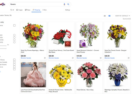
It's been a decade since it was first discovered that Google has famously tested those 41 shades of blue. Last month I discovered that they began experimenting with link colors on their search results screen - once again. This time Google tested a lighter blue with a lower contrast which turned out that they rejected (most likely due to a negative experiment result).
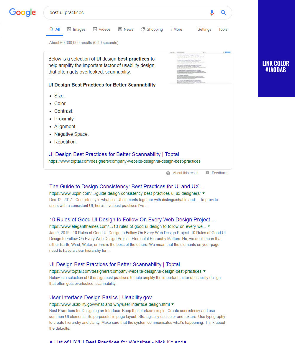
B - Jun 17, 2019 Screenshot
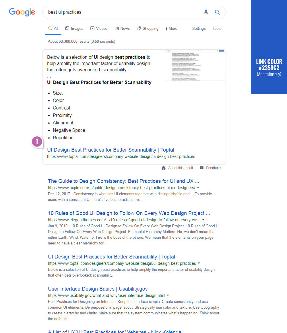
Highlighted UI Changes From This Leak
-
Lower Contrast Blue
When these screenshots were taken, it became apparent that the original control version used a #1A0DAB blue for the link colors. The variation visible on the same day used a lighter #2358C2 blue. So why didn't the lighter version that arguably looks a little nicer (just my own feeling) didn't make the cut? When I ran the color hex codes through a contrast checker, it turns out that the darker blue has more contrast and the lighter blue has a lower contrast. Perhaps this might explain why this a/b test resulted in a rejection of the variant.
-0.5 Repeatability has been assigned to Pattern #107: Contrast Links & Buttons as evidence that it's getting worse
Repeatability is a net count of evidence for or against a pattern. It’s how we can predict which patterns are better than others. :)
Does This Mean That One Link Color Is Better Than Another?
Probably yes - in a white background context. But we should also keep in mind that the magnitude of effect from this leaked experiment is not visible to us. And we can only speculate that such a small change has a very small effect. Of course for giants like Google, even small effects might not be as meaningless as for me and you. :)
Comments