Google Also A/B Tests The List Vs The Grid
Interestingly, Google was also discovered a/b testing the list vs grid pattern just as Bol finished a similar experiment this month. The Google experiment ran on one of their shopping results pages with the specific query for "flowers". And the outcome? Looks like the grid beat the list and was rolled out in this case.

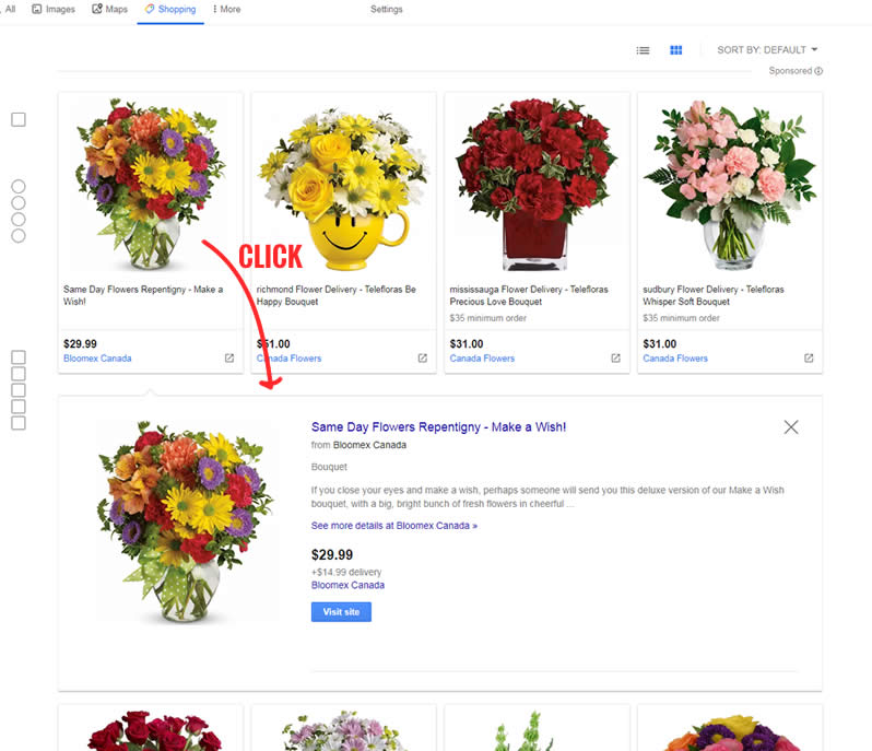
B - Oct 31, 2019 Screenshot

Highlighted UI Changes From This Leak
-
Grid View
Clearly we have a list vs grid experiment here between the A and the B variants.
0.5 Repeatability has been assigned to Pattern #37: List Or Grid View as evidence that it's getting better
Repeatability is a net count of evidence for or against a pattern. It’s how we can predict which patterns are better than others. :)
A Possibly Important Little Interaction?
I should also add that at a glance, the grid looks like it has less space to display any additional information that might be helpful to make a purchasing decision. The way Google has overcome this limitation (in both the A and B versions) is with an inline expanded detailed view seen below. Hence, clicking on any product, more information is shown before sending a viewer onto a different web site.
So Are Grids Better For All Of Google's Searches?
Not necessarily. Prying further into other queries such as "wine" we discovered that the list view is still active in some cases (similar to Bol's experiment result). And equally confusing is the "flower" (singular not plural) search query which also shows a list view. Google may have only run this experiment on a very defined segment of some sort - possibly only effective in certain situations. However, many other shopping-related searches still look like they are skewed towards using the grid.
Have Any Explanations For When To Use Lists Vs Grids?
And if you have ideas as to when to use grids vs lists, please share your interpretations as a comment. It would be great to better understand and better predict when to use one layout vs another.


Comments
Joel Kesler 6 years ago ↑0↓0
It looks like they are recording which view (grid or list) leads to more conversions for popular search terms. Once they have found which view leads to more conversion, they default that view for that search.
You can test this yourself with different searches. Ex: toybox vs toilet
Reply
Nick Kolenda 6 years ago ↑1↓1
The main contextual factor (in my personal, humble opinion) is the position in the sales funnel. I explain the research and reason at 7:49 in this video:
https://youtu.be/HWHLQ-O5B6c?t=469
My guess / hypothesis / biased conclusion: Grids work better for customers in the early stages of a funnel because they increase the perceived variety of offerings, while lists work better for customers in the later stages of a funnel because they funnel attention more effectively. On Amazon, queries in the early stages of a funnel (e.g., flowers) trigger a grid layout, whereas queries for specific products (e.g., flowers for algernon) trigger a list layout. If a list layout performs better on a website, then perhaps more customers are searching for specific products (vs. browsing).
Reply
Jakub Linowski 6 years ago ↑1↓0
Thanks for the comment. That's an interesting explanation. Although additional examples can be found on Amazon where this rule isn't followed. Ex: the generic "cpu" keyword uses a list view, so does the specific "intel core i9-9900k". And in films, the pattern is equally not applied with both "comedy" and "Stranger Than Fiction" both using the vertical list view. Cracks in the explanation or application? Not sure. At least this is now a more testable hypothesis that could be potentially falsified or verified. Thanks!
Reply
Hing-Cheung Li 6 years ago ↑1↓0
Depending on what you are looking for, I guess it makes one can work better than the other.
In the case of flowers, could it be users are mainly interested in how the flowers look, and in the case of wine, users might be also interested in other attributes like grape, year, region, age, tasting notes etc.?
Reply
Ying 6 years ago ↑1↓0
I agree. I feel in the grid view, the product image has more weight. and while in the list view, The content of the product is more important.
Reply