Zalando Rejects A/B Tested Company Logos And A Smaller Add-To-Cart Button
Zalando (Germany) has been experimenting with at least two interesting cascade variations on their product page. Both of these variations seem to have been rejected which is consistent with other evidence in favor of larger buttons (ex: similar to the inverse experiment from Airbnb).
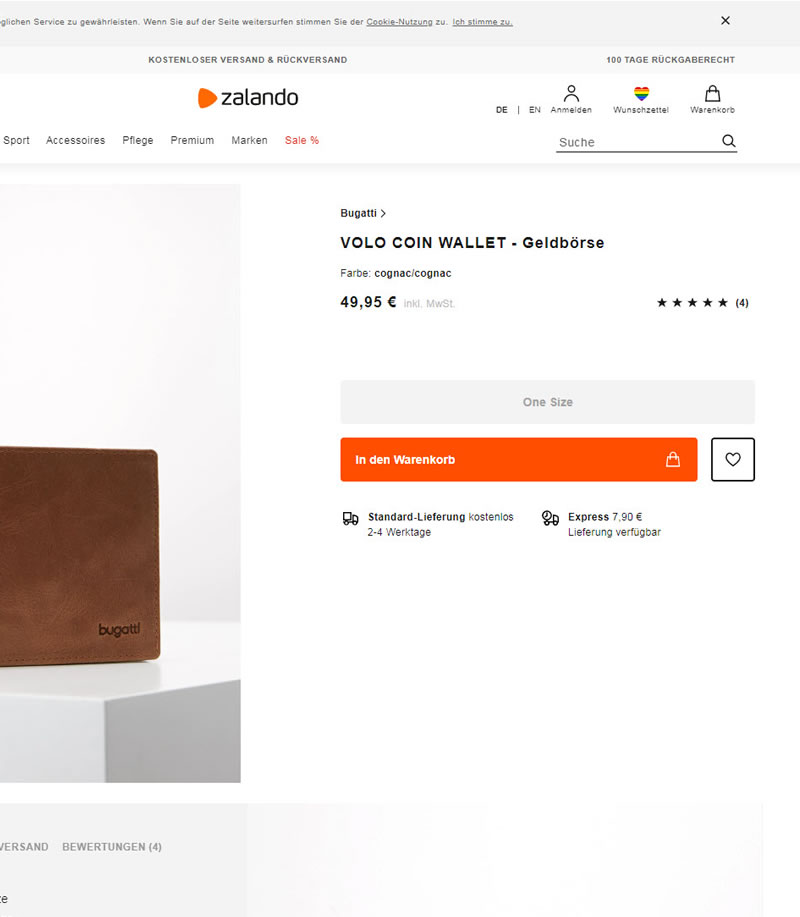
A - Aug 12, 2019 Screenshot


Highlighted UI Changes From This Leak
-
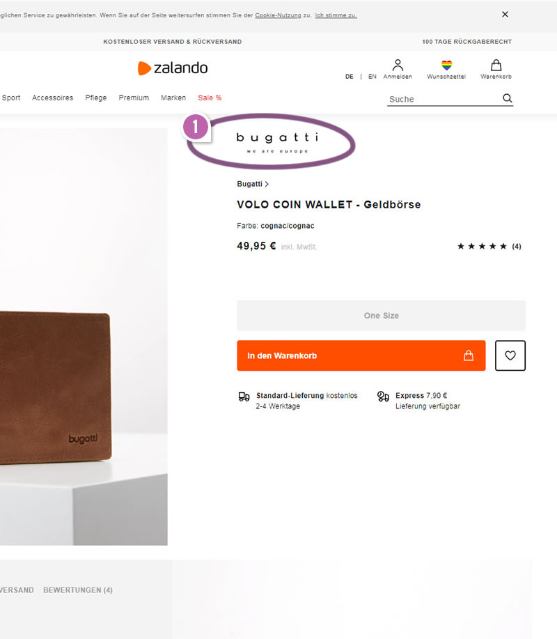
Company Logo + Lower Button Position
In the B variation we can identify at least two changes: injection of a company logo, which also pushed the add to cart a little further down. The change in position is very tiny and most likely would still make the button appear above the fold (at least on desktop).
But what about the presence of the additional Bugatti product logo? It's difficult to guess what type of effect this might have had if any. One thought (a big guess) is that perhaps having two logos (Zalando vs. Bugatti) creates some uncertainty about who might fulfill the order. And if Zalando is already trusted, well then, perhaps less is more. Of course this is simply a hypothesis. :)
This is very similar to Pattern #49: Above The Fold Call To Action
-
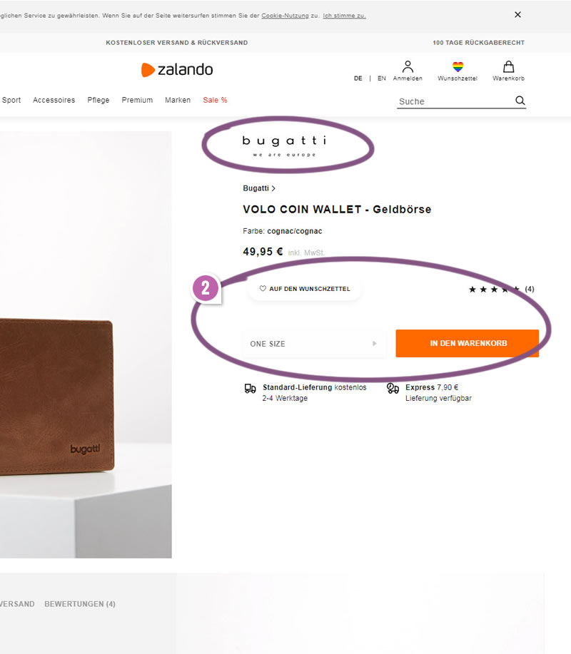
Shorter Add To Cart Button
Building on variation B, variation C introduces a number of other subtle changes with possibly the most visible one being a shorter add-to-cart button. On top of this they also changed: the position, size and color of the size selector; color, and title case of the add-to-cart button; removed the cart icon; changed the favorite button, label and its size.
0.5 Repeatability has been assigned to Pattern #97: Bigger Form Fields as evidence that it's getting better
Repeatability is a net count of evidence for or against a pattern. It’s how we can predict which patterns are better than others. :)

Comments
Ivan Burmistrov 7 years ago ↑0↓0
There is another change in variation C – UPPERCASE button label. I think this is an important factor because UPPERCASE is the synonym of shouting on the web. It is not polite to shout at your customers...
Reply