7 Experiments We Ran This Month - Jan 2018
Every month we cross-pollinate testing ideas between companies and then publish the results looking for repeating patterns. Here is a summary from 7 highlighted experiments we ran and published this month:
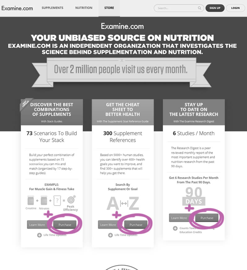
Examine.com: 3 Extra Purchase Buttons
Examine.com is a health & nutrition information. In this pricing page test we added 3 purchase buttons to enable sales sooner. The control only contained "learn more" buttons to further product pages. This change is now defined and tracked by Pattern #51: Learn More Or Purchase (along with the test result).
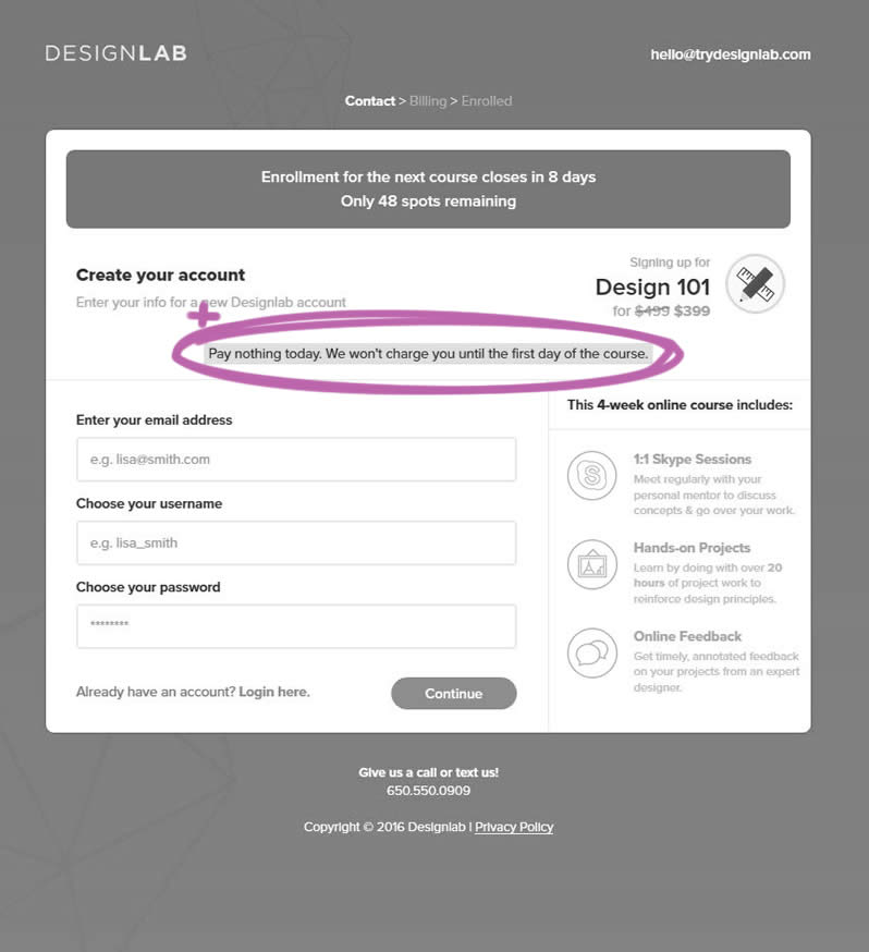
Trydesignlab.com: Pay Later Message
Trydesignlab.com is an online design school. In this checkout funnel test a simple message was added to let students know that they would not be charged until the start of the course (some time in the future). This change is now defined and tracked by Pattern #46: Pay Later (along with the test result).
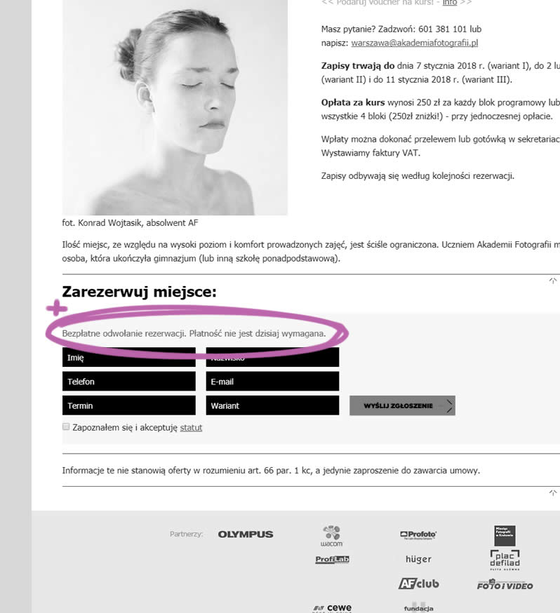
Akademiafotografii.pl: Pay Later Message
Akademiafotografii.pl is a photography school in Warsaw and Cracow. In this course page experiment we tried to replicate the same Pay Later pattern. The following copy was added above a lead form: "Free Cancellation. Payment is not required today". This change is now defined and tracked by Pattern #46: Pay Later (along with the test result).
Trydesignlab.com: Above The Fold Call To Action
Trydesignlab.com is an online design school. In this course page test we simply added a call to action linking to a lead form all the way at the bottom of a long page. This is being tracked as Pattern #49: Above The Fold Call to Action (along with the test result).

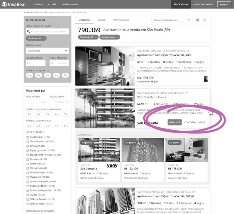
Vivareal.com.com.br: Hover Button
Vivareal.com.com.br is a real-estate directory in Brazil. This desktop test explores hiding all property calls to action and only showing them only on hover. This change is now defined and tracked by Pattern #56: Hover Button (along with the test result).
Normanrecords.com: No Coupon Fields
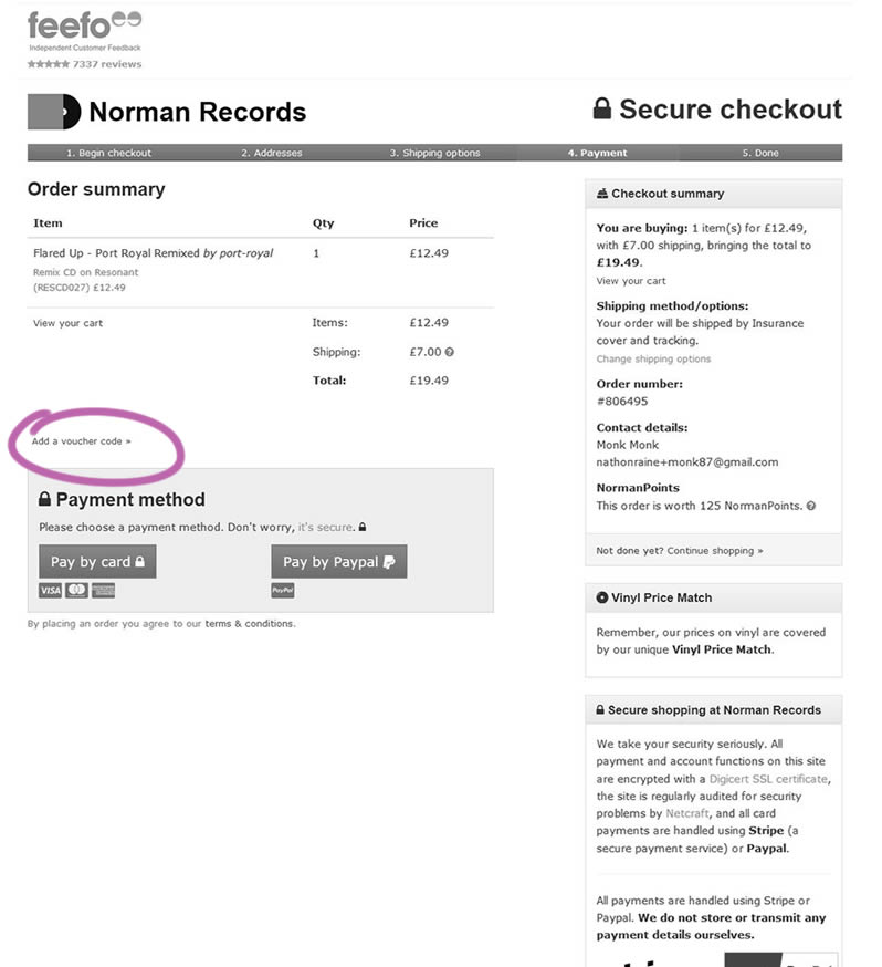
Normanrecords.com is an e-commerce store for LPs. This checkout test changed a visible coupon field into a hidden one under a link. Only clicking the "Add a voucher code" link would show the coupon field. This change is now tracked with Pattern #1: No Coupon Fields (along with the test result).
Reverb.com: Canned Response
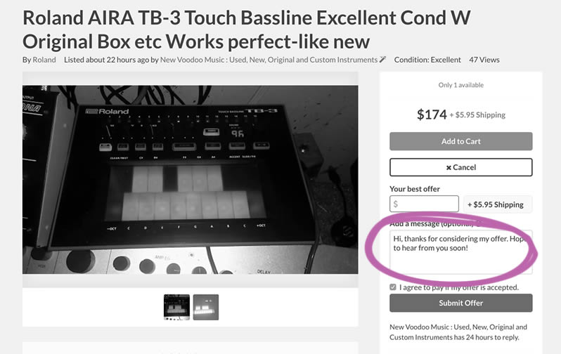
Reverb.com is a marketplace for musical instruments. In this product page test, Pattern #20: Canned Response was attempted to be replicated.
Why Do We Test Small Changes Like These?
Reflecting on the tests above, some might wonder - why are we testing such small changes instead of larger ones (possibly with higher impact)? The answer is simple. All of the above tests have been defined as patterns which makes them more reproducible (necessary if we want to know which tend to work more so than others).
Every month we cross-pollinate testing ideas between companies and then publish the results looking for repeating patterns. Here is a summary from 7 highlighted experiments we ran and published this month:
Examine.com: 3 Extra Purchase Buttons
Examine.com is a health & nutrition information. In this pricing page test we added 3 purchase buttons to enable sales sooner. The control only contained "learn more" buttons to further product pages. This change is now defined and tracked by Pattern #51: Learn More Or Purchase (along with the test result).

Trydesignlab.com: Pay Later Message
Trydesignlab.com is an online design school. In this checkout funnel test a simple message was added to let students know that they would not be charged until the start of the course (some time in the future). This change is now defined and tracked by Pattern #46: Pay Later (along with the test result).

Akademiafotografii.pl: Pay Later Message
Akademiafotografii.pl is a photography school in Warsaw and Cracow. In this course page experiment we tried to replicate the same Pay Later pattern. The following copy was added above a lead form: "Free Cancellation. Payment is not required today". This change is now defined and tracked by Pattern #46: Pay Later (along with the test result).

Trydesignlab.com: Above The Fold Call To Action
Trydesignlab.com is an online design school. In this course page test we simply added a call to action linking to a lead form all the way at the bottom of a long page. This is being tracked as Pattern #49: Above The Fold Call to Action (along with the test result).

Vivareal.com.com.br: Hover Button
Vivareal.com.com.br is a real-estate directory in Brazil. This desktop test explores hiding all property calls to action and only showing them only on hover. This change is now defined and tracked by Pattern #56: Hover Button (along with the test result).

Normanrecords.com: No Coupon Fields
Normanrecords.com is an e-commerce store for LPs. This checkout test changed a visible coupon field into a hidden one under a link. Only clicking the "Add a voucher code" link would show the coupon field. This change is now tracked with Pattern #1: No Coupon Fields (along with the test result).

Reverb.com: Canned Response
Reverb.com is a marketplace for musical instruments. In this product page test, Pattern #20: Canned Response was attempted to be replicated.

Why Do We Test Small Changes Like These?
Reflecting on the tests above, some might wonder - why are we testing such small changes instead of larger ones (possibly with higher impact)? The answer is simple. All of the above tests have been defined as patterns which makes them more reproducible (necessary if we want to know which tend to work more so than others).
 Jakub Linowski on Jan 29, 2018
Comments
Brandon 8 years ago ↑0↓0
Awesome to see these real-world results! I love it when people are sharing such valuable info to make the entire web a better (and more conversion-rich) place.
Reply
David Frosdick 8 years ago ↑2↓0
Love seeing your tests Jakub!! Keep them coming :) It just shows if we make minor adjustments or creatively hiding features we can see increased conversions.
Reply