Blueprint: The Social Teaser Signup Page
We recently optimized massagebook.com's signup funnel and wanted to share one UI pattern that we ended up with as a result: The Social Teaser Signup Page. As we optimized for more signups (shallow starts and deeper completions), we found our new signup landing page to have 16% More Signup Starts. Here are both screens from the top of the funnel and the reasons why we think variation B did better:
The Two Signup Landing Pages That We Tested
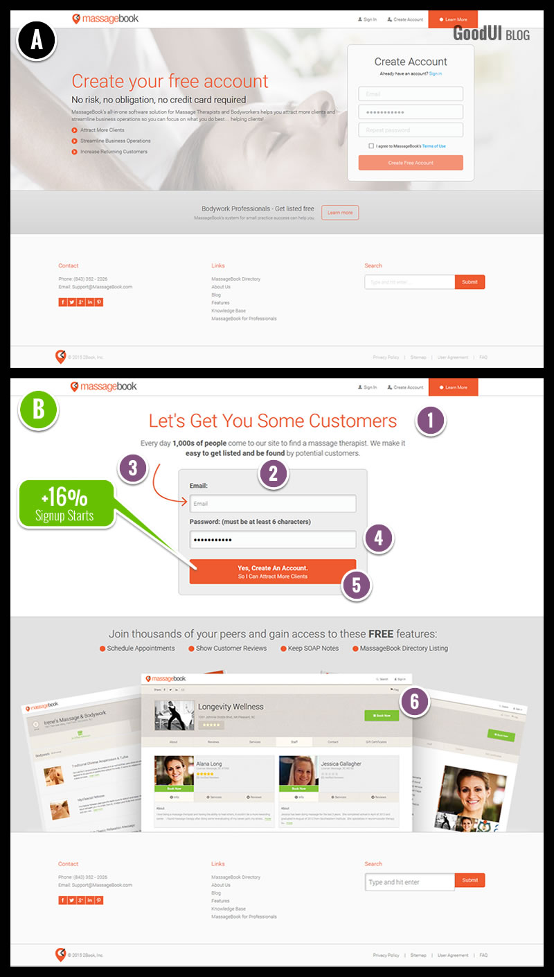
1. Benefit Based Headlines
Considering that these were business people signing up to list their massage companies, we first reinforced the headline with a key benefit - that of receiving more customers (GoodUI #24).
2. One Column Layouts
We placed the critical form in the center of the page using a single column layout, instead of having the form sit on the sidelines. (GoodUI #1).
3. Attention Grabs
Additional attention was directed to the first form field using a simple arrow. (GoodUI #56).
4. Fewer Form Fields
The Confirm Your Password field was removed, because it is disrespectful to humanity while making people feel stupid and generating unnecessary friction. (GoodUI #13).
5. Benefit Buttons
The main call to action repeated the key benefit of gaining more customers, while reaffirming that an account will in fact be created. (GoodUI #18).
6. Social Proof
Just below the main signup button, sample profiles were displayed of users who have already signed up. Social proof was also applied indirectly with wording such as "join thousands of your peers". (GoodUI #4).
These Changes Resulted In +16% Signup Starts
We measured how many people landed on both signup pages (A & B) and which of those people moved one step forward onto the next page. For the improved variation B, +16% more people started the signup process.
Download The Social Teaser Signup Page Blueprint (Free PDF)
Read The Complete Story In Datastories Issue #18
Inside, we share with you the full details to learn from, including: additional screens that were redesigned, the testing strategy used (Implement Now, Measure Later), our reflections on the process, and transparent data.
We recently optimized massagebook.com's signup funnel and wanted to share one UI pattern that we ended up with as a result: The Social Teaser Signup Page. As we optimized for more signups (shallow starts and deeper completions), we found our new signup landing page to have 16% More Signup Starts. Here are both screens from the top of the funnel and the reasons why we think variation B did better:
The Two Signup Landing Pages That We Tested
1. Benefit Based Headlines
Considering that these were business people signing up to list their massage companies, we first reinforced the headline with a key benefit - that of receiving more customers (GoodUI #24).
2. One Column Layouts
We placed the critical form in the center of the page using a single column layout, instead of having the form sit on the sidelines. (GoodUI #1).
3. Attention Grabs
Additional attention was directed to the first form field using a simple arrow. (GoodUI #56).
4. Fewer Form Fields
The Confirm Your Password field was removed, because it is disrespectful to humanity while making people feel stupid and generating unnecessary friction. (GoodUI #13).
5. Benefit Buttons
The main call to action repeated the key benefit of gaining more customers, while reaffirming that an account will in fact be created. (GoodUI #18).
6. Social Proof
Just below the main signup button, sample profiles were displayed of users who have already signed up. Social proof was also applied indirectly with wording such as "join thousands of your peers". (GoodUI #4).
These Changes Resulted In +16% Signup Starts
We measured how many people landed on both signup pages (A & B) and which of those people moved one step forward onto the next page. For the improved variation B, +16% more people started the signup process.
Download The Social Teaser Signup Page Blueprint (Free PDF)
Read The Complete Story In Datastories Issue #18
Inside, we share with you the full details to learn from, including: additional screens that were redesigned, the testing strategy used (Implement Now, Measure Later), our reflections on the process, and transparent data.
Posted by  Jakub Linowski on Oct 13, 2015
Comments