From Good To Better - How Can We Further Improve These 4 Figma UI Templates?
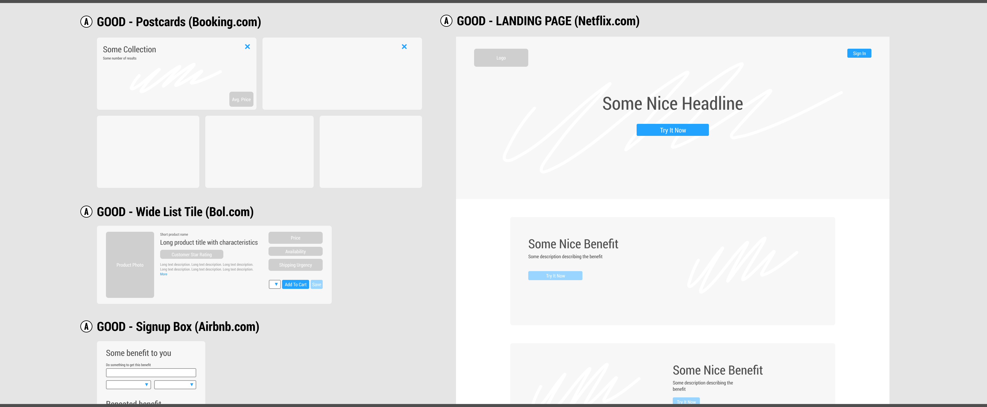
I'm continuing to improve the GoodUI Design System and I would love to hear more of your feedback on these emerging template components. This month I've been exploring the space between moving the GOOD and BETTER class templates with a handful of components and one more landing page (Figma). Is there any way this could be improved? Please have a look and leave your suggestions as a comment further below.

Can we inspire BETTER variations by raising question?
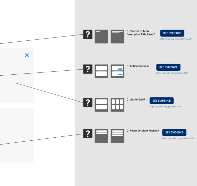
It's becoming clearer that the GOOD class templates, although inspired by UI's of leading companies, will only be meant to act as a starting point. I think it will be more interesting to enable design triggers or questions that encourage further variation. The screenshot snippet below shows a few examples of such "catalysts" in the context of Booking.com Postcard component. How is this?

Share Your Suggestions For Improvement
The template system is work in progress. Please share your comments or ideas how I can improve this further for you. Will you use this template? Why? Why not? Do you have ideas for how to make it better? Let me know. I'm listening.
I'm continuing to improve the GoodUI Design System and I would love to hear more of your feedback on these emerging template components. This month I've been exploring the space between moving the GOOD and BETTER class templates with a handful of components and one more landing page (Figma). Is there any way this could be improved? Please have a look and leave your suggestions as a comment further below.

Can we inspire BETTER variations by raising question?
It's becoming clearer that the GOOD class templates, although inspired by UI's of leading companies, will only be meant to act as a starting point. I think it will be more interesting to enable design triggers or questions that encourage further variation. The screenshot snippet below shows a few examples of such "catalysts" in the context of Booking.com Postcard component. How is this?

Share Your Suggestions For Improvement
The template system is work in progress. Please share your comments or ideas how I can improve this further for you. Will you use this template? Why? Why not? Do you have ideas for how to make it better? Let me know. I'm listening.
 Jakub Linowski on Nov 22, 2019
Comments
Sai 6 years ago ↑1↓0
If the landing page imagery is decorative, align it down the page instead of alternating: https://www.nngroup.com/articles/zigzag-page-layout/
Reply