Visualizing A/B Test Effect Trends
Continuing our exploration of how experiment UI and visualization could be pushed further, one area that could use some love is effect trends. We're used to seeing a single point estimate, maybe with a confidence interval, but what about the shape of the effect over time? Did it start strong and fade? Creep up slowly? Jump one day and stay there? Here's a first sketch of what that could look like.
The Prototype
Here's how these charts might look on a program-level dashboard, with one compact card per experiment so trends can be compared at a glance.
At Icon Size
Shrunk down to just the oversimplified shape, each trend becomes a small glyph that could sit next to a test name in a list or table.
Where This Came From
The idea started with a weekend sketch while thinking of how a few common trends might look.
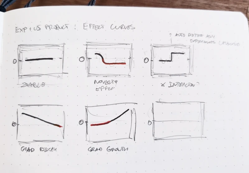
Gating on Whether a Trend Is Real
Today I ran into a paper that L. Richardson, one of its authors, shared on LinkedIn: "Testing for Trends in Online Experiments" by Haulk, Richardson & Soriano. It tackles exactly the question these charts raise — is a trend in the daily effect real, or just noise? — so I borrowed its core method to decide which cards earn a shape.
A shape like "novelty effect" or "gradual growth" is only useful to show if the daily data actually supports it — otherwise it's just a guess dressed up as a chart. So each card is put through a statistical gate first: fit a straight line to the daily effect, and use a jackknife (refit the line leaving out one day at a time, and use the spread of those refits as the uncertainty) instead of a standard OLS confidence interval, which the source paper's own A/A-test validation found badly overconfident for this exact problem (76% actual coverage vs. a claimed 95%). If the resulting interval excludes zero, the trend is credible and gets drawn; if not, the card is marked flat or too noisy to call instead of showing a shape the data doesn't back.
Everything past that core jackknife test — the moving-average line, naming a trend's shape, telling "confirmed flat" apart from "too noisy," and the separate weekly-pattern check — is this prototype's own addition, not part of the paper.
One limitation worth flagging: the paper's test is for a linear trend specifically, so on its own it would call a real but non-monotonic pattern (like the "Recurring" cards above) "too noisy" even though something is clearly happening — it just isn't a straight line. That's why those cards go through separate recurring-pattern checks instead.
Method source: Haulk, C., Richardson, L., & Soriano, J. "Testing for Trends in Online Experiments", arXiv:2609.01973.
Posted by  Jakub Linowski on Sep 19, 2026
Comments