Google's A/B Test Is Hinting That Labels With Icons Are Better Than Labels Alone
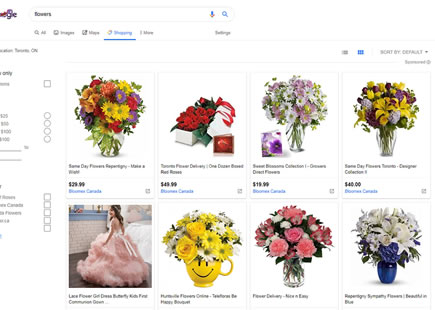
Take a look at these two screenshots, both taken on May 15, 2019. With some cookie clearing magic in between it's pretty clear that Google ran an icon experiment on their search results page. The control version had labels only in the top nav, whereas the variant contained icons in addition to the labels. The variation was implemented a month later in June.
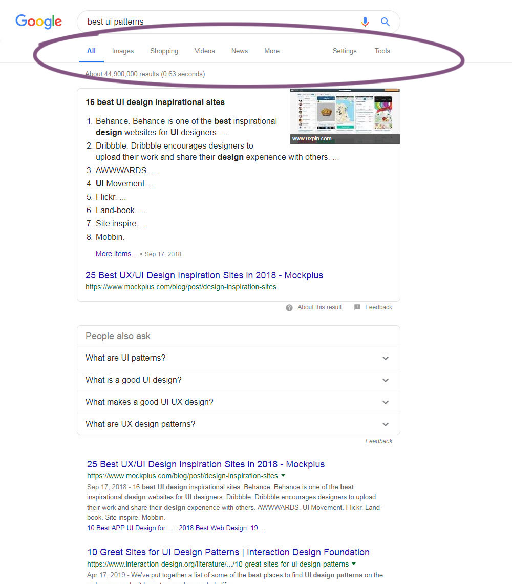
B - May 15, 2019 Screenshot
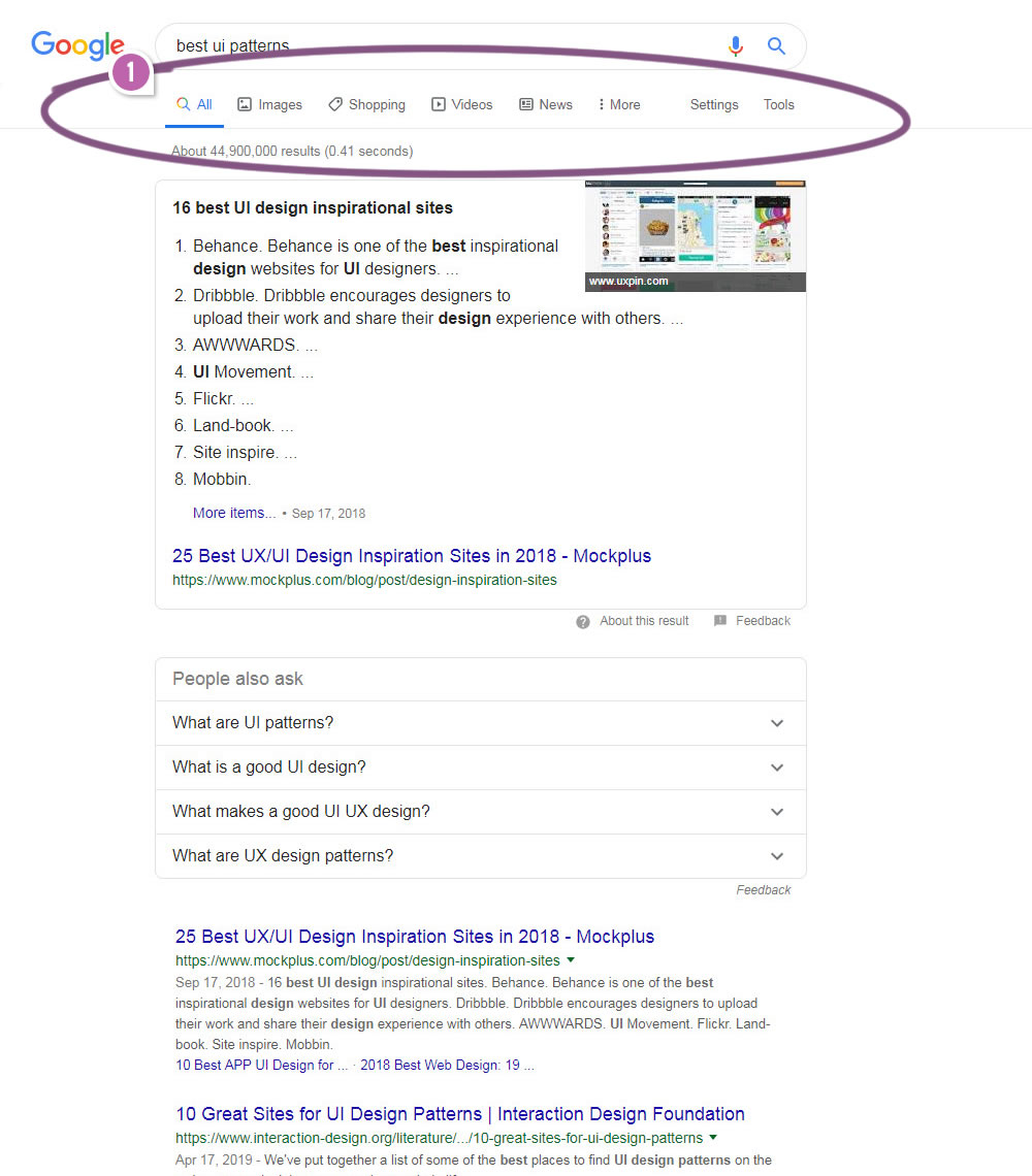
Highlighted UI Changes From This Leak
-
Labels With Icons
Luckily, the addition of icons on top of the existing navigation text labels was the only change in this experiment. Although we can infer that this version is better, we can only speculate as to why this might have been so.
One such explanation is perhaps that the icons simply increased the visibility of the navigation links (assuming that it's a good metric to have more people visit the subsections such as: Images, Shopping, News and More).
Another similar reason is perhaps that the icon labels increased the clickable surface area of the navigation links. Usually larger clickable areas might lead to more clicks (with or without intent).
Finally, we also have a series of experiments comparing icons vs labels right here - hinting that labels are slightly superior.
Do you have any other explanations as to why version B with the icons might have been better? Please share. :)
0.5 Repeatability has been assigned to Pattern #2: Icon Labels as evidence that it's getting better
Repeatability is a net count of evidence for or against a pattern. It’s how we can predict which patterns are better than others. :)
Comments
Thomas Philp 7 years ago ↑0↓0
People naturally lean towards pictographs. I think avoiding icons for so long was more of a thing they were doing to keep the google homepage simple.
We were using them before letters :)
Happy face of triumph.
Reply
Bruno Mota 7 years ago ↑0↓0
Here's an example of what Luke said:
1st query "ST8000VN004 newegg" Maps followed by Images
https://www.google.com/search?ei=fycaXcihBpXMgwfNkpu4Bw&q=ST8000VN004+newegg&oq=ST8000VN004+newegg&gs_l=psy-ab.3..35i39.16681.17938..18305...0.0..0.101.591.6j1......0....1..gws-wiz.......0i5i30j0i30.VBMsDdeW1RU
2nd query: "ST8000VN004" Images followed by maps
https://www.google.com/search?ei=ricaXfzXMaaGjLsPtou4-AE&q=ST8000VN004&oq=ST8000VN004&gs_l=psy-ab.3..0i19j0i30i19.66034.66353..66536...0.0..0.82.155.2......0....1..gws-wiz.......0i5i30j0i30.QDP3EvYdWrE
Reply
Luke Lowrey 7 years ago ↑1↓0
Google changes around the order of those items dependent on your search query. I've often just automatically clicked the second option in the navigation bar because I've assumed that it'll be 'Images'. I imagine that when this is used, it helps people realise if those navigation items have changed around, and people will see the icon as well as the text and click the correct option.
Reply
Jakub Linowski 7 years ago ↑1↓0
Can you share two example queries that show different icon usage? I detected the difference with the same query as an active a/b test (so I'm assuming it's a global change that's query agnostic).
Reply
Michael Pdeachey 7 years ago ↑0↓0
Hi Jakub - I can't post images, but try Google search for:
* Niagara Falls - All, Maps, Images, News ...
* Abraham Lincoln - All, Images, News, Books...
* BBQ Grill - All, Shopping, Images, Maps...
Reply
Jakub Linowski 7 years ago ↑0↓0
I see what you mean. Those labels themselves are contextual to the search query. Although all now have icons which was the controlled change in the recent experiment.
Reply
Luke Lowrey 7 years ago ↑0↓0
Yeah. In Michaels example above, if I was looking for pictures of BBQ grills, I know at least sometimes I'd end up clicking on the second item in the list when it's just text, assuming that the second item is generally "Images" (without actually reading the text)
With their update with icons in place, I imagine it'll be a lot clearer to jump to the correct option, or at least should prevent you from clicking the wrong one!
Reply