A +58,782% More Annoying Modal Popup
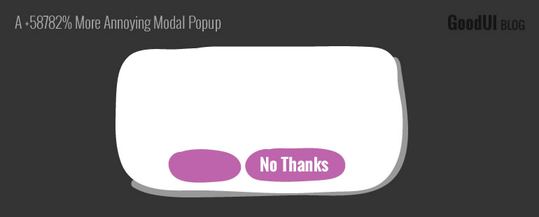
During a recent a/b test, we discovered our highest effect to date and it wasn't pretty. The record breaking increase of +58782% appeared for the number of people who clicked "No Thanks" and/or "Close" on a modal popup between these two tested variations.
Coming back down to earth, the astronomical +58782% effect really translated into an absolute rate of 72% of people who clearly did not wish to see the modal popup - perhaps that's a little easier to chew on. 72% is still high and suggests a major irritation. Part of the explanation was that our modal window variation was shown after a fixed 6 second delay. More so, the popup window was floating, so no amount of scrolling would have removed it (although I'd say that's pretty common). These two factors combined easily could have explained the large amount of people who might have expressed their annoyance.
Relatively speaking, was this a fair comparison? Probably not. The control variation actually did not have a "No Thanks" button and only a smaller "X" to close its floating footer. Nevertheless, the footer in the control only had an absolute close rate of around 0.1%.
Did We Learn Anything From Any Of The 5 Variations?
Yes. For one, we think there might be a more intelligent way to time modal windows based on behavior (ex: scroll or mouse movement rules). Secondly, we also discovered a way better interaction pattern with a slide element positioned at the very top of the screen which we'll be falling back on from now on. Here are the exact 5 variations that were tested, while focusing on the primary metric of trying to increase the "signup" rate.
Get the full story described in Issue #21 to learn everything we learned from this amazing test.
Find Out Which Of The 5 Variations Had The Highest Signups
Posted by  Jakub Linowski on Jan 11, 2016
Comments
Ben 8 years ago ↑1↓0
Modal popups are THE most ANNOYING website features, especially on news articles, because I will begin to read the article and then the popup will show, blocking the view. Even worse, not all of them are the same, so I have to figure out whether I can click a "no thanks" button (sometimes you have to wait a few seconds for it to appear!), an escape/close button ("X" button), or click outside of the popup box.
Sometimes these boxes can't be closed, such as the box that shows up on Facebook pages. In fact, that box takes up nearly 1/3rd of the screen, which is obviously an annoyance. (I get it, it's meant to be annoying to make people sign up, but that is THE WRONG WAY to get them to sign up. They'll just sign up to get rid of the box, not because they like your content!!!)
Personally, they actually put me off rather than get me interested. Most people I've talked to say the same thing. The best way to get more subscriptions and such is to have good content! I subscribe to things that I really like.
Reply