BetterUI Challenge: InVision + Natural Language Forms = +7.6% Prediction

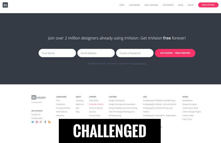
I think Invisionapp.com, an amazing collaboration platform for designers, can do a better job in terms of collecting more signups on their long homepage. I'm openly challenging the very bottom of their homepage which contains a set of horizontally aligned form fields. I think that the form fields could apply the Natural Language Forms pattern organizing them as sentences. More so, based on 6 observed tests using this pattern (with 4 positive results), I can also make an approximate effect guess of +7.6% more signups. There, I made a public prediction! Now will InVision test this? I hope so, since there is still so much to learn.
InVision Should Test This Pattern With These 3 Key Changes
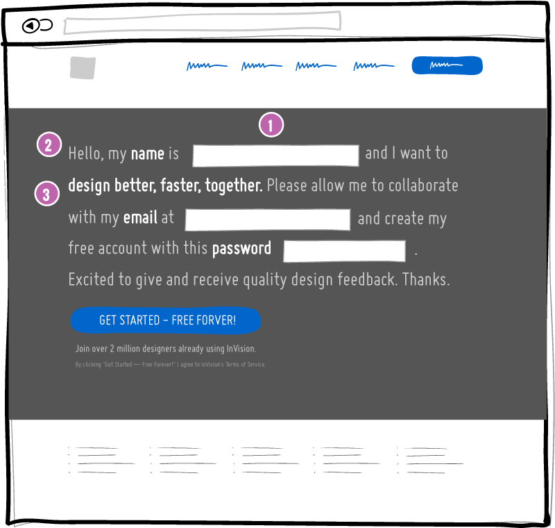
Here is what I would change if I were to apply the Natural Language Forms pattern to InVision's homepage. The concept contains 3 key properties:

- Fields As First Person Narrative
All form fields are weaved together into sentences using a first person narrative. The form labels and reasons for filling them out are all written from the reader's perspective. - Friendly & Informal Language
The narrative starts with a friendly introduction and uses informal language throughout. - Benefit Amplification
Benefits should be mentioned and reminded of throughout the narrative. In this concept, we suggest to reuse the key benefits from the headline: "design better, faster, together" (with additional consistency of message).
Measuring Success
In order to gauge whether this pattern is successful or not I would setup the test as follows:
- Audience: Desktop + Anyone Who Sees The Form
I would include only desktop traffic in the test (although it would be interesting to mirror the test in a mobile segment). Furthermore, because the change is actually quite far down on the page, I would also further segment the test results to those people that actually scroll down to the bottom of the screen (and see the variant). - Primary: Signups
The primary metric would be a successful shallow signup - measured with a next page visit in the registration flow. - Secondary: First Project Creation
It's good practice to measure something closer to the business, further in the funnel. In this case it could be either a deeper task (such as first project creation) or even further (becoming a paying customer).
Outcomes & Updates
I really hope to influence InVision to test this concept and share the data with everyone in here so we can learn something about natural language forms. Here is what has happened so far:
-
April 28, 2017 - InVision Has Seen It
I reached out to InVision about this challenge and Clark Valberg (the company's awesome CEO) confirmed he noticed it at least.
@jlinowski @InVisionApp @mikefiorillo Cool idea Jakub!
— Clark Valberg (@ClarkValberg) April 28, 2017
Mike Fiorillo (Growth & Product / ex-Head Of Optimization) also chimed in saying they have a bunch of other testing ideas in the pipeline but is interested in the concept as well.
@jlinowski @InVisionApp I am indeed curious about this pattern. Personally I prefer a straightforward form but data always trumps opinion :)
— Mike Fiorillo ???????? (@mikefiorillo) April 28, 2017
Here Is Where You Come In
If you'd like to help and make this happen, nudge InVision a little to encourage some open experimentation. Here is a tweet link that you could use:
Tweet To InVision To Encourage Them To Test This
 Jakub Linowski on Apr 28, 2017
Comments
Bill Lee 9 years ago ↑2↓0
Wish a mobile goodui !
Reply
Jay Scott ANDERSON 9 years ago ↑3↓0
I feel a consistent narrative perspective is important. And I tend towards second person narrative throughout the sites I design. However this challenge brings to mind the concept of a "conversation" narrative with the narrative, when appropriate, as in this challenge, for example, changing from "your name" to "my name". In that case I think it's important to clarify the conversation narrative boundaries for the user, i.e., when I am talking (the site designer) and when you are talking (the site user). So here the thought comes to mind to present the subscription form in the form of a template correspondence the user can use to communicate essential information to the site owners.
Reply
David Morrison 9 years ago ↑4↓0
Great test idea. This reminds me a bit of direct mail order form copywriting. I looked at the copy and wondered, since it's at the bottom of the page and follows the credibility 'bar', if it could remind the viewer with a Why?/Because benefit reinforcement/reminder. This sample includes a pre-head, mini-headline and a restatement of the benefit in/on the CTA button.
_____
Elevate Your Design Process. With Invision You: Prototype | Present | Revise | Succeed
Be Better - Design Better, Faster, Together
Hi, my name is [ ] and I want to design better, faster, together. Get me designing right away with just this email [ ] and open my forever-free account with this password [ ].
CTA:
I Want to Design Better, Faster - It’s Free Forever
_____
Hope this adds to, not inhibits, the viewer's flow and builds positive psychology motivation to say YES and take action.
Reply
Jakub Linowski 9 years ago ↑2↓0
Interesting. I like it. Potential for a C variation for the test.
Reply