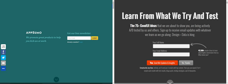
Can You Imitate Other Sites For Higher Conversions?

Of course you can. We did this recently ourselves when we were inspired by one of AppSumo's prominent patterns. When we tested the pattern, it increased our signups by +191% on our very own goodui.org. Here is a short story about what gave us the confidence to imitate another site and reap the benefits of higher conversions - thanks AppSumo.
What AppSumo Did & What We Did On GoodUI

The Full Height Email Grab is a pattern which shows a signup form with a lot of padding that precedes the rest of a landing page. It's essentially a large, full window height container which probably makes any visitor take a few seconds before realizing that there is more content underneath. It definitely maximizes attention towards the call to action with deep focus and no distractions. I noticed this interesting pattern a few years ago on AppSumo.com and did not think much of it. When a year or two passed however, and the pattern was still being used, I started wondering if perhaps it was an effective one with potential for reuse. I always thought that the team at AppSumo are analytical, data focused and are known to a/b test their work. More so, they actually turned this pattern into a service / app called the Welcome Mat with a big conversion increase claim. Ok, by this point in time I knew this needed to be tested and so we did on our own goodui.org landing page.
The results? The variation with the Full Height Email Grab outperformed our control page with a floating bottom footer by a strong +191% to signups. This became one of our first indications that perhaps it pays to look around and see what others are doing.
Can Effects Repeat From One Site To Another?
There seems to be some perpetuated myth about non repeatability of effects. The claim is that what happens on one site will always remain unique to only that specific site and copying the success of others is futile. I no longer buy this extreme argument of ultra specificity. Surely some problems might be more specific to a given business, but there will also be some patterns which are more general to human beings. Some human behaviors are predictably grounded in social conditioning, psychology and biology (if not, we'd all behave randomly). These more general patterns come with a greater probability of repeating themselves, and so it makes complete sense to look for them. Repeating patterns also lower effort which translates into a higher return on investment.
Pointers For Imitating Other Websites
Of course we do not advocate to blindly copy others out of desperation for matching someone's success. Here are few pointers when seeking inspiration:
-
Stay Clear of Popularity
Popular patterns do not guarantee anything. Flash, splash, intro pages were once popular. Carousels are popular. The belief in fire/earth/water/air as the key ingredients of matter was once popular.
-
Test It
If you are going to imitate some UI pattern out there, consider it having a big degree of uncertainty. Since you can't pry into another company's analytics, it's probably better to a/b test ideas you get inspired about.
-
Don't Just Copy
It's probably obvious that ripping code, design, copy from another site is not nice (surely unethical and maybe even illegal). Seek inspiration and imitate, but put in the work to make it your own.
-
Seek Ideas From Smart People
If you know that a company has data scientists, optimization experts, analytics gurus, chances might be higher that what they have publicly facing is ever becoming better and better (as opposed to spinning round and round with opinions).
Multiple Sources Of Higher Conversion Ideas
We are always searching for higher conversion ideas, no matter where they are. They may originate from various sources such as: drop offs in analytics, unmet customer needs, our own exploratory ideas, successes we observe in past a/b tests, or even interesting patterns used by others. The more sources of inspiration which we can combine together, the higher the chance for finding higher optimums. In this case, we were able to replicate successfully something which worked for a completely different site. This leads me to believe that more repeatable patterns are waiting around to be discovered, just around the corner, if we only look for them.
What's Your Story?
Were you ever inspired by another site and have data to prove it also did/didn't work on your site?
 Jakub Linowski on Feb 19, 2016
Comments
Justin Rondeau 10 years ago ↑0↓0
Popularity doesn't entail better performance, but meeting user expectations with a design schema they expect is just a better user experience.
As we know a better user experience leads to a better conversion rate. I tested several of the 'common' practices on pages to see how they would impact conversions (leads and sales) and out of 10 tests 8 increased conversions, 1 flatlined, and 1 lost.
Reply
Neil 10 years ago ↑0↓0
How are you measuring quality of lead? This approach banners significant conversion increases but how many are real emails? We've seen this approach prompts people to enter a made up email just to get past the form. Does quality equal quantity?
Reply
Jakub Linowski 10 years ago ↑0↓0
Hi Neil. In the A/B test we measured real signups with a post email confirmation step from a visit to a thank you page.
Reply
Mathieu Hamel 10 years ago ↑0↓0
I was exactly showing this AppSumo fullpage email grabber to a client when discussing the use of a modal form. Great article, justifies the use of this pattern for lead capture. Best,
Reply