The Signup Story With -12% To Signups
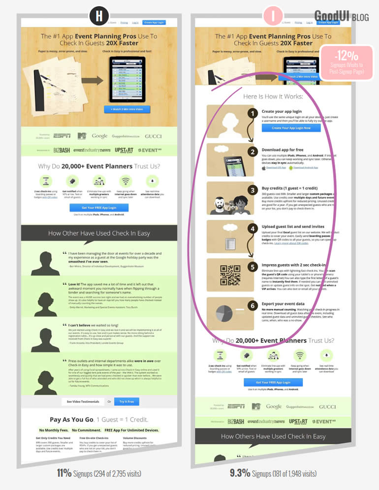
This 8 month iterative optimization project just finished and we learned something about storytelling while comparing 2 of the 8 variations. This comparison hints subtly that describing a signup and usage process perhaps isn't very effective at convincing people to signup. The possible -12% signup decrease (p-value of 0.17) in stands as some evidence. Although we don't consider this comparison as a very strong one, nevertheless here are some possible explanations as to why the storytelling variation (I) looked weaker.
Conflicting Message Of A Lengthy 6 Step Process
One reason which might explain the -12% decrease is that length of the 6 step process itself. Perhaps some people were discouraged by so many steps, thinking it wasn't very easy or quick. All these steps might have conflicted with the message in the headline which emphasized speed as the key benefit.
Distracted Attention
Another explanation for the weak loss might be from the large amounts of copy across all those 6 paragraphs. The "Here Is How It Works" story took up quite a bit of height from the page itself. Considering human attention is a scare resource, perhaps the story took people's attention away from the more effective messages (such as the benefits in the header, or social proof in the testimonials, etc.)
Telling, Instead Of Doing
Finally, maybe simply establishing a strong focus on the task at hand is more powerful than describing what needs to be done. Perhaps getting users to do the first step is better than telling or describing the full set of steps. Maybe the idea of smaller commitments (or rather, lack of) has manifested itself here in this variation.
Share Your Thoughts
But enough about my interpretations. Why do you think variation I hinted with weakness? I, and I'm sure others, would be very curious to hear why you think this data turned out the way it did.
Get The Full Test With All Variations & Blueprint In Datastories #22
Posted by  Jakub Linowski on Feb 03, 2016
Comments
Ty Cahill 10 years ago ↑4↓0
Interesting take on "storytelling." I've always thought of it more like Universal Principles of Design describes: "A method of creating imagery, emotions, and understanding of events through an interaction between a storyteller and an audience." My first thought was that a "how-to" isn't storytelling, but I can see how it fits.
Regardless of the storytelling aspect of the design, things seem out of order. Sell me on the benefits and social proof before you try explaining how it works. If it seems like a possible solution I'll search out the "how it works" details, but if I don't easily see the benefit I'll hit the back arrow.
Would be interesting to see the results if the "how to" list was moved to the bottom of the page...
Reply
Ivan Burmistrov 10 years ago ↑0↓0
Agree. This is not storytelling. But true storytelling doesn't work anyway. See page 7 in Curagami (2014) Why E-Commerce Marketing is Broken (http://bit.ly/1T6xVmq):
"Testing “storytelling” on the product page proved harmful to conversion. Longer content not easy to scan on their ecommerce site’s product page hurt conversion."
Reply
Vlad Malik 10 years ago ↑1↓0
Agreed that it's not a true story. It's a flow, which is one aspect of a story.
Reply
Jakub Linowski 10 years ago ↑0↓0
It sounds like you also made use of smaller commitments by breaking the process down - http://goodui.org/#44 ? Would love to see the a/b test. Feel free to share by email (in the footer). Thanks.
Reply
Dave Nielsen 10 years ago ↑2↓0
Inserting the story actually displaced or changed many parts of the page: the logos of trusted brands, the
"20,000+ trust us" line, the testimonials, introduced a bland beige color in the "how it works" graphics. It's hard to tell which of all these changes hurt or helped.
Overall, the copy makes it look like this app is selling based on simplicity/efficiency/speed. I think Variation I covered part of the top graphic (which was an indicator of simplicity in variation H) and exposed the process in a way that looked not simple. With the benefit of hindsight, it seems that Variation I wasn't aligned with the selling proposition.
If I wanted to run a new variation that was similar, I would show more of the top graphic, and cut the "How it Works" story to 3 steps with no graphics (or at least new graphics). That would probably include restructuring the app/process so that they don't need to create an app login before downloading the app.
Reply
Patrick 10 years ago ↑0↓0
My humble thoughts: Maybe the appealing "Get your FREE app login" button was moved so far down due to the "Here is how it works" section that many people simply didn't read that far..
Anyway, I would have not detailed out all the steps on this very first page. The headline of each step would have already been the most people are willing to take in at that point in time.
Reply