4 Checkout UI Changes For A Highly Significant +1% Sales On Menufy.com
Menufy.com, a restaurant order & delivery service, ran a multiple change A/B test on their checkout page (with our help). I really like this experiment because it's effect is rather small and yet tightly defined in terms of its statistical significance. Sometimes when we make UI improvements we might feel that our work will have a great impact, and this test brings us down a little closer to reality. Here are the changes which were tested and in return inspired our evidence-based patterns.
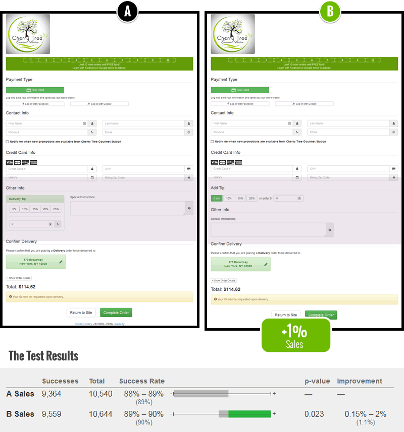
The 4 Changes
Here are the 4 things that were changed (interpreted by me).
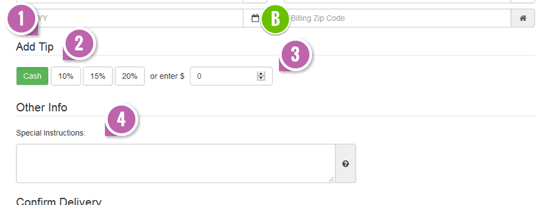
- Clearer Label
"Add Tip" was used as a label instead of the more ambiguous "Other Info". - Cash Option As Default - Fastforward Pattern #87
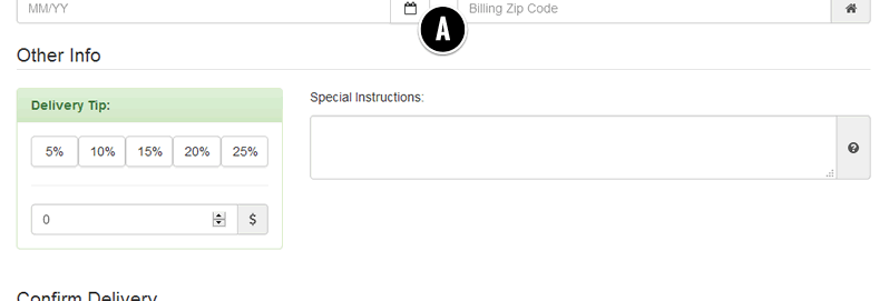
The cash tip option was added as a default. This is a key change as it might have empowered customers to feel like their decision to tip was given back to them - by being postponed to the time of delivery. Whereas the control might have suggested that a tip was more mandatory and committal. - Custom Amount Alignment & Better Grouping
The custom tip amount field was aligned onto the same line with the other fixed tip amounts. Text ("or") was also added to clarify that this was an alternative input. - Special Instructions Text Area Was Repositioned
The text area was shifted downwards and separated from the tip option as other information.
Share Your Thoughts
Are there any other UI changes you would test? Please share your thoughts as a comment.
Menufy.com, a restaurant order & delivery service, ran a multiple change A/B test on their checkout page (with our help). I really like this experiment because it's effect is rather small and yet tightly defined in terms of its statistical significance. Sometimes when we make UI improvements we might feel that our work will have a great impact, and this test brings us down a little closer to reality. Here are the changes which were tested and in return inspired our evidence-based patterns.

The 4 Changes
Here are the 4 things that were changed (interpreted by me).


- Clearer Label
"Add Tip" was used as a label instead of the more ambiguous "Other Info". - Cash Option As Default - Fastforward Pattern #87
The cash tip option was added as a default. This is a key change as it might have empowered customers to feel like their decision to tip was given back to them - by being postponed to the time of delivery. Whereas the control might have suggested that a tip was more mandatory and committal. - Custom Amount Alignment & Better Grouping
The custom tip amount field was aligned onto the same line with the other fixed tip amounts. Text ("or") was also added to clarify that this was an alternative input. - Special Instructions Text Area Was Repositioned
The text area was shifted downwards and separated from the tip option as other information.
Share Your Thoughts
Are there any other UI changes you would test? Please share your thoughts as a comment.
 Jakub Linowski on Oct 30, 2018
Comments