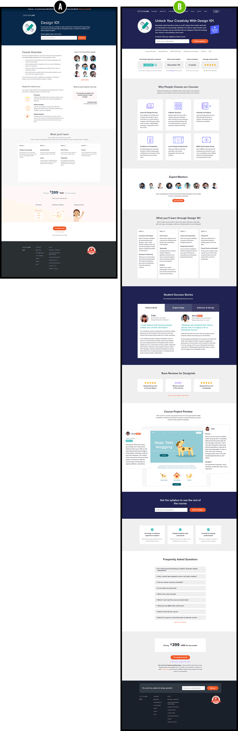
13 Course Landing Page UI Changes With +49% Enrollments For Designlab
UI patterns that are based on real experiments can be very impactful - especially when combined together. We recently proposed a series of changes for a Designlab's course landing page. Designlab is an online design school with a heavy focus on mentorships. Many of the suggested changes were driven by a series of evidence-based patterns (backed by positive experiments). Here are the 13 changes that went into the redesign along with the measured effect.
The Changes
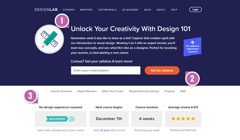
- Empowering Headline - Fastforward Pattern #22
The first change involved changing the headline to more of a benefit driven one (unlocking creativity). Whereas the control only mentioned the course name (Design 101). - Benefit Button - Fastforward Pattern #85
The button label for the syllabus lead generation call to action was changed from "Take A Tour" to "Get The Syllabus". We had some positive data on the use of framing the action into obtaining or achieving something. - Benefit Bar - Fastforward Pattern #45
Some of the key objections, questions and positive reviews were addressed high up on the page - largely influenced by Viljo's pattern. - Social Proof Headline
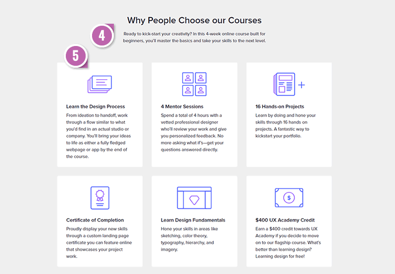
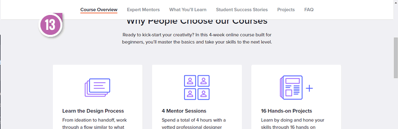
Instead of simply having a "Course Overview" section, we added a social element to it by framing it as reasons "Why People Choose This Course". Although is not linked to any particular pattern, we do have a handful of positive and negative social proof ideas. - Larger Tile-Based Benefits
Instead of showing the course overview and its benefits as a bullet list, we decided to showcase it in a more visible way as tiles. - Centered Mentors
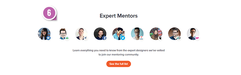
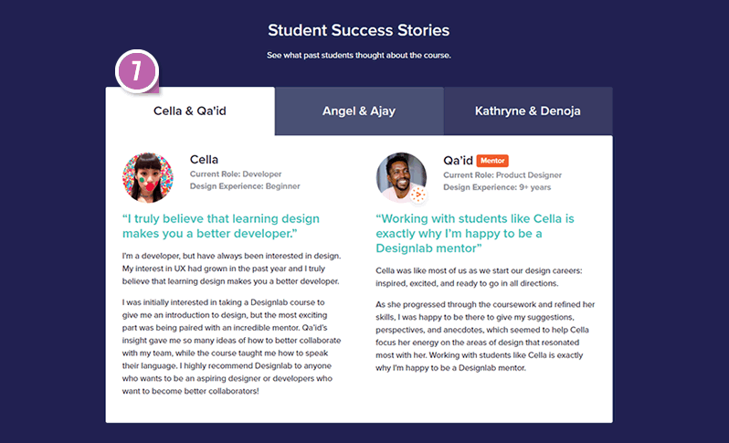
Believing that course mentors are a key selling point of the course, we positioned them towards the center column (from a right column alignment). One similar pattern which inspired this was the centered forms pattern (with a handful of mixed experiment results). - Benefit Testimonials - Fastforward Pattern #19
We added a very particular way of showing testimonials with elaborate descriptions of who the students were, and key highlight statements. To be consistent with the duality of the student-mentor relationships, each testimonial was visually paired with a corresponding mentor. - Customer Ratings - Fastforward Pattern #6
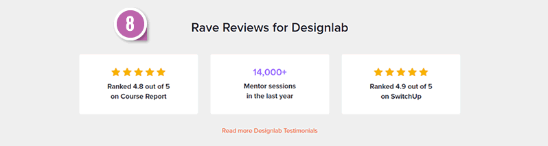
Given the positive probability of customer reviews, rating summaries from multiple sources were repeated further on the page. - Student Work
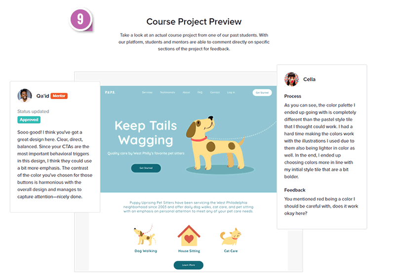
Samples of student work were shown to illustrate the active nature of the course, as well as the benefit of having a portfolio at the end. - Repeated Call To Action - Fastforward Pattern #60
Further down on the page, another lead-generating call to action was added to share the syllabus with potential students. - Frequently Asked Questions
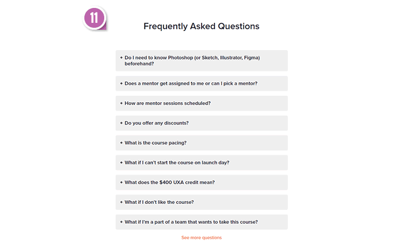
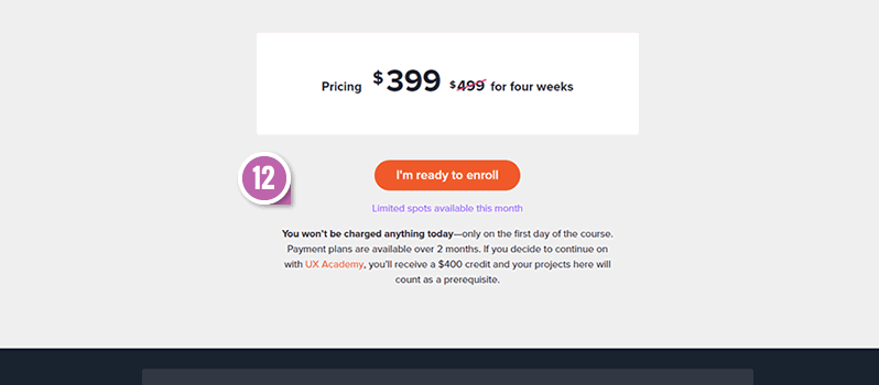
A sections with common questions and answers was added (with some answers being answered for the second time compared to the rest of the page). - Pay Later Messaging - Fastforward Pattern #46
Given that the payment itself does not actually occur during the enrollment, an additional message was added to clarify this. - Sticky Navigation - Fastforward Pattern #41
Last but not least, a floating or sticky navigation was also added with the key page sections - given that the page length grew quite a bit compared to the control (Thanks Carl from Conversionista for sharing this successful pattern).

The Results
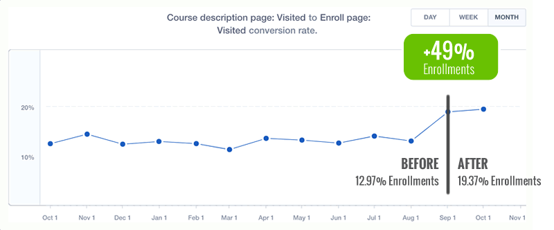
Although we typically encourage our clients to test any proposed changes, in this situation Will from Designlab decided to simply roll them out. The decision rested on a very high degree of confidence (based on prior data from numerous positive experiments) with a desire to exploit and maximize the potential gains as quickly as possible. It was decided that the new course landing page would be rolled out at the beginning of September, and the enrollment conversion rate compared before and after. Above is the deep course enrollment rate shifting clearly from almost 13% to over 19% and keeping steady over 2 months.
UI patterns that are based on real experiments can be very impactful - especially when combined together. We recently proposed a series of changes for a Designlab's course landing page. Designlab is an online design school with a heavy focus on mentorships. Many of the suggested changes were driven by a series of evidence-based patterns (backed by positive experiments). Here are the 13 changes that went into the redesign along with the measured effect.
The Changes
- Empowering Headline - Fastforward Pattern #22
The first change involved changing the headline to more of a benefit driven one (unlocking creativity). Whereas the control only mentioned the course name (Design 101). - Benefit Button - Fastforward Pattern #85
The button label for the syllabus lead generation call to action was changed from "Take A Tour" to "Get The Syllabus". We had some positive data on the use of framing the action into obtaining or achieving something. - Benefit Bar - Fastforward Pattern #45
Some of the key objections, questions and positive reviews were addressed high up on the page - largely influenced by Viljo's pattern. - Social Proof Headline
Instead of simply having a "Course Overview" section, we added a social element to it by framing it as reasons "Why People Choose This Course". Although is not linked to any particular pattern, we do have a handful of positive and negative social proof ideas. - Larger Tile-Based Benefits
Instead of showing the course overview and its benefits as a bullet list, we decided to showcase it in a more visible way as tiles. - Centered Mentors
Believing that course mentors are a key selling point of the course, we positioned them towards the center column (from a right column alignment). One similar pattern which inspired this was the centered forms pattern (with a handful of mixed experiment results). - Benefit Testimonials - Fastforward Pattern #19
We added a very particular way of showing testimonials with elaborate descriptions of who the students were, and key highlight statements. To be consistent with the duality of the student-mentor relationships, each testimonial was visually paired with a corresponding mentor. - Customer Ratings - Fastforward Pattern #6
Given the positive probability of customer reviews, rating summaries from multiple sources were repeated further on the page. - Student Work
Samples of student work were shown to illustrate the active nature of the course, as well as the benefit of having a portfolio at the end. - Repeated Call To Action - Fastforward Pattern #60
Further down on the page, another lead-generating call to action was added to share the syllabus with potential students. - Frequently Asked Questions
A sections with common questions and answers was added (with some answers being answered for the second time compared to the rest of the page). - Pay Later Messaging - Fastforward Pattern #46
Given that the payment itself does not actually occur during the enrollment, an additional message was added to clarify this. - Sticky Navigation - Fastforward Pattern #41
Last but not least, a floating or sticky navigation was also added with the key page sections - given that the page length grew quite a bit compared to the control (Thanks Carl from Conversionista for sharing this successful pattern).
The Results
Although we typically encourage our clients to test any proposed changes, in this situation Will from Designlab decided to simply roll them out. The decision rested on a very high degree of confidence (based on prior data from numerous positive experiments) with a desire to exploit and maximize the potential gains as quickly as possible. It was decided that the new course landing page would be rolled out at the beginning of September, and the enrollment conversion rate compared before and after. Above is the deep course enrollment rate shifting clearly from almost 13% to over 19% and keeping steady over 2 months.
Posted by  Jakub Linowski on Nov 14, 2018
Comments