7 Pricing Screen Changes For +28% Sales On Examine.com
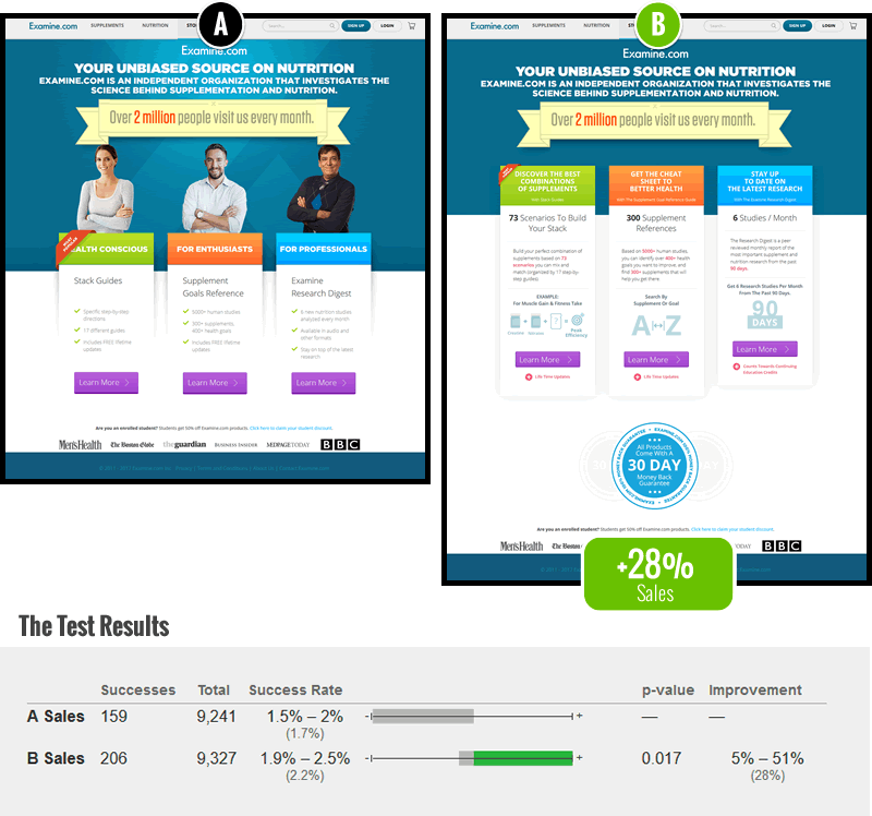
When we feel confident about numerous improvements for a given screen, we might group all of them together for higher impact. Assuming that most changes are positive and compound together, this strategy speeds up test results on lower-mid traffic/conversion sites. And this is exactly what we did when we were tasked with improving the pricing screen on Examine.com - an amazing nutrition portal backed by heavily curated evidence-based research. Below you can see the original control (A) vs our improved variation (B) which was also a/b tested to check our confidence against real data.
The 7 Changes
Here are the 7 things we changed.
- Removed Ambiguous Photos
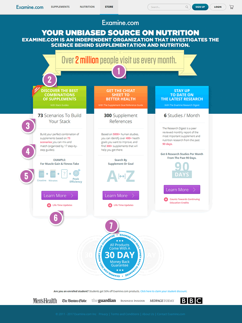
The control contained 3 photos related to each of the products. In our opinion this added ambiguity and blurred the selection process between the 3 products. Is the first product for women? No. Is the last product for men in darker colored sweaters? No. And the defensive arm posture didn't help either. The removal of the photos also raised the products higher for more visibility. - Benefit-Lead Labels - Fastforward Pattern #47
We applied a pattern which achieves clarity with benefit-first copy. Hence we replaced the target audience labels (For Enthusiast, For Professionals, etc) with clearer benefit statements. These were then followed by actual product names in smaller print underneath. - Detailed Supporting Numbers
After showing the benefit copy we decided to differentiate each product with a clear and distinct number of "things" that comes as part of it. - Detailed Descriptions
Further building on the product offering, a description was written for each product. - Example Usage
For the first two products we decided to suggest how they might be used by customers (ex: combinations being looked up by a health goal, or supplements being looked up alphabetically). - Bulleted Reassurances - Fastforward Pattern #15
We applied another conversion pattern which suggested to address any last minute objections before moving on to purchase. In this case, we reminded customers about "Lifetime Updates" and "Educational Credits". - Consistent Money Back
Finally, we noticed that all products have a money back guarantee and so we placed it under all products - communicating that it applies to all of them.
The Takeaway: Grouping Changes Is An Option
The positive effect from the test of these changes is a reminder that larger change tests are an option. There is a misconception out there that you should only test isolated single changes in experiments. However, if we decided to slice and dice these changes into 7 separate experiments, there is a likelihood that we would still be running the experiments. More so, some of the changes are also related (establishing consistency and building upon each other) which might also lead to a greater effect (only manifesting itself when combining each of the separate changes). The choice to isolate or group is one of many variables that you can decide when designing your experiments.
What We Did For Examine.com: Rapid Advice Concepting
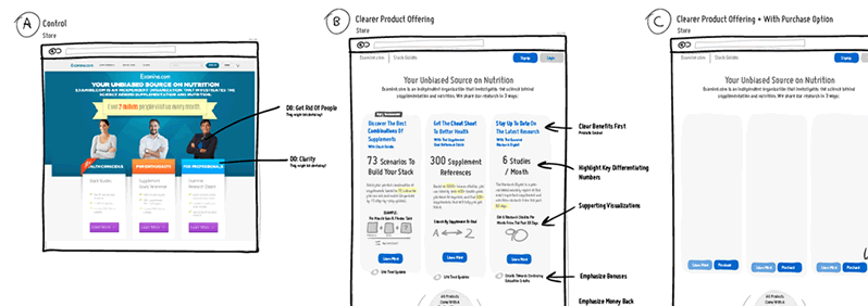
Although we showed final mockups above, I should add that we only offered Rapid Advice Concepting as the service. Examine.com designed, built and setup the test on their own. The concepting service is a fast and cost effective way for us to quickly sketch out our best ideas leading up to implementation or experimentation (decided by the client).
When we feel confident about numerous improvements for a given screen, we might group all of them together for higher impact. Assuming that most changes are positive and compound together, this strategy speeds up test results on lower-mid traffic/conversion sites. And this is exactly what we did when we were tasked with improving the pricing screen on Examine.com - an amazing nutrition portal backed by heavily curated evidence-based research. Below you can see the original control (A) vs our improved variation (B) which was also a/b tested to check our confidence against real data.
The 7 Changes
Here are the 7 things we changed.
- Removed Ambiguous Photos
The control contained 3 photos related to each of the products. In our opinion this added ambiguity and blurred the selection process between the 3 products. Is the first product for women? No. Is the last product for men in darker colored sweaters? No. And the defensive arm posture didn't help either. The removal of the photos also raised the products higher for more visibility. - Benefit-Lead Labels - Fastforward Pattern #47
We applied a pattern which achieves clarity with benefit-first copy. Hence we replaced the target audience labels (For Enthusiast, For Professionals, etc) with clearer benefit statements. These were then followed by actual product names in smaller print underneath. - Detailed Supporting Numbers
After showing the benefit copy we decided to differentiate each product with a clear and distinct number of "things" that comes as part of it. - Detailed Descriptions
Further building on the product offering, a description was written for each product. - Example Usage
For the first two products we decided to suggest how they might be used by customers (ex: combinations being looked up by a health goal, or supplements being looked up alphabetically). - Bulleted Reassurances - Fastforward Pattern #15
We applied another conversion pattern which suggested to address any last minute objections before moving on to purchase. In this case, we reminded customers about "Lifetime Updates" and "Educational Credits". - Consistent Money Back
Finally, we noticed that all products have a money back guarantee and so we placed it under all products - communicating that it applies to all of them.
The Takeaway: Grouping Changes Is An Option
The positive effect from the test of these changes is a reminder that larger change tests are an option. There is a misconception out there that you should only test isolated single changes in experiments. However, if we decided to slice and dice these changes into 7 separate experiments, there is a likelihood that we would still be running the experiments. More so, some of the changes are also related (establishing consistency and building upon each other) which might also lead to a greater effect (only manifesting itself when combining each of the separate changes). The choice to isolate or group is one of many variables that you can decide when designing your experiments.
What We Did For Examine.com: Rapid Advice Concepting
Although we showed final mockups above, I should add that we only offered Rapid Advice Concepting as the service. Examine.com designed, built and setup the test on their own. The concepting service is a fast and cost effective way for us to quickly sketch out our best ideas leading up to implementation or experimentation (decided by the client).
Posted by  Jakub Linowski on Jan 03, 2018
Comments
Daniel Jacobs 8 years ago ↑2↓0
Very informative post with detailed information as to why B had more sales thanks for sharing.
Reply
Adam Zach 9 years ago ↑1↓0
Hi Jakub.
You asked for alternative interpretations
(2) For me it is not the defensive arm posture but rather the "American smile" of "happy customers" what makes me thinking that someone is trying to sell me something I don't want to buy.
(5) The question mark makes me curious what would they suggest, so I'd click the "Learn More" just out of curiosity.
(1) Any sort of graphic or external stylesheets may slow down rendering through slow connections. So if a friend shares this page on facebook, I try to open it on my iphone and for a couple of seconds nothing shows up then I go back, ignore this post and I scroll away.
Brgds
Adam
Reply