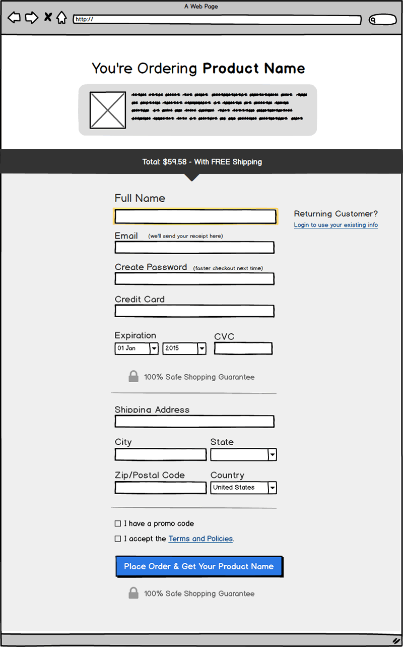
BetterUI: Can You Make This Checkout Screen Better? (Balsamiq Template)
I am creating and a better checkout screen template based on everything we know about checkout patterns and your help is needed. There is so much more that can be improved to make a better checkout experience (think which elements, copy, or interactions can be added, removed or adjusted). I'm willing to synthesize this knowledge in an updated template (with your and my own ideas) and to kick off the process I created a mediocre checkout template (in Balsamiq) to be used as a starting point for you to improve. You in?

Instructions
- Make Any Improvements To The Checkout Screen In Balsamiq or Your Chosen Tool
Make any number of improvements to the above checkout screen (ex: improvements to the copy, elements, or interactions). If you have Balsamiq you can download and edit the checkout template we created. If you don't have Balsamiq, you can also use whatever program you have (including a simple pen and paper sketch) as long as you export to a flat JPG or PDF that I can read. Last, it your ideas is super simple, you can also just leave a comment on this blog post. - Describe Your Suggestions
For each improvement: label it as a CHANGE, ADD or REMOVE, and then describe why you think it's an improvement. - Share & Upload Your Ideas
Share your improved checkout version with me using this submit form. I will do my best to publish it here, and turn selected ideas into new UI patterns (with credit to you).
Let's Do This To Learn From Everyone's Ideas
I want everyone to learn from your ideas (which I will try and publish here on our blog). At the very least we'll generate new UI patterns (that can be attributed to you and evaluated by others in future tests). Finally, I will also revise this mediocre template into a better one (based on your and my own ideas) and then share it back.
Get Started & Share Your Ideas For Improving This Checkout Screen
You can use the Balsamiq template we created, your own tool or simply leave a comment below.
I am creating and a better checkout screen template based on everything we know about checkout patterns and your help is needed. There is so much more that can be improved to make a better checkout experience (think which elements, copy, or interactions can be added, removed or adjusted). I'm willing to synthesize this knowledge in an updated template (with your and my own ideas) and to kick off the process I created a mediocre checkout template (in Balsamiq) to be used as a starting point for you to improve. You in?

Instructions
- Make Any Improvements To The Checkout Screen In Balsamiq or Your Chosen Tool
Make any number of improvements to the above checkout screen (ex: improvements to the copy, elements, or interactions). If you have Balsamiq you can download and edit the checkout template we created. If you don't have Balsamiq, you can also use whatever program you have (including a simple pen and paper sketch) as long as you export to a flat JPG or PDF that I can read. Last, it your ideas is super simple, you can also just leave a comment on this blog post. - Describe Your Suggestions
For each improvement: label it as a CHANGE, ADD or REMOVE, and then describe why you think it's an improvement. - Share & Upload Your Ideas
Share your improved checkout version with me using this submit form. I will do my best to publish it here, and turn selected ideas into new UI patterns (with credit to you).
Let's Do This To Learn From Everyone's Ideas
I want everyone to learn from your ideas (which I will try and publish here on our blog). At the very least we'll generate new UI patterns (that can be attributed to you and evaluated by others in future tests). Finally, I will also revise this mediocre template into a better one (based on your and my own ideas) and then share it back.
Get Started & Share Your Ideas For Improving This Checkout Screen
You can use the Balsamiq template we created, your own tool or simply leave a comment below.
 Jakub Linowski on Sep 10, 2018
Comments
selman 8 years ago ↑0↓0
People might use a credit card not on their name. For that case, to somewhere around the credit card line you can add a checkbox or button next to a text box saying: Are you using a credit card not on your name? [Yes] -> then another line for credit card name shows up to fill.
Reply
Drew 8 years ago ↑0↓0
I'm a fan of consolidating the shipping address into a single field with autocomplete. It's faster to fill out, but it's also less visually daunting when you get to the page.
Reply