Reverse Engineering Booking.com's Homepage Design Optimizations
Booking.com runs a/b tests left and right with astronomical statistical power - so here we're going to pry into some of their possible rational design decisions. With the wonderful help of the Internet Archive I compared two homepage snapshots between 2017 and 2018. Here is what I found (please leave your comment if you find anything else that's different):
-
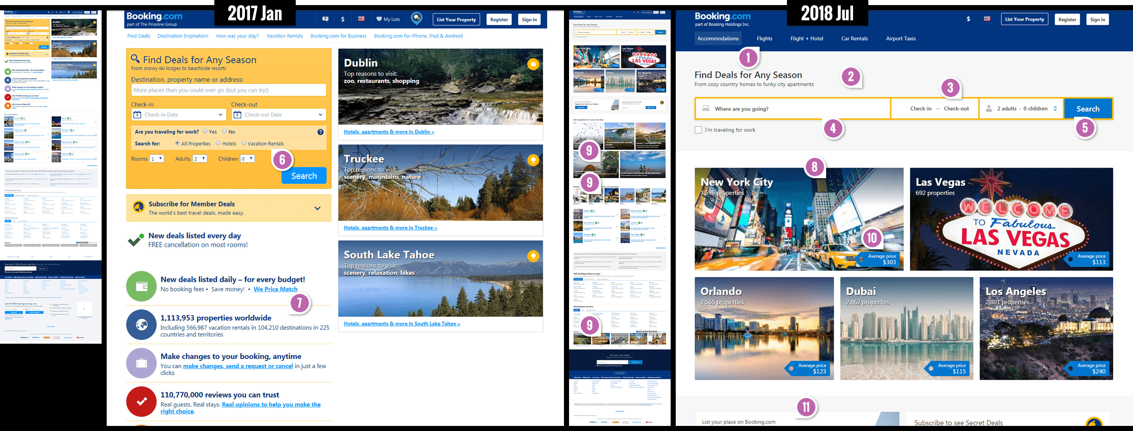
Exposed Categories In Header - See Pattern #14 For Similar Tests
It appears that new high level categories (Accommodations, Flights, Car Rentals, etc) have made their way into the top header. We can't be sure whether this was a result of an experiment or just a business decision. What we do know is that this exact pattern has been tested on many other sites (with varying but mostly positive results).
-
Central Search - See Pattern #13 For Similar Tests
Clearly the search box was centered with a strong one column layout, pushing the city cards downwards. Along with this change in position, the search form also gained additional padding - possibly removing any ambiguity that the search is the task that deserves the highest attention.
-
Combined Task Based Menus
I love this pattern. Instead of showing two separate pull down menus for each check-in and check-out dates, some ultra intelligent human at Booking figured out that these two choices are actually part of the same task and grouped them together into a single box. The same approach was applied to the guest selection menu (rooms, adults and children options were grouped into a single menu).
-
Larger Form Fields
The three core form fields (destination, check-in/out dates and guest selector) have increased in size, mostly from additional padding - possibly providing them with additional attention and making it easier to select (respecting Fitt's Law).
-
Slightly Higher Button Contrast
It looks like the button background color was darkened - providing more contrast against the white text. I wonder how many button color combinations they ran. :)
-
Fewer Form Fields - See Pattern #3 For Many Similar Tests
It seems like the option for the search type (All Properties, Vacation Rentals, Hotels) was removed. It might have been a perfect example of an unnecessary or ambiguous choice with users wishing to search for all of those options ("I wish to find all vacation hotels"). Removing ambiguity seems smart.
Additionally, it's also interesting how the two yes-no radio button choice for work travel evolved into a single checkbox - a simplification.
-
Removal Of Social Counts (Pattern #7) & Reassurances (Pattern #15)
During design optimizations it's important not to forget to test both the addition and removal of elements. This seems to have been the case with the removal of the "reassurances" and "social counts" (waving big numbers around) in the left column. Interestingly we also have some really powerful a/b tests on these patterns as well (with mixed results).
-
More Results - See Pattern #36 For Similar Tests
Instead of having 3 city cards, there are now 5. Could showing more results be better? We currently do have 1 a/b test about this.
-
Mixed Search Cues - Inspired The Start Of Pattern #79
Often you might find optimization and marketing experts rave about having a single focus for any given screen. This rule seems to have been challenged with the addition of more diverse search cues. Instead of mainly showing city thumbnails, the new version also contains visible: inspirational articles, types of rentals (Apartments, Resorts, Villas, etc.) and countries. Yes, arguably these are all still searches, but the calls to action clearly diversified.
-
Price Averages
The new homepage shows average prices on top of the city cards - possibly setting up for anchoring. Could this idea be further extended onto property pages? For example, if a specific property has a lower price than the surrounding average, it could be communicated more clearly (opportunity as demonstrated by pattern #21).
-
Mixed Audience Calls To Action

The rule of having a uniform call to action (per screen) is further challenged by the more visible messaging for property owners. Just below the city cards, a more visible invitation to list a property can be seen. The email signup call to action has also been made more prominent on the right. -
Long Link Titles - See Pattern #43 For A Similar Test

It looks like Booking is trying to show links to collections with longer link titles. This very similar pattern has been supported and shared by Ronny from Microsoft. Similarly we also have some test results for the idea of linking to quality articles as an acquisition stepping stone. -
Ghost Button Gives Way To A Solid Fill
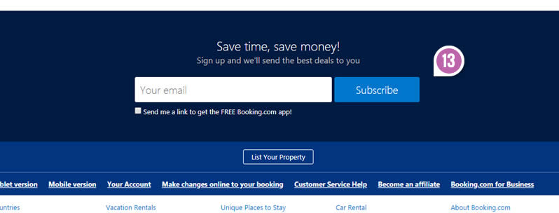
It looks like the "Subscribe" button gained a background fill (sending the ghosts away). To be fair, a secondary button to "List Your Property" appeared a little further down. Sometime in the future I'd like to gather more tests about Ghost Buttons and get a better picture of its probability for better or for worse (I'm guessing the latter).
Want To Be More Confident In These Changes?
Inferring from the above screens is somewhat risky as we don't really know if the above changes were tested or how they were decided on. There probably is some positive probability from these changes on such metrics as searches, leads, sales, bookings, etc. But if we want additional confidence I would recommend understanding the test results that are already available as more direct evidence. Of course running your own tests is always advised (if you wield enough statistical power). Nevertheless past test data is always a powerful asset in: planning, prioritizing, or designing your own tests (as we have many tests that also show negative effects - and those are the ones you really want to be aware of).
Gain confidence from patterns that have already been tested
Booking.com runs a/b tests left and right with astronomical statistical power - so here we're going to pry into some of their possible rational design decisions. With the wonderful help of the Internet Archive I compared two homepage snapshots between 2017 and 2018. Here is what I found (please leave your comment if you find anything else that's different):
-
Exposed Categories In Header - See Pattern #14 For Similar Tests
It appears that new high level categories (Accommodations, Flights, Car Rentals, etc) have made their way into the top header. We can't be sure whether this was a result of an experiment or just a business decision. What we do know is that this exact pattern has been tested on many other sites (with varying but mostly positive results).
-
Central Search - See Pattern #13 For Similar Tests
Clearly the search box was centered with a strong one column layout, pushing the city cards downwards. Along with this change in position, the search form also gained additional padding - possibly removing any ambiguity that the search is the task that deserves the highest attention.
-
Combined Task Based Menus
I love this pattern. Instead of showing two separate pull down menus for each check-in and check-out dates, some ultra intelligent human at Booking figured out that these two choices are actually part of the same task and grouped them together into a single box. The same approach was applied to the guest selection menu (rooms, adults and children options were grouped into a single menu).
-
Larger Form Fields
The three core form fields (destination, check-in/out dates and guest selector) have increased in size, mostly from additional padding - possibly providing them with additional attention and making it easier to select (respecting Fitt's Law).
-
Slightly Higher Button Contrast
It looks like the button background color was darkened - providing more contrast against the white text. I wonder how many button color combinations they ran. :)
-
Fewer Form Fields - See Pattern #3 For Many Similar Tests
It seems like the option for the search type (All Properties, Vacation Rentals, Hotels) was removed. It might have been a perfect example of an unnecessary or ambiguous choice with users wishing to search for all of those options ("I wish to find all vacation hotels"). Removing ambiguity seems smart.
Additionally, it's also interesting how the two yes-no radio button choice for work travel evolved into a single checkbox - a simplification.
-
Removal Of Social Counts (Pattern #7) & Reassurances (Pattern #15)
During design optimizations it's important not to forget to test both the addition and removal of elements. This seems to have been the case with the removal of the "reassurances" and "social counts" (waving big numbers around) in the left column. Interestingly we also have some really powerful a/b tests on these patterns as well (with mixed results).
-
More Results - See Pattern #36 For Similar Tests
Instead of having 3 city cards, there are now 5. Could showing more results be better? We currently do have 1 a/b test about this.
-
Mixed Search Cues - Inspired The Start Of Pattern #79
Often you might find optimization and marketing experts rave about having a single focus for any given screen. This rule seems to have been challenged with the addition of more diverse search cues. Instead of mainly showing city thumbnails, the new version also contains visible: inspirational articles, types of rentals (Apartments, Resorts, Villas, etc.) and countries. Yes, arguably these are all still searches, but the calls to action clearly diversified.
-
Price Averages
The new homepage shows average prices on top of the city cards - possibly setting up for anchoring. Could this idea be further extended onto property pages? For example, if a specific property has a lower price than the surrounding average, it could be communicated more clearly (opportunity as demonstrated by pattern #21).
-
Mixed Audience Calls To Action
The rule of having a uniform call to action (per screen) is further challenged by the more visible messaging for property owners. Just below the city cards, a more visible invitation to list a property can be seen. The email signup call to action has also been made more prominent on the right. -
Long Link Titles - See Pattern #43 For A Similar Test
It looks like Booking is trying to show links to collections with longer link titles. This very similar pattern has been supported and shared by Ronny from Microsoft. Similarly we also have some test results for the idea of linking to quality articles as an acquisition stepping stone. -
Ghost Button Gives Way To A Solid Fill
It looks like the "Subscribe" button gained a background fill (sending the ghosts away). To be fair, a secondary button to "List Your Property" appeared a little further down. Sometime in the future I'd like to gather more tests about Ghost Buttons and get a better picture of its probability for better or for worse (I'm guessing the latter).
Want To Be More Confident In These Changes?
Inferring from the above screens is somewhat risky as we don't really know if the above changes were tested or how they were decided on. There probably is some positive probability from these changes on such metrics as searches, leads, sales, bookings, etc. But if we want additional confidence I would recommend understanding the test results that are already available as more direct evidence. Of course running your own tests is always advised (if you wield enough statistical power). Nevertheless past test data is always a powerful asset in: planning, prioritizing, or designing your own tests (as we have many tests that also show negative effects - and those are the ones you really want to be aware of).
Gain confidence from patterns that have already been tested
Posted by  Jakub Linowski on Aug 16, 2018
Comments
Steve Hough 8 years ago ↑1↓0
FYI - Having to scroll up and down to see what each point is referring to on the image is time consuming and off-putting. Whilst I love the content it would have been great to pull out snippets of the main image to view alongside the reading. GoodUI...come on, practice what you preach :) Great work as always though.
Reply
David Efdé 8 years ago ↑0↓0
Thanks for the very interesting analysis. Could the more forcing hierarchy of the new cards cluster (#8) also be of influence? (besides the increase from 3 to 5)
Reply
Vito 8 years ago ↑0↓0
Great report. Thanks for sharing!
Reply
Andrea Pernici 8 years ago ↑1↓0
The single field Chack-in/Check-out is good, but their implementation is completely wrong. First click -> Disappear -> You need a second click to define the checkout date. The window should stick on the screen after the first click.
Reply
Jakub Linowski 8 years ago ↑0↓0
Your guess sounds / feels right. But I wonder if they actually tested their existing 1-day-plus-smart-default-interaction VS the sticky interaction you're suggesting. I'd leave some room for uncertainty and would prefer for an a/b test to answer this one. :)
Reply
Meshal Hamza 8 years ago ↑0↓0
thank you very useful UI information
Reply
Danny 8 years ago ↑3↓0
Thanks again for such great information on UI. I Always enjoy it and learn something new or interesting :)
Reply