Desktop vs. Mobile: Amazon's Account Creation
I'm opening up to the possibility that some of our UI patterns might be contextual to desktop or mobile. To feel out how some of these patterns might be reinforced, break or bend, it might be great to start with a simple side-by-side screen comparison. And so in this analysis, I chose to dissect Amazon's Account Creation flow as we know that they run 10,000s+ of experiments per year. Although a screenshot of Amazon isn't strong evidence alone, there might be some embedded probability within their implementation given that they do experiment so much. At the very least these observations could be considered as juicy hypotheses worthy of further experimentation.
The Default Starting State
Here are what the starting desktop vs mobile screens look like after having clicked "Create Account" on Amazon:
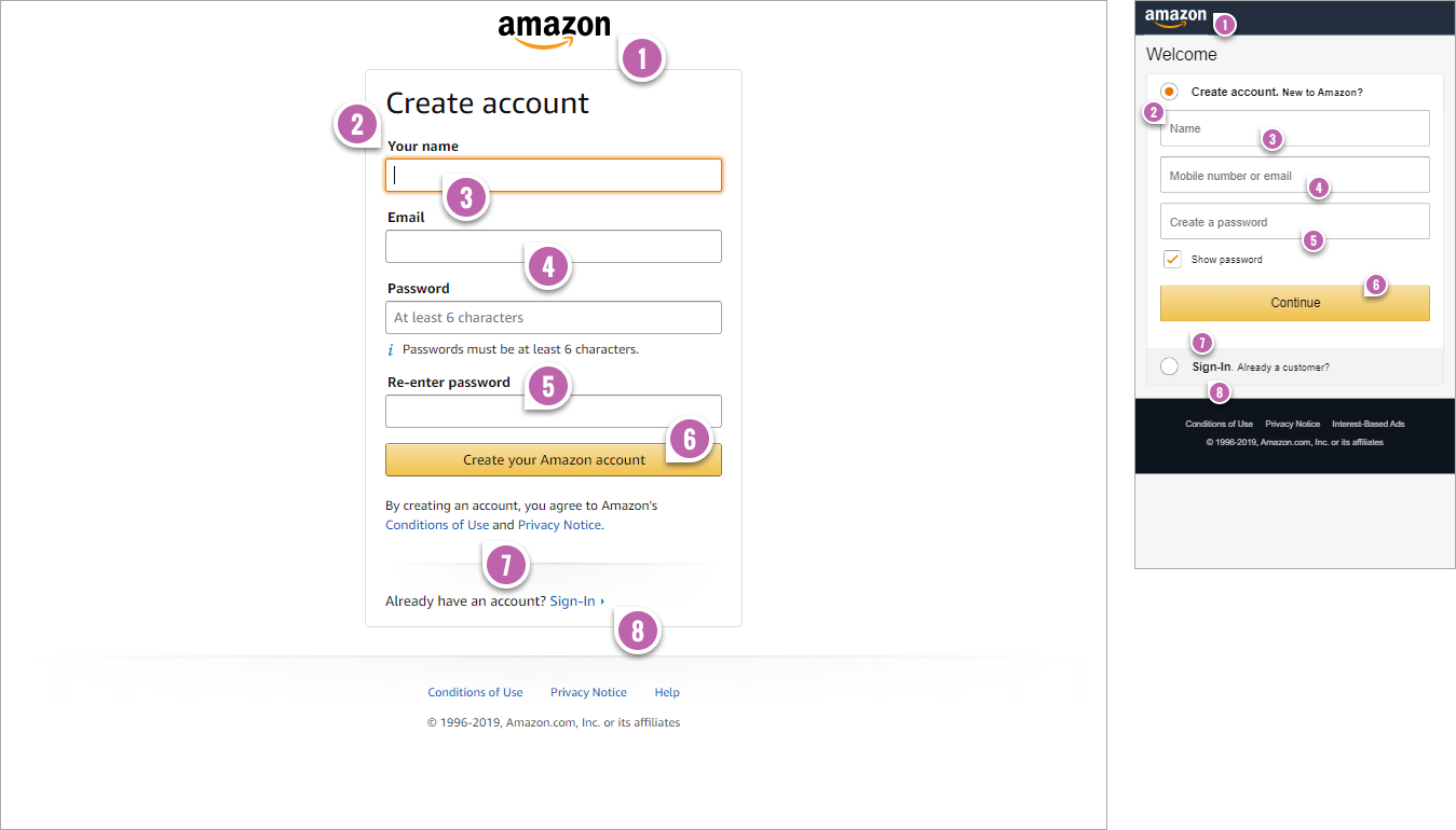
- Lesser Logo Emphasis
The first visible difference between desktop and mobile is that the logo became slightly smaller, with tighter margins and more left-alignment. These combined differences might help conserve precious space on mobile. (You might also notice that the footer and header are darker but I wouldn't dwell too much on this. Looking at other sections of the site, the difference disappears with both desktop and mobile having a darkened footer and header). - Inline Field Labels
On desktop, the field labels are top-aligned above the form fields - consistent with our own findings. On mobile however, Amazon deviates from this pattern and places the field labels inline - inline! This is surprising to me as the default understanding is that inline field labels are inferior (to top aligned ones) due to their missing cue of what to data to enter.
To be fair, Amazon did also add two important interaction details on their mobile version: focus alone does not clear the inline labels (typing does), and clearing the field also brings the label back. With these two differences in place, could conserving space on mobile be the better trade-off? I would be curious if Amazon also considered experimenting with floating labels on (ex: field labels that appear inline but move a little higher while decreasing in size). - No Field Focus
On desktop the first field has been focused to direct attention and encourage a form fill. On mobile however there is no field focus. I speculate that this might be intentional to let users see more of the screen elements upfront along with the button (than showing an overlapping keyboard at start). This explanation might also be consistent with the pattern of showing the call to action above the fold. - Flexible Email Or Phone Input
On desktop users have to signup with an email address. On mobile, a single field offers users the choice of signing up with an email or phone number (keep in mind there is a validation step later on). - No Confirmation Fields
I'm also surprised to see a duplicate Password Confirmation field on desktop even though we've seen many form field removal experiments increase conversion rates. Perhaps in the context of optimizing for return customers, the added upfront friction on desktop isn't such a big deal. On mobile however, there are no confirmation fields and our pattern is consistent with Amazon's implementation. - Dynamic Button Labels
The desktop version uses more of a fixed and outcome-based label of "Create your Amazon account" whereas on mobile it's "Continue" which later changes dynamic based on whether someone enters a phone number or email (seen further below). - Less Visible And Distracting Terms & Condition
Both the desktop and mobile version have legal links to terms and conditions. On mobile Amazon removed a duplicate set of Terms & Conditions that were linked up to secondary pages. Perhaps having secondary side links near the primary call to action leads to non-intentional distractions. - Accordion Sign-In
Interestingly, the mobile version uses an accordion style interaction with the options to "Create Account" or "Sign-In". This keeps users on the same screen, whereas in the desktop version users are sent to a new page (after clicking the Sign-In link). Could this slight adjustment be a little better than just hitting the back button? - Error Summary
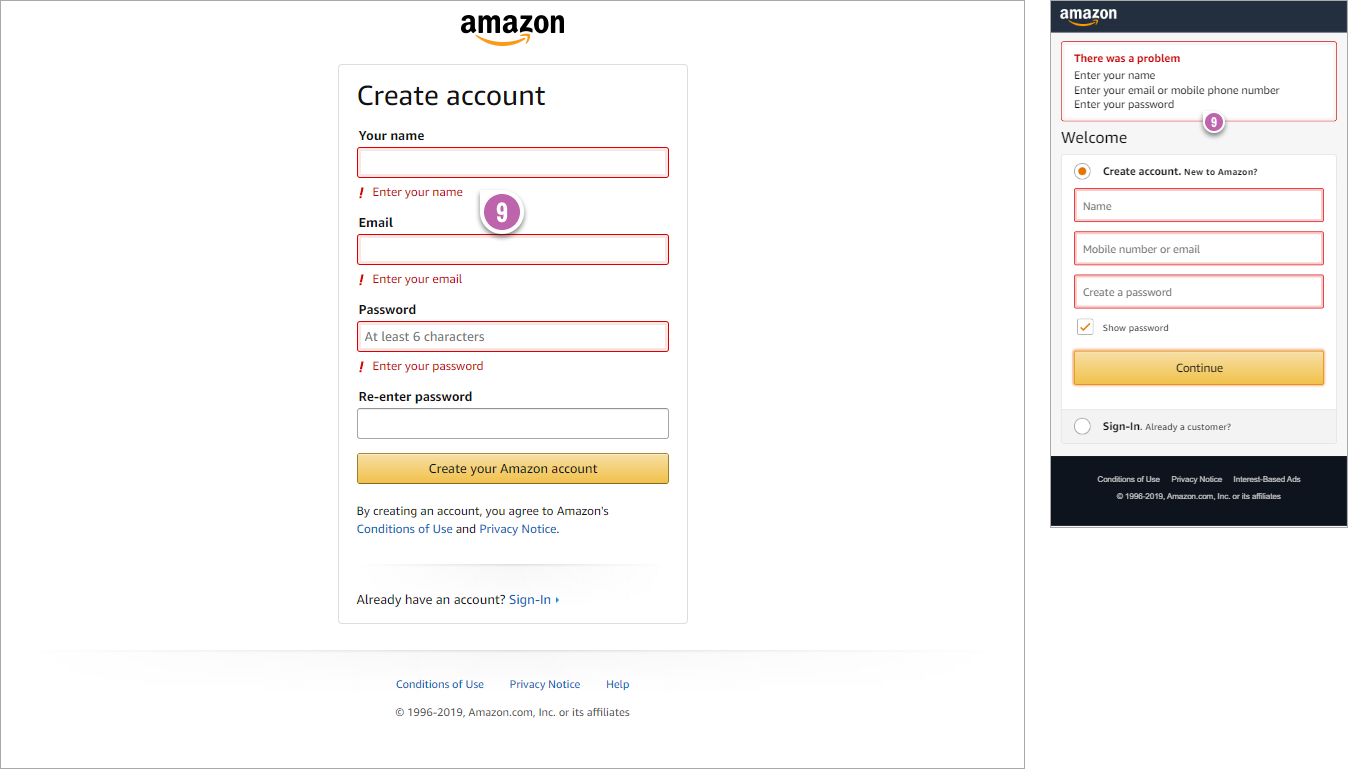
On desktop all errors appear contextually below each related field. In comparison, on mobile, an error summary appears at the top with multiple errors listed out as bullets. Perhaps this hints at the importance of setting expectations and providing users with a complete overview of the full range of errors (instead of risking that there is only one error and returning to a future error state again). - Reset Icons
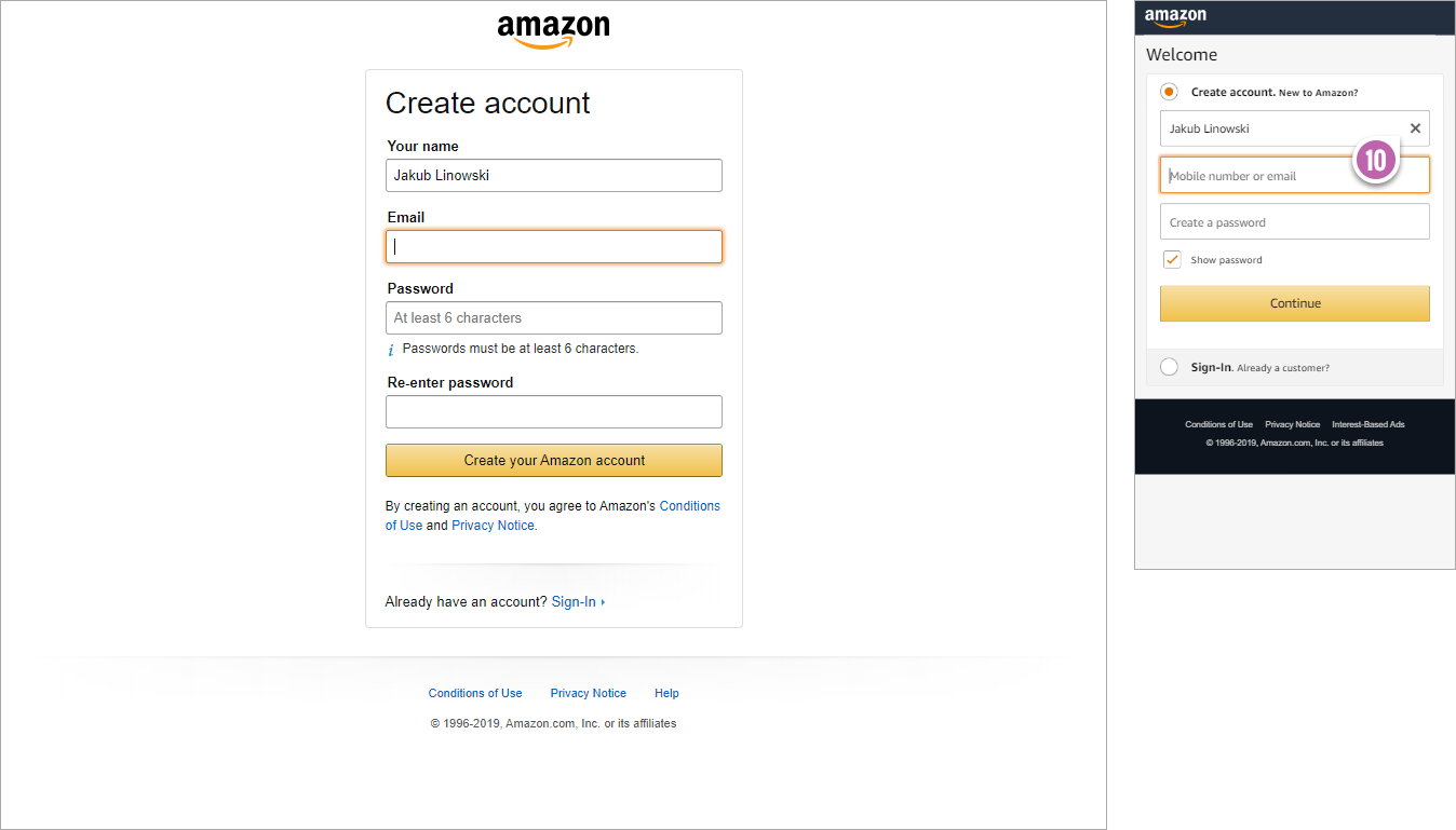
As users enter information on the mobile version, little reset icons appear on the right side of each field. Reset functions are considered prone to unintentional destructive errors, but perhaps on mobile they could actually remove some friction by letting users clear our the full field (without having to tap the backspace key repetitively). - Visible Passwords By Default
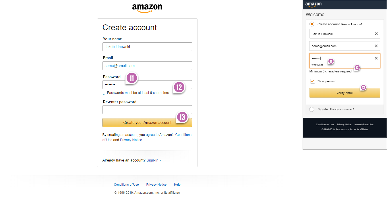
On desktop passwords are hidden by default. On mobile, the password field (for new passwords being entered) is being shown as a default. This makes sense to me as mobile keyboard input is more prone to errors. Some might argue that showing passwords is a security concern but Amazon seems to have solved this problem. They hide passwords on 1) larger screens (desktop), and 2) they also hide passwords on return visits (when they are recalled from storage by the browser). - OnFocus Explanations
On desktop the password requirements are shown at all times. On mobile the passwords requirements are only shown during when the password field is focused - further conserving space (and increasing the chances of that call to action being visible). - The Dynamic Button Label
Here we finally see how the button label has changed dynamically based on the entered email (instead of phone number). - Darkened Background
It's here that we can best see that the desktop background has been mostly white. On mobile, there was a light gray background all along. Could this added background contrast help bring out form fields (or form groups) in some way? Could make an interesting experiment. :)
The Error State
Sooner or later some users might encounter form errors and here is what it looks like when we just click submit without filling anything out.
One Field Entered State
Once we fill out the first field, this is what the screens look like:
Password Field State
As users get to the password field here is what they see:
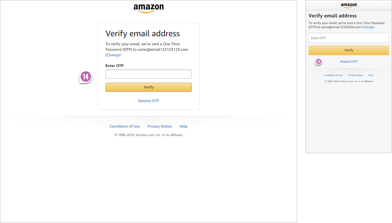
Verification State
And at last, this is the second verification screen right after filling out the form and hitting submit.
Are There Any Other Key Differences?
Share your comments if you notice any other critical differences between these desktop vs mobile screens. :)
Posted by  Jakub Linowski on Sep 30, 2019
Comments
Artem Kobyakov 6 years ago ↑0↓0
Great compare! But, why were they do it? Really so much more differences in user platform?
Reply
Lee 6 years ago ↑1↓0
Thanks for sharing Jakub, it's really interesting to see all the differences they use in their forms depending on device, and it makes total sense and has probably come from tonnes of little experiments from all that traffic they have. We can all learn from this!
Reply