What Makes The Best Product Page Template?
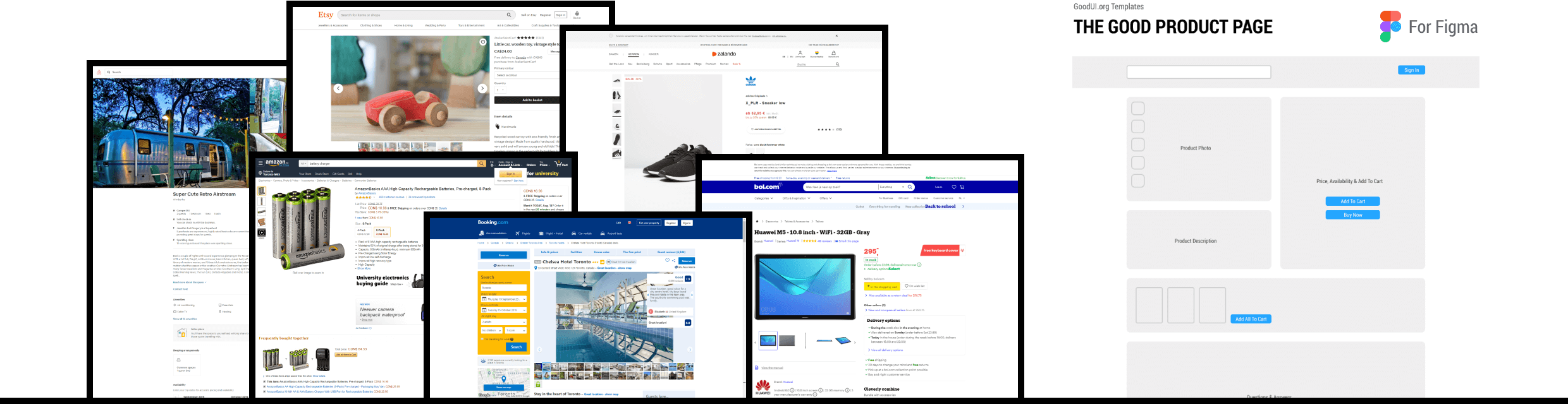
I am starting work on a GoodUI design system with the goal of providing designers, marketers and product owners with access to the best (highest converting) screen templates. Optimizing screens one change at a time takes too long and is often too difficult to detect for companies - this system will help companies optimize by making larger leaps. To do so, our emerging design system must at the very least do two things: 1) actively synthesize and update the templates with all the evidence from A/B tests as it comes in, and 2) express flexible variations as knowns and unknowns. Today, I'm sharing the tip of the iceberg with a potential starter GOOD Product Page Template (Figma) based on analyzing 6 product pages from: Amazon, Zalando, Booking, Airbnb, Etsy and Bol. I look forward to your feedback in order to make this even better.
Hello GOOD Templates
As a start I created this GOOD Product Page Template (Figma). This class of templates will most likely be free to anyone and its purpose is to surface core components and key layouts for such screens as: product, home & landing, listing, checkouts, signups, etc. How will we know what's good? Right now I've looked over a handful of product pages from companies that I considered leaders in the space. This template will also change over time (possibly offered to members).
Making GOOD Even BETTER
Although good might be good enough for some, the core idea of this system will be so that you can take a good template and make it better on your own. Can you tell I'm excited about this? :) This also will most likely will be a premium feature for GoodUI members and here is how we're going to enable this:
More Variations - Unknowns
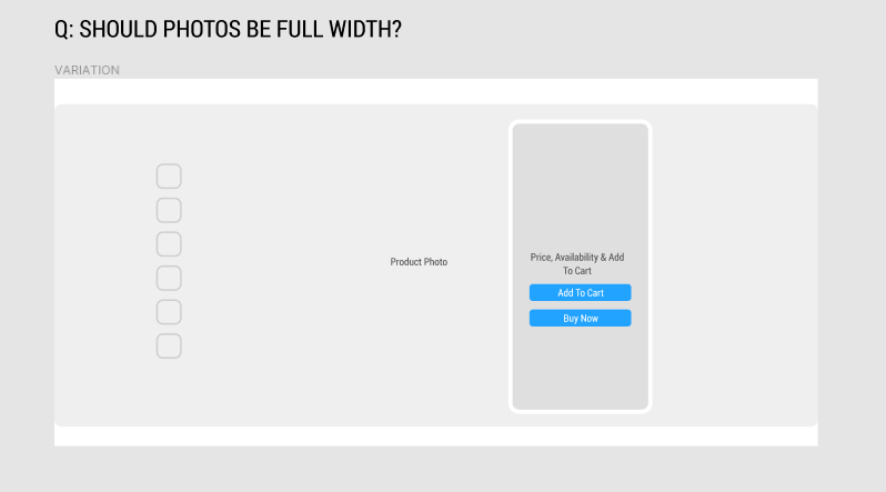
As this project unfolds, I expect a lot of variations and interesting design question to emerge. The default stand on any new variation will be a neutral probability - an unknown. Here is one example of a variation for a full width photo on a product page. Because right now we don't have any evidence for or against it, it's still an unknown:
More Evidence - Knowns
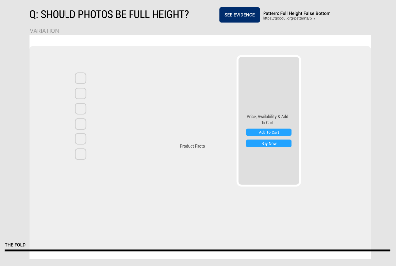
As new evidence comes in, our patterns will start telling us which variations are better or worse. As an example, here is a full height photo variation that we've already collected some evidence for. And yes, our patterns also remember cases where such variations failed as in this recent Airbnb leak.
More Detail - Component Templates
For selected components or referenced patterns I think we'll need to add more detail in case someone wishes to speed up their design work (ex: testimonials, comparisons, reviews, top navigation, etc). To do this, we'll likely link to component templates (also with variations and evidence where available).
The Best Template
Ultimately the best templates will be ones which users modify on their own using the variations, evidence and patterns that we make available.
What Else Does This System Need For You To Be Successful?
As I'm working on this template system and integrating it into the existing platform, I'd love to hear from you - how can we make this even better? What are some characteristics you imagine that might be important for you to generate the highest converting templates and make a leap forward? Please share your comments or ideas how I can best deliver on this.
I am starting work on a GoodUI design system with the goal of providing designers, marketers and product owners with access to the best (highest converting) screen templates. Optimizing screens one change at a time takes too long and is often too difficult to detect for companies - this system will help companies optimize by making larger leaps. To do so, our emerging design system must at the very least do two things: 1) actively synthesize and update the templates with all the evidence from A/B tests as it comes in, and 2) express flexible variations as knowns and unknowns. Today, I'm sharing the tip of the iceberg with a potential starter GOOD Product Page Template (Figma) based on analyzing 6 product pages from: Amazon, Zalando, Booking, Airbnb, Etsy and Bol. I look forward to your feedback in order to make this even better.
Hello GOOD Templates
As a start I created this GOOD Product Page Template (Figma). This class of templates will most likely be free to anyone and its purpose is to surface core components and key layouts for such screens as: product, home & landing, listing, checkouts, signups, etc. How will we know what's good? Right now I've looked over a handful of product pages from companies that I considered leaders in the space. This template will also change over time (possibly offered to members).
Making GOOD Even BETTER
Although good might be good enough for some, the core idea of this system will be so that you can take a good template and make it better on your own. Can you tell I'm excited about this? :) This also will most likely will be a premium feature for GoodUI members and here is how we're going to enable this:
More Variations - Unknowns
As this project unfolds, I expect a lot of variations and interesting design question to emerge. The default stand on any new variation will be a neutral probability - an unknown. Here is one example of a variation for a full width photo on a product page. Because right now we don't have any evidence for or against it, it's still an unknown:
More Evidence - Knowns
As new evidence comes in, our patterns will start telling us which variations are better or worse. As an example, here is a full height photo variation that we've already collected some evidence for. And yes, our patterns also remember cases where such variations failed as in this recent Airbnb leak.
More Detail - Component Templates
For selected components or referenced patterns I think we'll need to add more detail in case someone wishes to speed up their design work (ex: testimonials, comparisons, reviews, top navigation, etc). To do this, we'll likely link to component templates (also with variations and evidence where available).
The Best Template
Ultimately the best templates will be ones which users modify on their own using the variations, evidence and patterns that we make available.
What Else Does This System Need For You To Be Successful?
As I'm working on this template system and integrating it into the existing platform, I'd love to hear from you - how can we make this even better? What are some characteristics you imagine that might be important for you to generate the highest converting templates and make a leap forward? Please share your comments or ideas how I can best deliver on this.
Posted by  Jakub Linowski on Sep 20, 2019
Comments
Themeora 7 years ago ↑0↓0
Really cool resource. Great to see someone else using Figma too. Amazing software :)
Reply
Paul 7 years ago ↑0↓0
Hi Jakub,
Is this "product page" project focused primarily at e-commerce sites? What about doing separate product pages for e-commerce and Saas? As a Saas company, we still have product pages, and honestly we struggle to find the best way to present these solutions and convert folks (just like e-commerce product pages) but I don't see a strong correlation between the design of our product page (hand-full of software solutions) and an e-commerce site (many different products/suppliers). Thoughts? I'd love to benefit from this project as well, and I'm guessing you'd have many potential Saas clients who would too. Perhaps this is a spin-off project, an optimized Saas product page template that takes into account all of the Saas sign-up/conversion patterns? Thanks Much -PB
Reply
Jakub Linowski 7 years ago ↑0↓0
Paul, would this be taken care of by a single best "Landing Page" for a Saas business (instead of a product page)? Or would you have both a "landing page" and a "product page"? And if so, what would be the difference?
Reply
Hing-Cheung Li 7 years ago ↑0↓0
I'd guess that full width or height images aren't suitable for every type of product. Hotel rooms, beaches etc might benefit from it, but for spare parts for a bike it might not be that useful.
Reply
Software HRIS 7 years ago ↑0↓0
personally i like 80% screen for image in phone. but yeah its personal
Reply
Pieter Beerten 7 years ago ↑1↓0
In my experience the ideal product page is linked to the type of product:
In my previous job at a fashion retailer where the average product price was under 40 $, the product page is very much focused on making a quick sell, prominent CTA etc. Let the customer "fall in love" with the product, don't let them think to much and go for a quick conversion.
In my current job at a well known electronic brand where the average product price is around 300 $ there is much more extra info needed to persuade the customer. A lot of customer attention goes to FAQ's, specifications etc. We see a lot of customers visiting the product page multiple times before making a purchase. It is not about quick conversion it is about convincing the customer that the product is worth the high amount of money.
Reply
Ben 7 years ago ↑0↓0
IMO this is inherently flawed if you're combining factors across verticals -- ecommerce & hospitality customers have different needs and nuances in UX reflect that.
Furthermore, how do you quantify the claim that these are "highest converting" views? Do they do better on mobile or on desktop? What's their traffic split between mobile and desktop, or even more nuanced viewport sizes? What about conversions? All screenshots are of desktop which almost certainly is in the minority of visits if not conversions.
Reply
Jakub 7 years ago ↑0↓0
I agree that there should be a distinction between desktop & mobile.
As far as verticals, I'm quite sure that there will be things which will be generic enough that apply more widely (ex: showing reviews and a clear product image). And there might be some changes which could be specific to industries - do you have an example of this (I'm open to expressing it as a potential variation / hypothesis)?
In terms of quantifying what's better, I hope to rely on how the patterns report on reproducibility (ex: if a pattern failed to 2 out of 3 times, it's likely an undesirable change, etc.)
Reply
Ivan Burmistrov 7 years ago ↑0↓0
Airbnb is not a model to emulate. Their UX/CRO team is very unprofessional.
Reply
Jakub 7 years ago ↑1↓0
Oh common Ivan, you can do better than that. That's so subjective - how does that help us here? :)
Reply