Pattern #16: Full Height Email Grab
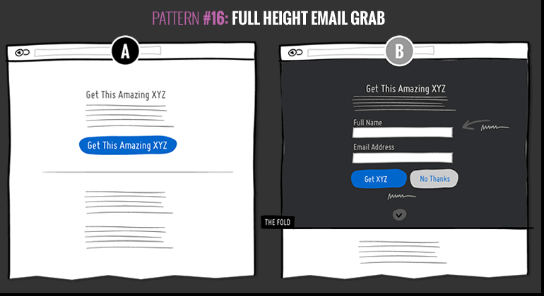
I want you to try and replicate this conversion pattern which we observed to increase signups by +191%. We were inspired by this strong test result we discovered ourselves on goodui.org and we don't want it to stop there. The test has strong potential and I think it would be great to see if it also works for other people (such as yourself) or where it breaks down. Are you up to the challenge? If so, here is the conversion recipe and how to setup your a/b test.
Basic sample size requirements: We advise to run this test on pages which have at least 200-500 conversions per month for the primary metric (signups or a deeper step in a multi step signup funnel). Otherwise the test may take more than a month to run (still ok if you're willing to wait).
Applies To Screen Types
HomeLandingSignupProductPricingCartCheckout
Essential Ingredients For Variation B
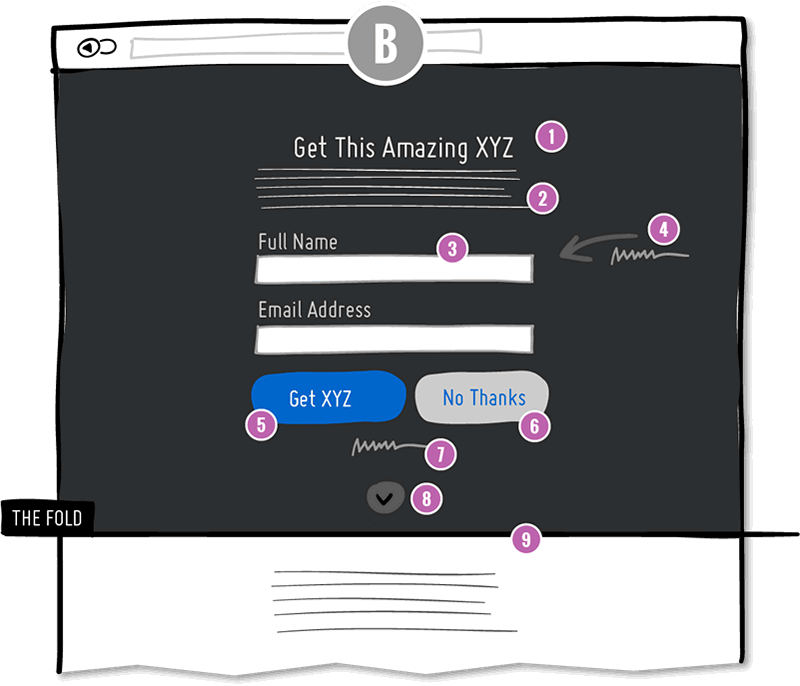
- Benefit Headline
The headline contains a benefit or clear value proposition. - Benefit Paragraph
Key benefits are further elaborated and clarified in a paragraph or bullet format. - Exposed Fields
One or two key fields are exposed and centered. These could be for trial account signups or email lead capture. - Attention Grab
Attention is directed to the form using central positioning, an arrow, and a short sentence referring a social count (ex: how many users have already signed up). - Repeated Benefit Button
A button is shown which is consistent with the benefit headline. - Reaffirming Freedom
Giving people a way out with a "No Thanks" button that either collapses the full height component partially or scrolls down further to the rest of the content. - Reassurances & Clarifications
Address any objections. Let people know that they can leave anytime. Explain the amount or type of emails if they are signing up to a newsletter. Or explain the trial terms if it's a trial signup. - Continuity
Let people know that there is more content below just a scroll away. - Full Height
Make sure to set the height of the container to 100% so that the signup task is highly focused.
What To Measure
- Primary: Signups
You should measure success ideally with a visit to a successful signup or lead capture URL. This should be a post validated signup. If you have multiple steps in your signup funnel, you can also measure visits to the second or third step. - Secondary: Progression
If your signup is a multi step funnel, be sure to also measure progression of visits through all the steps all the way to a successful signup.
How To Setup The Test
- Set It Up Yourself
You can setup the test in your own tool of choice. We use Visual Website Optimizer if you need a tool that is great for the job. - Get Free Advice From Us
If you have already prebuild your test and just have a few test setup questions, we'll be glad to do a short call in exchange for your test link and data (to be used to build knowledge and shared with others). - Or, Have Us Setup The Complete Test For You
If you've never setup an a/b test before, we can set this one up for you for a fixed fee ($4,000). We'll design, build, setup, watch and show you how we've done it. It's a great way to get started with a/b testing.
Take Part In Comparing Results To See If This Works
The only way we'll know if this pattern is effective in a wider context is if more people, like you, run it and share their data. This pattern #16 we are now watching in GoodUI Datastories. Anyone who shares their test results will receive full credit for building this bigger pool of knowledge. You'll also get invited to an exclusive webinar where similar tests are compared by other people.
Share Your Test Or Get Updates To This Pattern
I want you to try and replicate this conversion pattern which we observed to increase signups by +191%. We were inspired by this strong test result we discovered ourselves on goodui.org and we don't want it to stop there. The test has strong potential and I think it would be great to see if it also works for other people (such as yourself) or where it breaks down. Are you up to the challenge? If so, here is the conversion recipe and how to setup your a/b test.
Basic sample size requirements: We advise to run this test on pages which have at least 200-500 conversions per month for the primary metric (signups or a deeper step in a multi step signup funnel). Otherwise the test may take more than a month to run (still ok if you're willing to wait).
Applies To Screen Types
HomeLandingSignupProductPricingCartCheckout
Essential Ingredients For Variation B
- Benefit Headline
The headline contains a benefit or clear value proposition. - Benefit Paragraph
Key benefits are further elaborated and clarified in a paragraph or bullet format. - Exposed Fields
One or two key fields are exposed and centered. These could be for trial account signups or email lead capture. - Attention Grab
Attention is directed to the form using central positioning, an arrow, and a short sentence referring a social count (ex: how many users have already signed up). - Repeated Benefit Button
A button is shown which is consistent with the benefit headline. - Reaffirming Freedom
Giving people a way out with a "No Thanks" button that either collapses the full height component partially or scrolls down further to the rest of the content. - Reassurances & Clarifications
Address any objections. Let people know that they can leave anytime. Explain the amount or type of emails if they are signing up to a newsletter. Or explain the trial terms if it's a trial signup. - Continuity
Let people know that there is more content below just a scroll away. - Full Height
Make sure to set the height of the container to 100% so that the signup task is highly focused.
What To Measure
- Primary: Signups
You should measure success ideally with a visit to a successful signup or lead capture URL. This should be a post validated signup. If you have multiple steps in your signup funnel, you can also measure visits to the second or third step. - Secondary: Progression
If your signup is a multi step funnel, be sure to also measure progression of visits through all the steps all the way to a successful signup.
How To Setup The Test
- Set It Up Yourself
You can setup the test in your own tool of choice. We use Visual Website Optimizer if you need a tool that is great for the job. - Get Free Advice From Us
If you have already prebuild your test and just have a few test setup questions, we'll be glad to do a short call in exchange for your test link and data (to be used to build knowledge and shared with others). - Or, Have Us Setup The Complete Test For You
If you've never setup an a/b test before, we can set this one up for you for a fixed fee ($4,000). We'll design, build, setup, watch and show you how we've done it. It's a great way to get started with a/b testing.
Take Part In Comparing Results To See If This Works
The only way we'll know if this pattern is effective in a wider context is if more people, like you, run it and share their data. This pattern #16 we are now watching in GoodUI Datastories. Anyone who shares their test results will receive full credit for building this bigger pool of knowledge. You'll also get invited to an exclusive webinar where similar tests are compared by other people.
Share Your Test Or Get Updates To This Pattern
Posted by  Jakub Linowski on Dec 23, 2016
Comments
Rodrigo 10 years ago ↑3↓0
Hi!
As a user I prefer "Name" instead of "Full Name" since I never give my full name and when someone asks me for the full name it only confuses/annoys me more...
Also: If possible I would only ask for the email, less fields --> less friction ....
Reply
Ivan Burmistrov 10 years ago ↑0↓0
In my experience, when presented with full-screen popups, some users perceive them as *new pages* and use browser “Back” button to “close” them (in many cases this results in leaving a website). I observed this behavior myself when conducting usability tests in a lab and I also read about this behaviour in the literature. Visitors of GoodUI are definitely different from the general population so spreading this pattern among other websites may be inappropriate…
Reply
Jakub Linowski 10 years ago ↑0↓0
Hey Ivan. This pattern is different than a full-screen popup, as it appears instantly. There is no content it overlays, and there is no content that is seen before. More so, there are cues to hint that there is actually more content after a scroll interaction. The experience is different.
Reply
Pedro Mourelle 10 years ago ↑0↓0
Looks great. What seems to be needs to have a little more of extra visibility is the continuity option as the user may think the whole page is for subscribing to this XYZ.
Leaving some space below could help ( with a vh of 90% for example) for the user to understand there's more content below.
Thanks for the post!
Reply
Jakub Linowski 10 years ago ↑1↓0
Thanks for pointing that out. However, when we ran https://goodui.org/datastories/all#21 we also included such a "shorter" variation and this full height one outperformed the shorter one in terms of signups. It was a scroll-to-signup trade off scenario.
Reply