Reverse Engineering Airbnb.com's Property Page Optimizations
Airbnb.com also runs a/b tests to learn what works better than not. To see how their truly amazing property page continues to evolve, I compared screenshots from two recent months (Aug 2018 and Sept 2018). Here are the changes I discovered - some of which match to our existing patterns.
The Changes
- More Meaningful Search Icon Label (Similar To This Pattern)
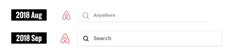
Previously, the search bar contained an inline icon with the word "Anywhere" inside the search field. In the more recent version, the icon was reinforced with the word "Search" removing the guess work of what "Anywhere" might mean. Interestingly, this is very similar to our own findings in Pattern #2 Icon Labels. In addition it also looks like the size of the search field might have been increased, along with added contrast. - Added A Cancellation Reassurance Under The Book Button (Similar To This Pattern)
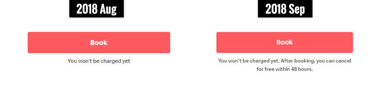
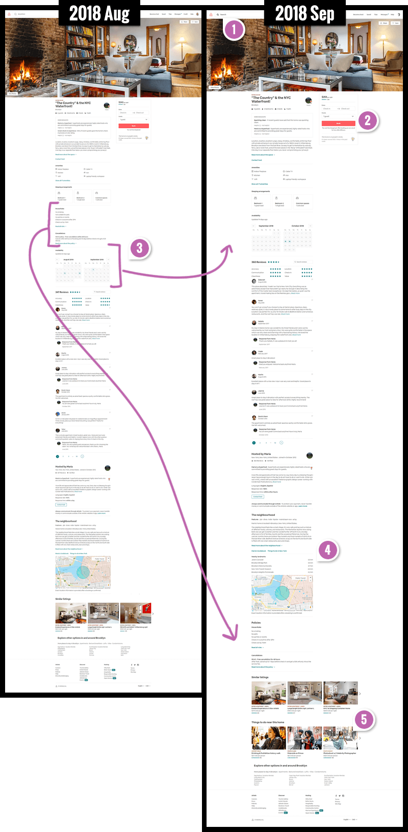
The newer version clearly communicates that guests can cancel the booking free of charge for up to 48 hours. We have mixed evidence for and against this pattern from numerous tests. - Repositioned The Calendar, House Rules And Cancellation
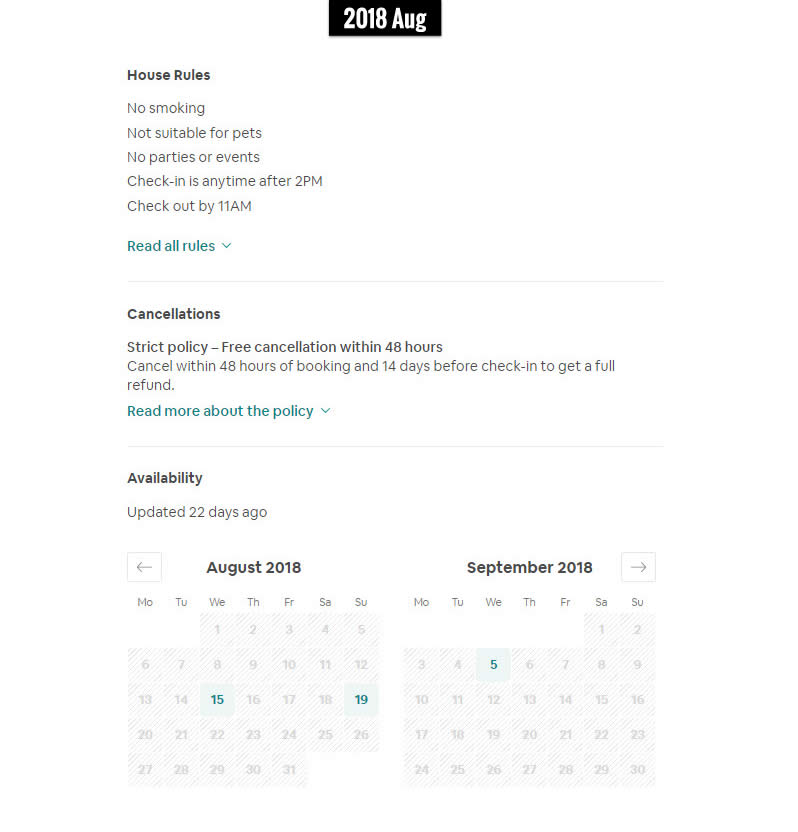
Clearly the availability calendar has shifted a littler higher. If you ask me, this sounds like the right direction based on this little pattern we have. As a result of this change, the house rules and cancellation information has shifted far down on the page - and I have no idea whether this is good or bad. :) - Added Nearby Locations With Relative Distance
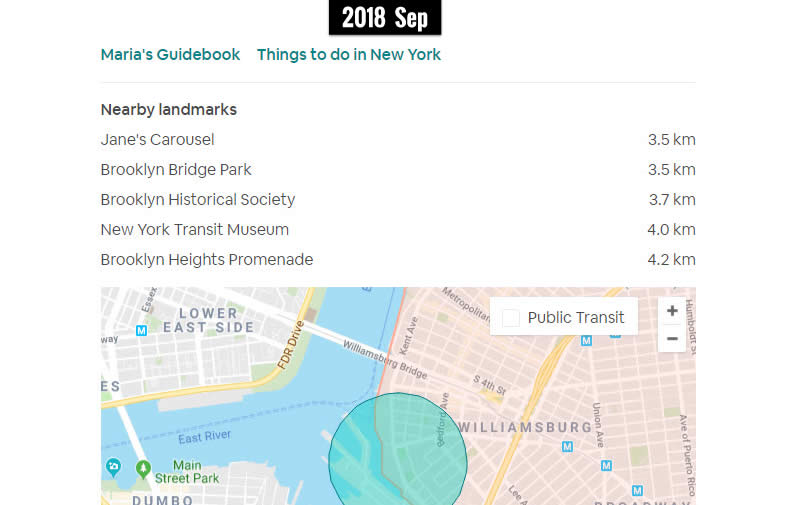
It looks like the map has evolved to contain a handful of prominent landmarks and their relative distance from the property. This seems like a interesting way of reassuring potential guests about relevant travel times. - Added Extra Search Cues & Triggers (Similar To This Pattern)
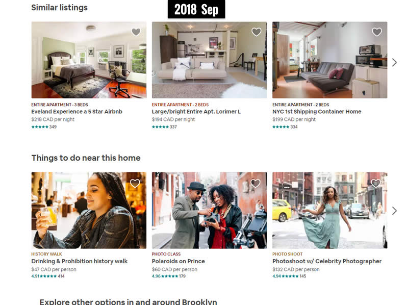
At the bottom of the screen, additional "Things-to-do-near this home" have been added. This might be very similar to the Mixed Search Cues pattern already added previously (similarly used by Booking.com).
Want To Be More Confident In These Changes?
Inferring from the above screens is somewhat risky as we don't really know if the above changes were tested, are being tested, or how they were truly decided on. There probably is some positive probability around these changes on such metrics as searches, leads, sales, bookings, etc. But if we want additional confidence I would recommend understanding the test results that are already available as more direct evidence. Of course running your own tests is always advised (if you wield enough statistical power). Nevertheless past test data is always a powerful asset in: planning, prioritizing, or designing your own tests (as we have many tests that also show negative effects - and those are the ones you really want to be aware of).
Gain confidence from patterns that have already been tested
Airbnb.com also runs a/b tests to learn what works better than not. To see how their truly amazing property page continues to evolve, I compared screenshots from two recent months (Aug 2018 and Sept 2018). Here are the changes I discovered - some of which match to our existing patterns.
The Changes
- More Meaningful Search Icon Label (Similar To This Pattern)
Previously, the search bar contained an inline icon with the word "Anywhere" inside the search field. In the more recent version, the icon was reinforced with the word "Search" removing the guess work of what "Anywhere" might mean. Interestingly, this is very similar to our own findings in Pattern #2 Icon Labels. In addition it also looks like the size of the search field might have been increased, along with added contrast. - Added A Cancellation Reassurance Under The Book Button (Similar To This Pattern)
The newer version clearly communicates that guests can cancel the booking free of charge for up to 48 hours. We have mixed evidence for and against this pattern from numerous tests. - Repositioned The Calendar, House Rules And Cancellation
Clearly the availability calendar has shifted a littler higher. If you ask me, this sounds like the right direction based on this little pattern we have. As a result of this change, the house rules and cancellation information has shifted far down on the page - and I have no idea whether this is good or bad. :) - Added Nearby Locations With Relative Distance
It looks like the map has evolved to contain a handful of prominent landmarks and their relative distance from the property. This seems like a interesting way of reassuring potential guests about relevant travel times. - Added Extra Search Cues & Triggers (Similar To This Pattern)
At the bottom of the screen, additional "Things-to-do-near this home" have been added. This might be very similar to the Mixed Search Cues pattern already added previously (similarly used by Booking.com).
Want To Be More Confident In These Changes?
Inferring from the above screens is somewhat risky as we don't really know if the above changes were tested, are being tested, or how they were truly decided on. There probably is some positive probability around these changes on such metrics as searches, leads, sales, bookings, etc. But if we want additional confidence I would recommend understanding the test results that are already available as more direct evidence. Of course running your own tests is always advised (if you wield enough statistical power). Nevertheless past test data is always a powerful asset in: planning, prioritizing, or designing your own tests (as we have many tests that also show negative effects - and those are the ones you really want to be aware of).
Gain confidence from patterns that have already been tested
Posted by  Jakub Linowski on Sep 26, 2018
Comments