Bol Discovers That Showing Product Quantity Options Is Better In This Experiment
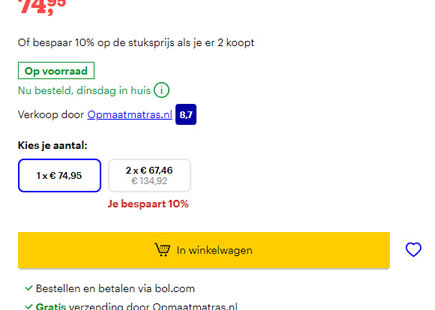
In this interesting e-commerce experiment, Bol displayed a simple product quantity option on some of their product pages. When the experiment completed this month, the variation with the change was rolled out - potentially hinting at some positive effect.
(We also have other effective patterns that have been tested on product screens.)
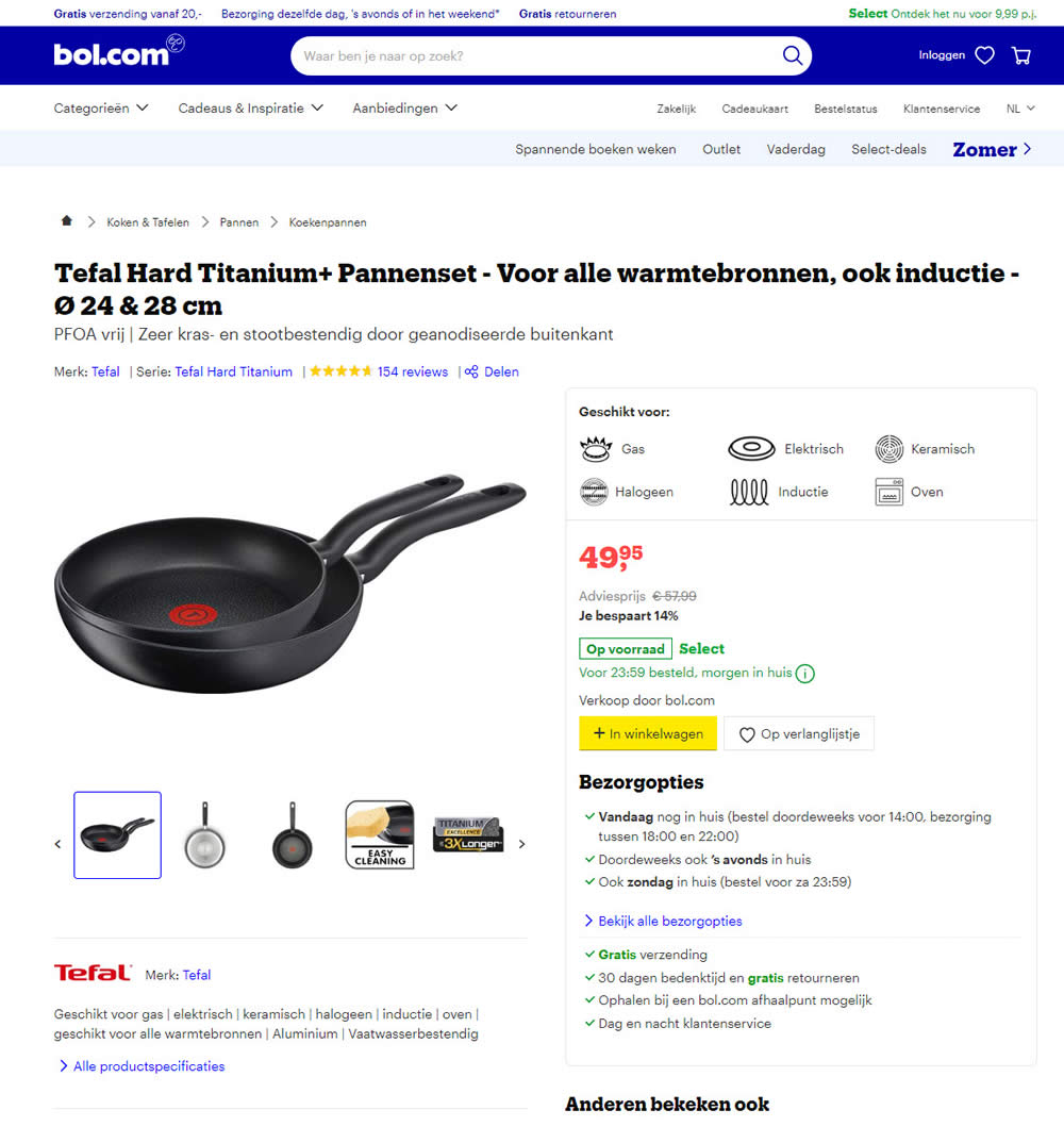
B - Jun 13, 2020 Screenshot
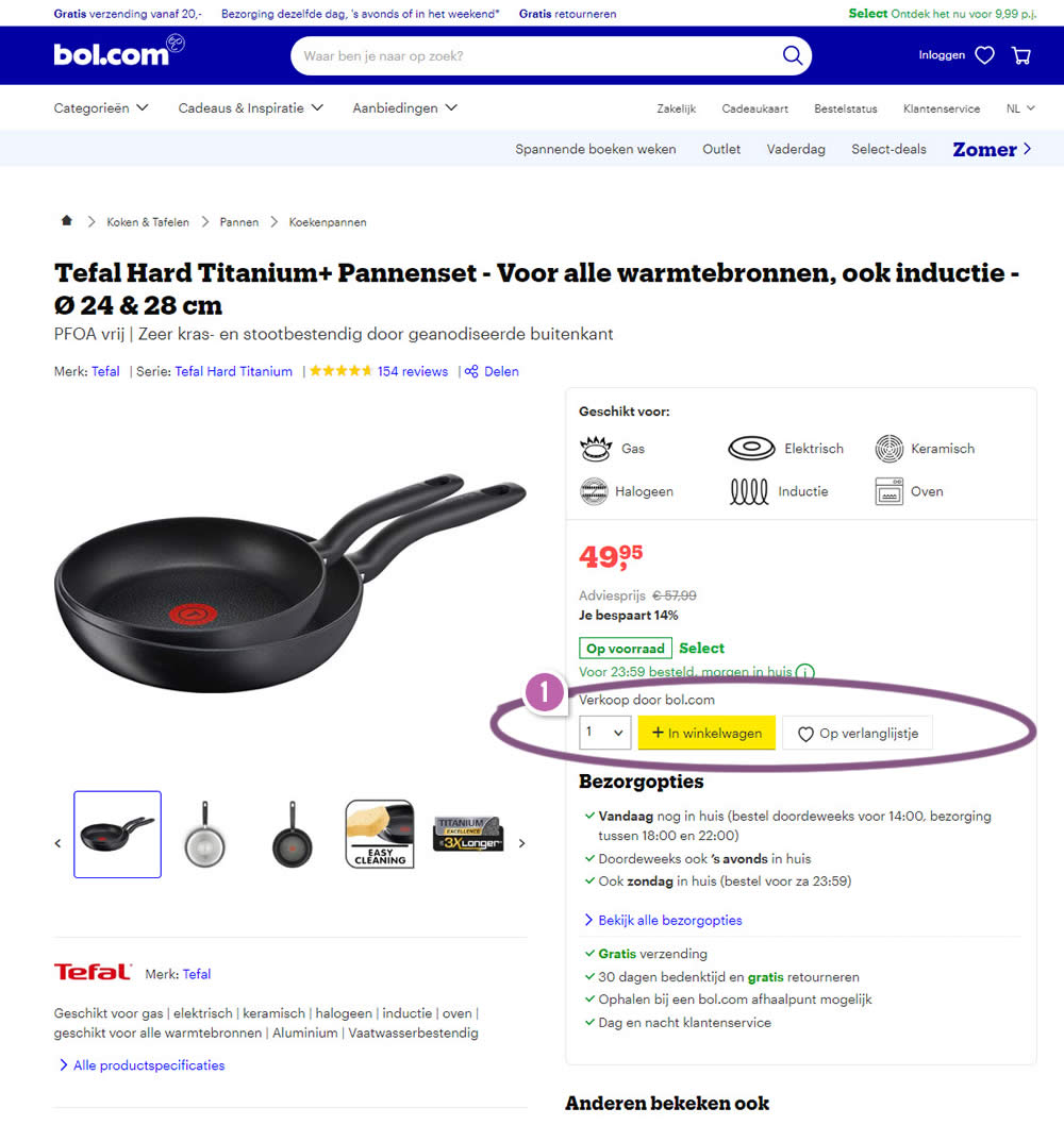
Highlighted UI Changes From This Leak
-
Visible Product Quanities
Here we can see the product quantities being tested as a classic pulldown menu, while the add-to-cart button being pushed to the right.
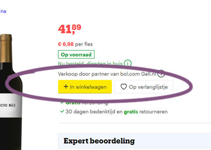
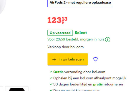
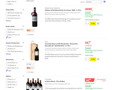
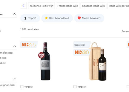
But is this better for all products? One outstanding note which I have to go along with this leaked experiment is that there might be products where this change is not guaranteed to be better. Although we've detected this variation being tested on many product pages (such as kitchen appliances) Bol continues to display products without these product quantities. Some of these might include: highly priced items, wines, or products already sold as sets. There might be other cases out there where this pattern breaks down as well. But for now we have some evidence in favor of quantity pulldowns.
Comments
David Efdé 6 years ago ↑1↓0
Very interesting observation Jakub!
Does this also mean that users more often order larger quantities of the concerning product? Or is this hard to say from this outcome?
Reply