Netflix Keeps Its Older Price Comparison Table And Rejects Their New Layout In This A/B Test
Netflix has been experimenting with the layout of their pricing plans. Challenging the more traditional pricing comparison table, instead they a/b tested three self-contained pricing plan tiles. This newer version however ended up being rejected as we noticed.
A - Nov 25, 2019 Screenshot


Highlighted UI Changes From This Leak
-
Pricing Comparison Table Vs Repeated Plan Properties
In their control version (A) we can see a pricing plan layout with the core features listed once and then referenced under each plan. In the variation however (B), the same information and labels were re-organized and repeated into three self-contained tiles.
One could argue that the A version makes comparison a little easier. This is even more evident in the mobile views where the A version had a floating plan selector that acted as a reference point. In other words, when users scroll on mobile, they would always see comparable information between all three plans (without needing to scroll up and down).
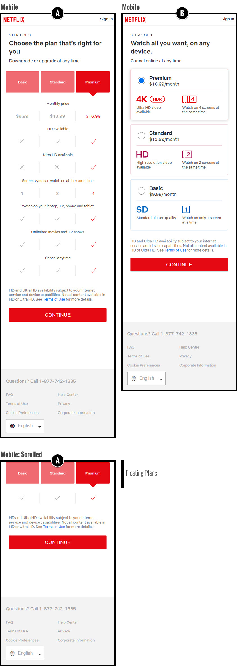
Mobile View -0.5 Repeatability has been assigned to Pattern #115: Pricing Comparison Table as evidence that it's getting worse
Repeatability is a net count of evidence for or against a pattern. It’s how we can predict which patterns are better than others. :)


Comments
Jakub Linowski 6 years ago ↑1↓0
I think you might be cookied in some older variation.
Reply
Vjeran 6 years ago ↑0↓0
At the end they decided to go with Option B: https://www.netflix.com/signup/planform
Reply