Netflix Rejected All These Tested Homepage Variations - Perhaps This One Will Help?
Netflix has been yet again noticed experimenting with a range of variations on their homepage - all of which yet again seem to have been rejected as before. Below is the leaked experiment with its key changes, the decision, as well as our own followup experiment recommendation (if we had the privilege of doing so).
A - Feb 11, 2019 Screenshot


Highlighted UI Changes From This Leak
-
Removal Of Cancellation How-To Visual
It's quite clear that the cancellation visual has been removed from A as compared with all B-E variants. This is rather surprising given that a previous homepage experiment already hinted at the inferiority of such a change (diluted by other changes contained in the big experiment).
-
Left Aligned Logo
Logo was shifted to the left. I'm going to guess that this barely made a dent in signups (for better or for worse). :)
-
Headline: Unlimited Movies, TV Shows & More
This is an interesting headline exploration of a powerful keyword (unlimited) as well as further clarification of the type of content (movies, tv shows, etc.).
-
Free Trial & Billing Visual
Comparing A with B, a new section has been injected which explains the free trial and billing in full detail. The visual mentions the 30 days free trial, the date of the reminder email, the first billing and future billing dates. It's an interesting concept but I have no idea whether this is a good or bad thing. This could easily have positive or negative effects and perhaps would be best tested in isolation?
-
Additional Selling Points
Notice how all B-E variations show these additional selling points or reassurances. Again, this type of content looks very similar to the previously failed experiment. These changes (1 and 5) could easily have brought down the full experiment into net negative territory - washing out any positive gains from all other changes.
-
Frequently Asked Questions
All variants have added the popular FAQ component answering a series of questions.
-
Movie Preview Thumbnails
A series of movie thumbnails can be seen across variants C-E. These have categorized the movies with such labels as: most popular, action, comedies, drama, etc. Although I believe that this element has the most potential (based on the heavily replicating Gradual Reassurance pattern), one other critical element might have been varied here. The movie thumbnails shown in variations C-E are defaulted to the "most popular" titles such as "Friends" and "The Office". Whereas the thumbnails in the homepage seem like they focus more on novel titles. I wonder if this was a conscious decision or something that might have been overlooked. If this was accidental, then a tighter experiment setup could have shown more of these "New" movies titles with greater consistency with the control.
This is very similar to Pattern #95: Clickable Product Previews
This is very similar to Pattern #11: Gradual Reassurance
-
Repeated Calls To Action
Finally, comparing variants D to E, we see additional (yet consistent) calls to action sprinkled throughout the landing page (most likely a positive change given these positive priors).
This is very similar to Pattern #60: Repeated Bottom Call To Action
Why The Experiment Failed
I suspect that the reason why this Netflix experiment failed is that it contains a mixture of negative and positive changes. The problem isn't that there are too many changes. The problem is that the potentially positive changes might have been overshadowed by the negative ones.
We know this because it looks like all variations were rejected on March the 23rd. We also know that similar changes present in this experiment (see 1 and 5) were already tested before with possibly negative effects (was that forgotten?). And we know that some changes are very similar to positive probability patterns (Gradual Reassurance and Product Previews) that have led to winning results for other companies.
Iterating On The Experiment - The Concept
If it were up to me to design the next homepage experiment for Netflix, I would recommend to further explore the Movie Preview Thumbnails idea. It's very closely tied to the promising Gradual Reassurance pattern backed by multiple positive experiments. The pattern idea is to let people express a desirable choice, followed by a reassuring statement. Letting people find what they are looking for (before signing up) can be a powerful way of building up motivation and providing a solid reason to move forward.
In terms of experimentation strategy, this setup follows a very simple principle: test your highest probability ideas first. The experiment design below shows two variations: B and C with ways of implementing the change. The first variation replaces the existing header, while the second variations adds or appends it as a new content block. Such a high level setup is just a safety check to make sure that nothing critical is lost by replacing and losing something important from the header.
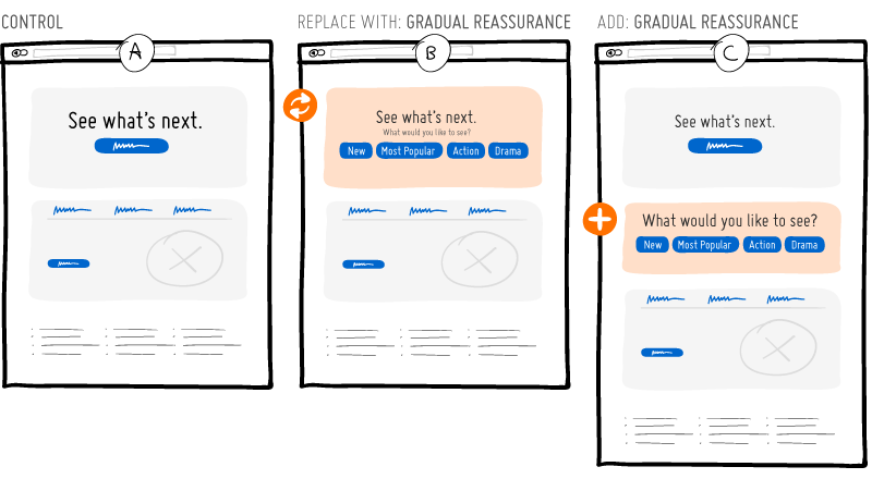
The experiment could also be further extended with additional variations about the types of choices being asked. For example, users could be asked about their preference for: movie categories, audience types, or even keyword input for the concrete shows they might be looking for, etc. Having a number of variations in this case would aim to discover what people wish to express the most when looking to watch shows or movies.
Would be interesting to see if Netflix picks this up and turns this into an experiment. :)


Comments
Helena 7 years ago ↑0↓0
I always think that the best method for user feedback is by collecting prototype analytics,
in this way you are gaining momentum and you do not waste your valuable time and effort.
Reply
Ernest 7 years ago ↑0↓0
I see variation B still being served.
Reply
Jakub Linowski 7 years ago ↑0↓1
Most likely you've been cookied into it a while ago.
Reply
Ernest 7 years ago ↑0↓0
Went incognito. Tried it again today. They still look to be serving the various variations. Try it yourself.
Reply
Aaron Russell 7 years ago ↑0↓0
I was served option E a few weeks ago and I think that the green bar going across doesn't really illustrate what they're trying to get across.
Reply
Jakub 7 years ago ↑1↓0
The free trial green bar could either clarify, reassure or scare people away with too much information. Any unknowns as such (neutral probability for/against) I would have tested separately in isolation. Perhaps Netflix already has done so in some previous experiment? :)
Reply