Netflix A/B Tests And Rejects Secondary Sign-in And Sign-up Calls To Action
Netflix ran an experiment with two variations of appended secondary links underneath the main "Try It Now" button. One variation had a link urging users to sign-in, while another urged to resume signing-up. Both ideas didn't make it and have been rejected. Here are my thoughts and comparisons on this ...
A - Jul 29, 2019 Screenshot


Highlighted UI Changes From This Leak
-
Added Secondary Sign-In Link
In the B variation we can see that a text with a link "Have an account? Sign In" has been added as an alternative call to action. And yet this variation did not outperform the control version without the added link. I find this little piece of evidence interesting as it's a subtle challenge to the Hobson’s+1 Choice Effect - Bart Schutz's general idea of having more than one call to action. It looks like having a single call to action in this case worked out better. Could it be that the alternative sign in link distracted people from signing up and lead to an increase in additional errors?
A possibly better way to do sign-in
If the above explanation holds, then it might be inline with a pattern about combining sign-in and signup (from a well respected experimenter - Ethan Smith). The idea is to merge signing in and signing up by combining enough smarts to detect whether it's a return signin or first time signup. Although we still don't have any real data for or against this pattern.
So does this mean that all secondary choices won't work?
Not at all. We actually do have some accumulating evidence in favor of showing alternative links that educate users about a product or service (think "Learn More" links and such). The idea is to offer secondary links to pages with more information (and repated calls to action) that help them choose whether the product or service is for them or not.
-
Added A Fake Restart Membership Link
In the C variant we can see a secondary message with the text and link "Been a member before? Restart membership". This also didn't outperform the control variation. Could this simply be because this secondary link was actually artificial? There was no logic or personalization which goverened it being displayed. It was simply a shot in the dark with the hope of perhaps connecting with users who might or might not have been members in the past. Well, this didn't work.
And yet personalized messaging for return visitors does show promse
When we look at example of screens that have been adjusted for return users based on "real unfinished tasks", we see positive evidence in favor of such patterns as cart reminders and personalized buttons. Return visit personalization can work. it just needs to be based on real user actions and not artificial guesses.
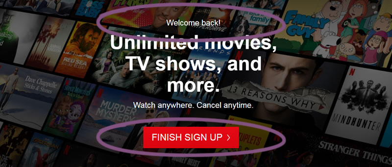
The Right Way To Personalize For Return Visitors
Here is another screenshot of what the Netflix homepage looks like when a user does not completely finish their signup process and moves past the email step. Notice how the homepage welcomes them back and the call to action evolves to a "finish sign up" message. More so, this button now links further into the signup funnel where they might have left of. This example is the right way to go about this and inline with some of the personalization evidence we have already collected.


Comments