13 Tests By  Niels Hapke
Tests
Test #288 on
Kenhub.com
by  Niels Hapke
Mar 05, 2020
Desktop
Mobile
X.X%
Signups
Niels Tested Pattern #117: Company Logos On Kenhub.com
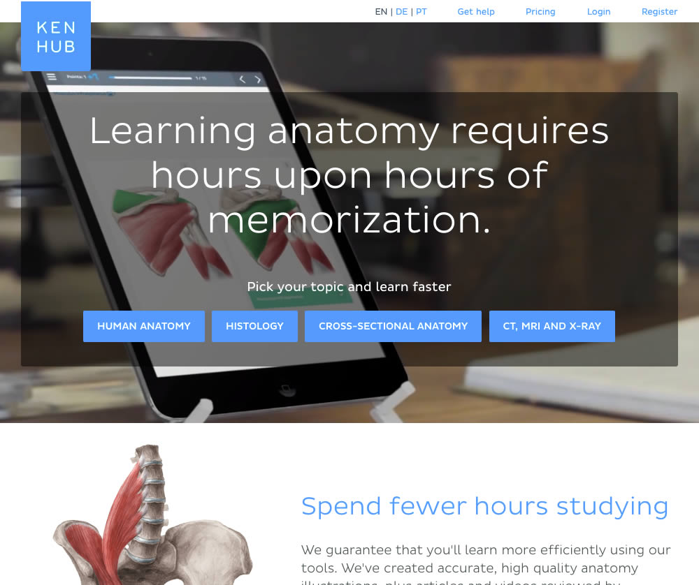
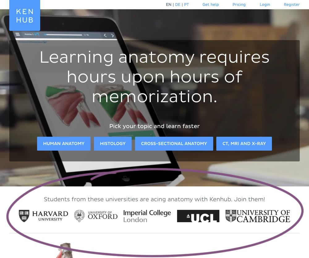
In this experiment, customer logos (of universities attended by students using Kenhub) were placed on a homepage. The experiment tested for the effect on registration visits, and premium subscription starts.
Test #283 on
Kenhub.com
by  Niels Hapke
Feb 08, 2020
Desktop
Mobile
X.X%
Sales
Niels Tested Pattern #42: Countdown Timer On Kenhub.com
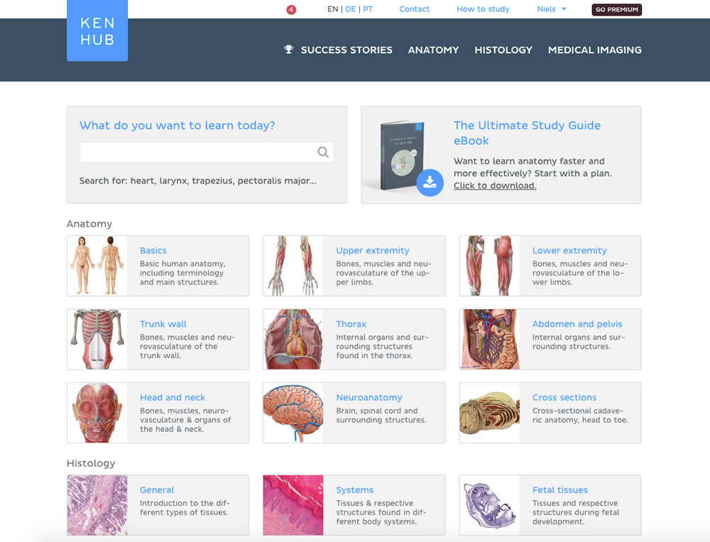
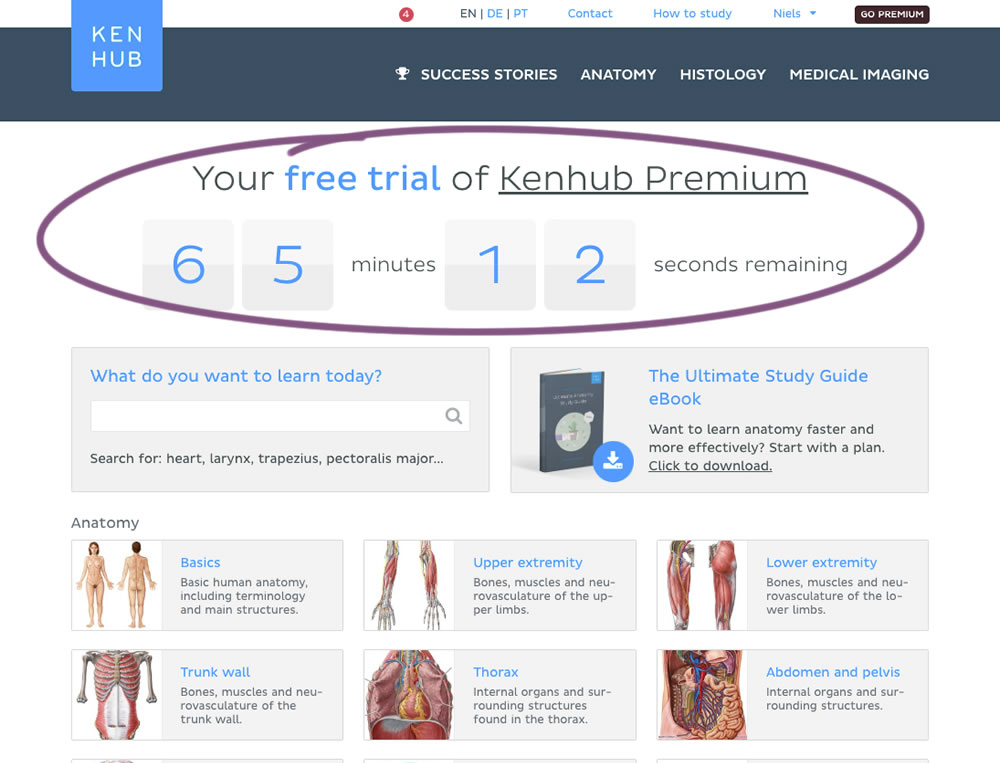
In this experiment, registered trial users were shown a 65 minute counter on multiple pages (dashboard, listing, quiz, articles) encouraging them to get a full subscription and study all content. Both A and B experiences offered the same limited content for trial users. After the 65 minutes came to an end, the B variation showed an additional "Go Premium" button on all pages, but continued to offer the same limited content.
Test #264 on
Kenhub.com
by  Niels Hapke
Oct 05, 2019
Desktop
Mobile
X.X%
Sales
Niels Tested Pattern #41: Sticky Call To Action On Kenhub.com
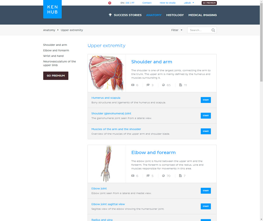
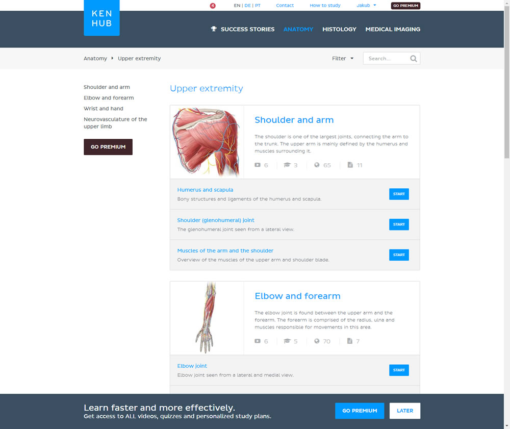
In this experiment users saw a sticky bar advertising the benefits of a Premium account across the bottom of the website, wherever they navigate. The sticky call to action appeared with a 4 second delay and was floating.
Test #245 on
Kenhub.com
by  Niels Hapke
Jun 11, 2019
Desktop
X.X%
Signups
Niels Tested Pattern #19: Benefit Testimonials On Kenhub.com
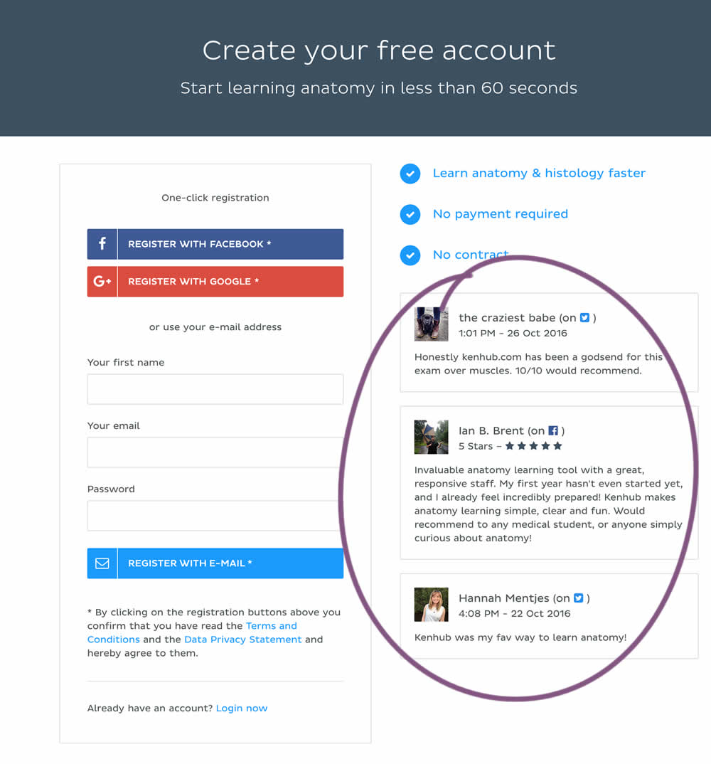
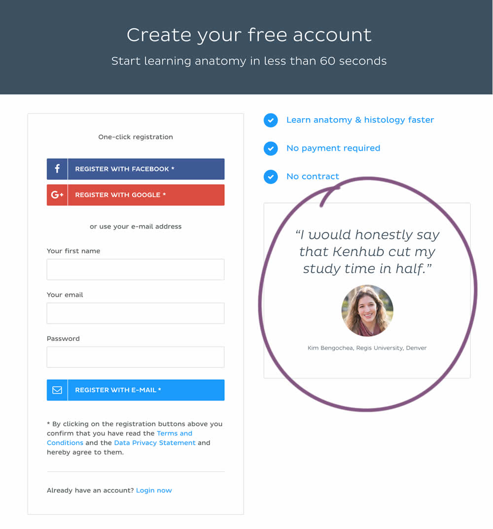
In this experiment a more elaborate and authentic testimonial was used instead of three more generic ones from social media sites.
Test #241 on
Kenhub.com
by  Niels Hapke
May 24, 2019
Desktop
Mobile
X.X%
Signups
Niels Tested Pattern #105: Lead Magnets On Kenhub.com
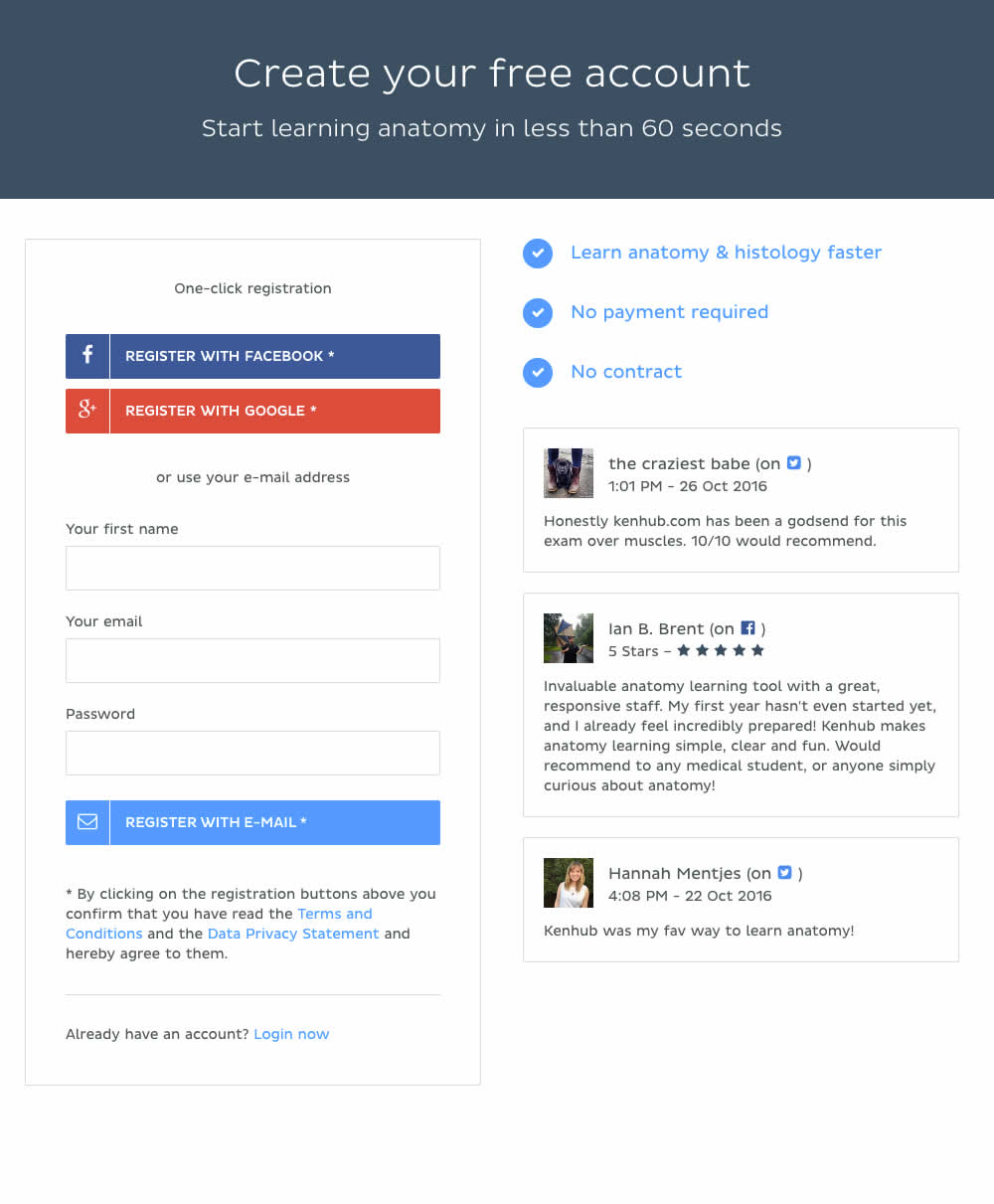
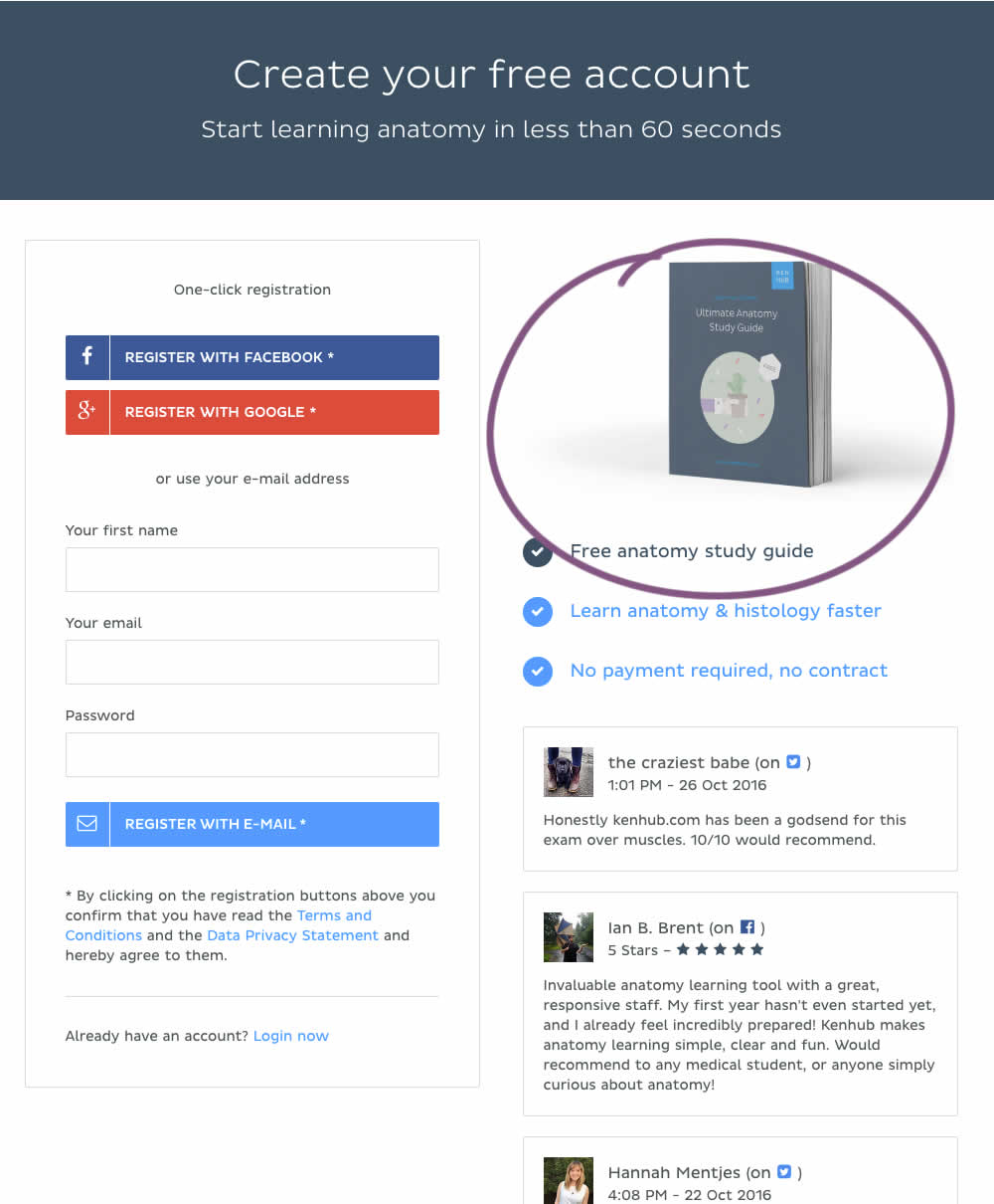
In this experiment, a free study guide ebook was promoted on a registration page.
Test #204 on
Kenhub.com
by  Niels Hapke
Oct 11, 2018
Desktop
Mobile
X.X%
Sales
Niels Tested Pattern #85: Benefit Button On Kenhub.com
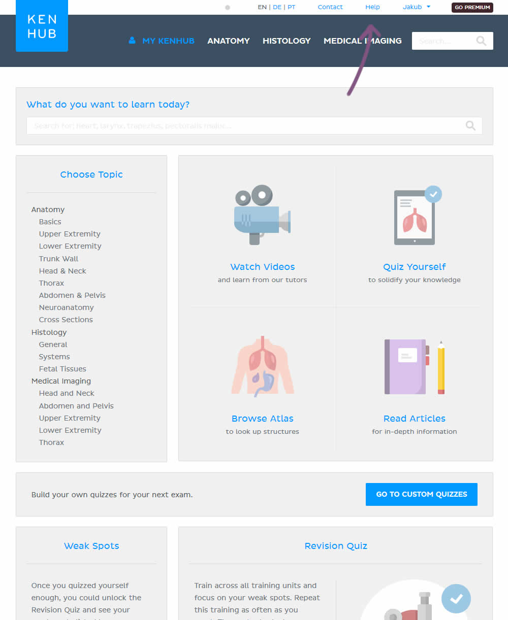
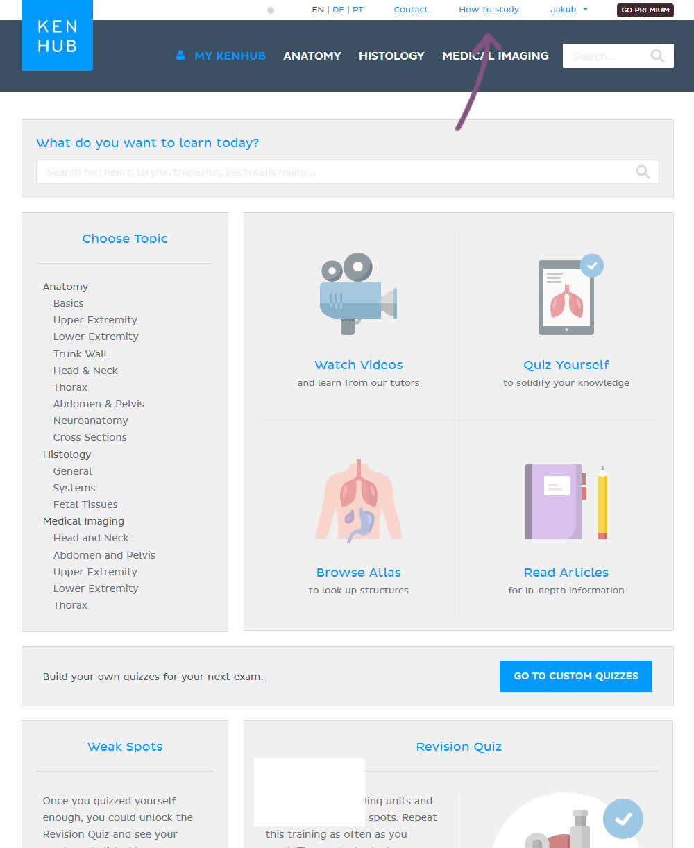
In the variation, the "Help" section was reworded to "How to study".
Test #202 on
Kenhub.com
by  Niels Hapke
Oct 01, 2018
Desktop
Mobile
X.X%
Sales
Niels Tested Pattern #13: Centered Forms & Buttons On Kenhub.com
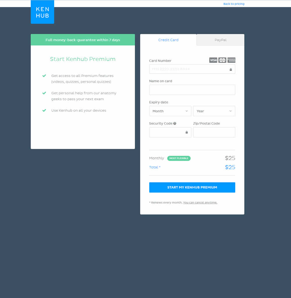
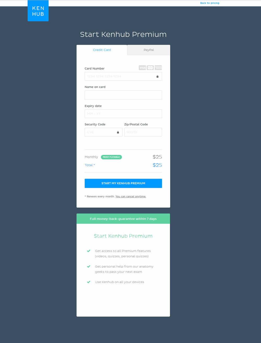
In this experiment, the form layout was adjusted by shifting the side benefits further down below the form.
Test #176 on
Kenhub.com
by  Niels Hapke
May 16, 2018
Desktop
Mobile
X.X%
Sales
Niels Tested Pattern #4: Testimonials On Kenhub.com
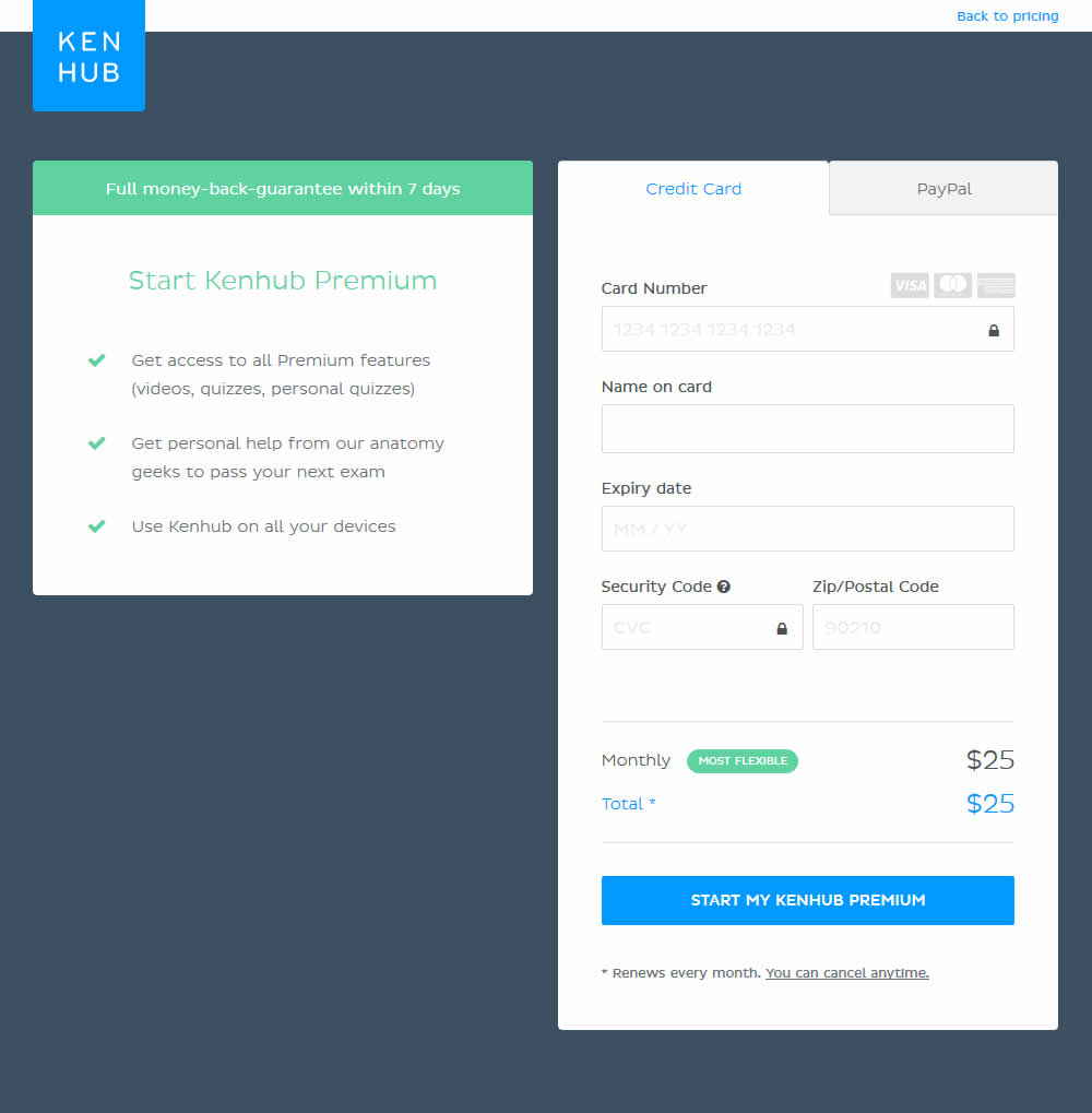
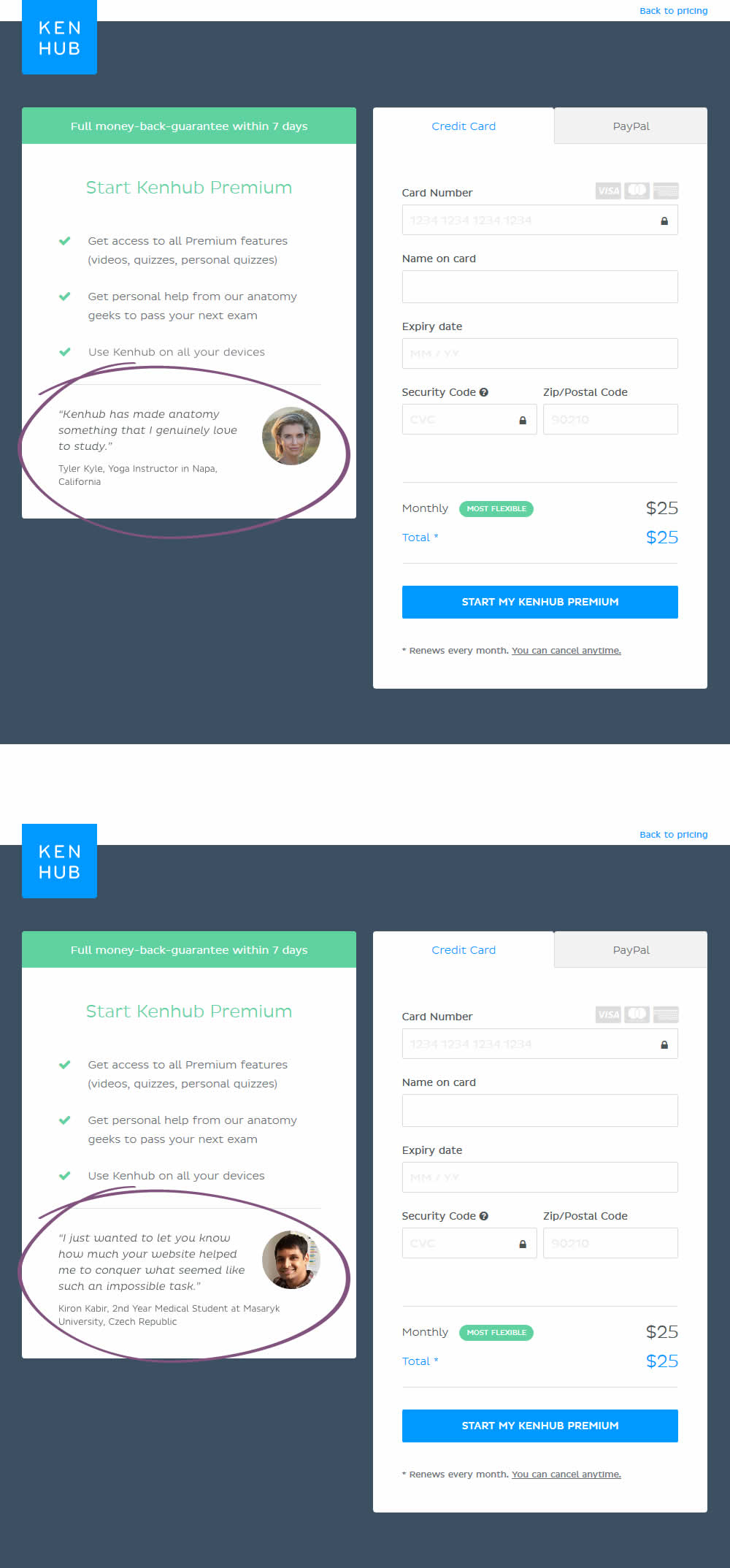
In this experiment, testimonials were added on a checkout screen.
Test #158 on
Kenhub.com
by  Niels Hapke
Mar 11, 2018
Desktop
Mobile
X.X%
Sales
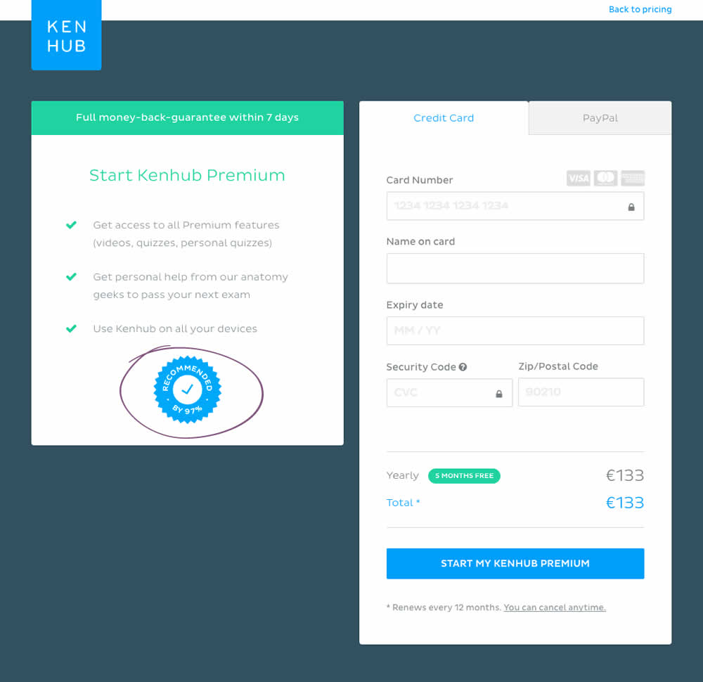
Niels Tested Pattern #63: Trust Seals On Kenhub.com

Test #148 on
Kenhub.com
by  Niels Hapke
Feb 01, 2018
Desktop
Mobile
X.X%
Signups
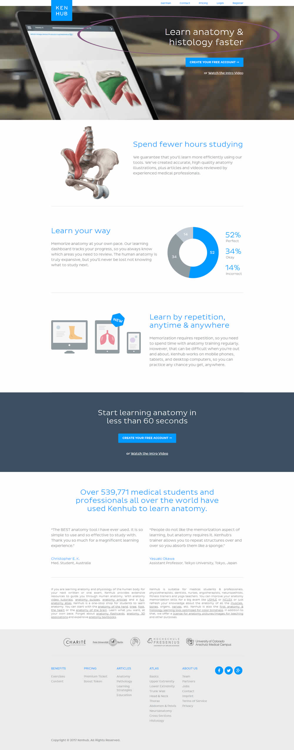
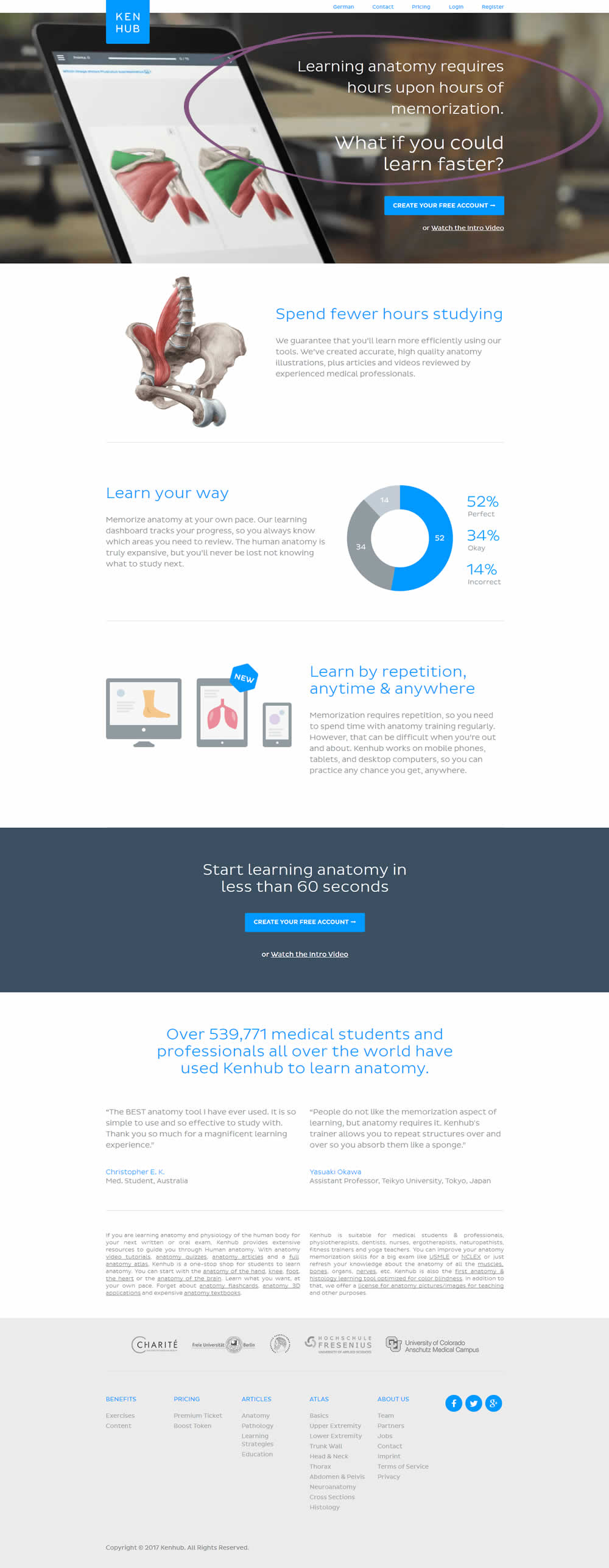
Niels Tested Pattern #53: Problem-Solution Headline On Kenhub.com
Test #134 on
Kenhub.com
by  Niels Hapke
Dec 14, 2017
Desktop
X.X%
Sales
Niels Tested Pattern #41: Sticky Call To Action On Kenhub.com
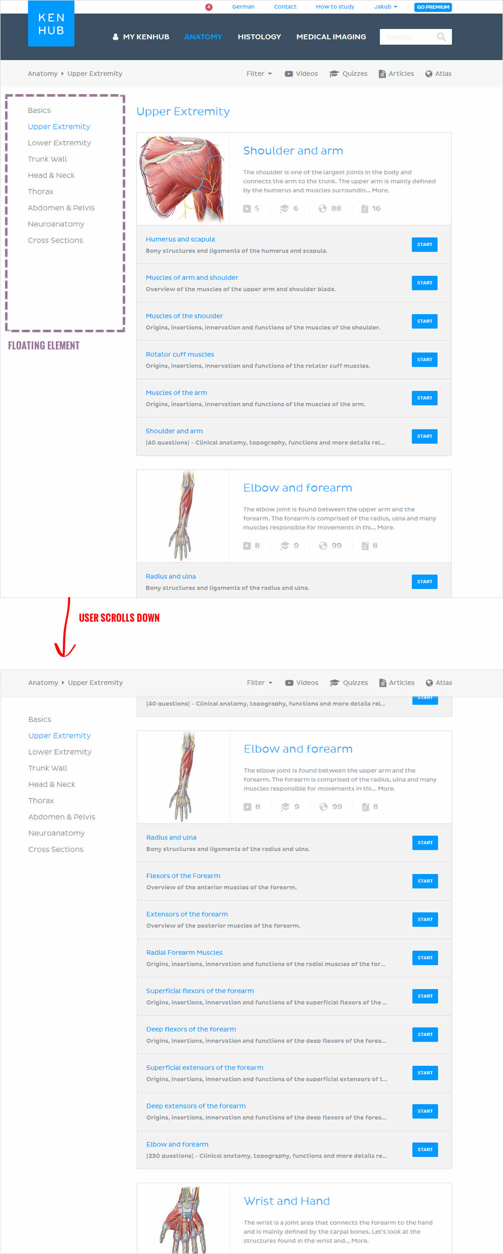
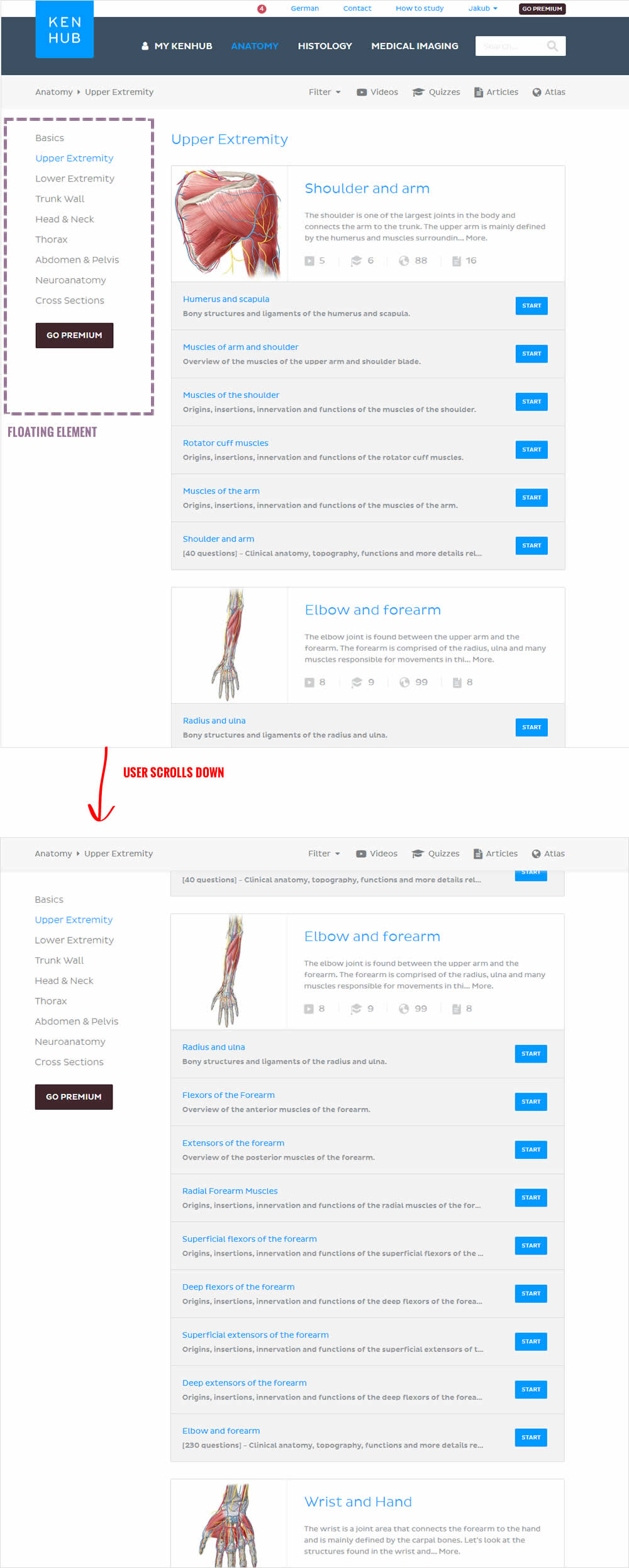
In this beautiful test, the key change was the introduction of a larger call to action linking to a premium / upgrade screen. The call to action was placed on the left sidebar which was floating. This is a great example of providing visibility to important elements by making them persistent.
Test #131 on
Kenhub.com
by  Niels Hapke
Dec 11, 2017
Desktop
X.X%
Signups
Niels Tested Pattern #11: Gradual Reassurance On Kenhub.com


Test #130 on
Kenhub.com
by  Niels Hapke
Dec 07, 2017
Desktop
X.X%
Revenue
Niels Tested Pattern #17: Least Or Most Expensive First On Kenhub.com
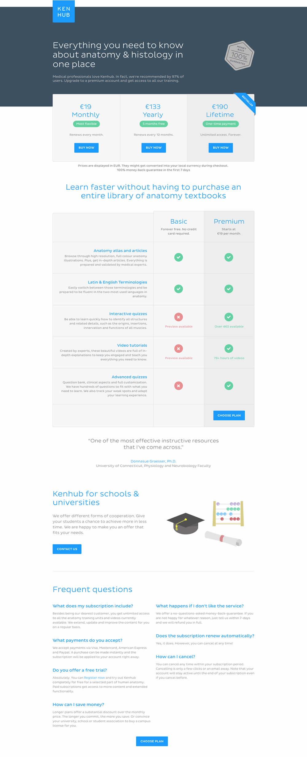
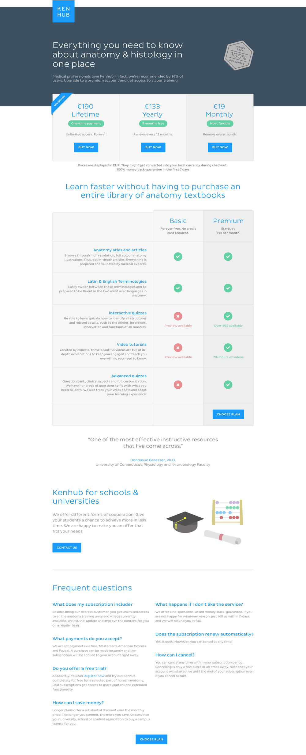
In this experiment, the plans were sorted by the most expensive first, left to right (variation).