The Failed Netflix Homepage Redesign Experiment That Nobody Even Noticed
It was last month that I took two screenshots of the Netflix homepage after clearing my cookies in between. By doing so I managed to detect an active A/B experiment without anyone even knowing that I knew - oooohh the excitement. Although Netflix is probably too big to share their experiment results publicly (although they do show their amazing process), I also knew that it was just a matter of time before they would make a visible decision. And so I waited. When February came and all traces of the experiment disappeared, it became clear that their decision was made - they rejected the B version, keeping the existing control (A). Here are some possible explanations as to why this might have happened. (with references to actively tested UI patterns of course).
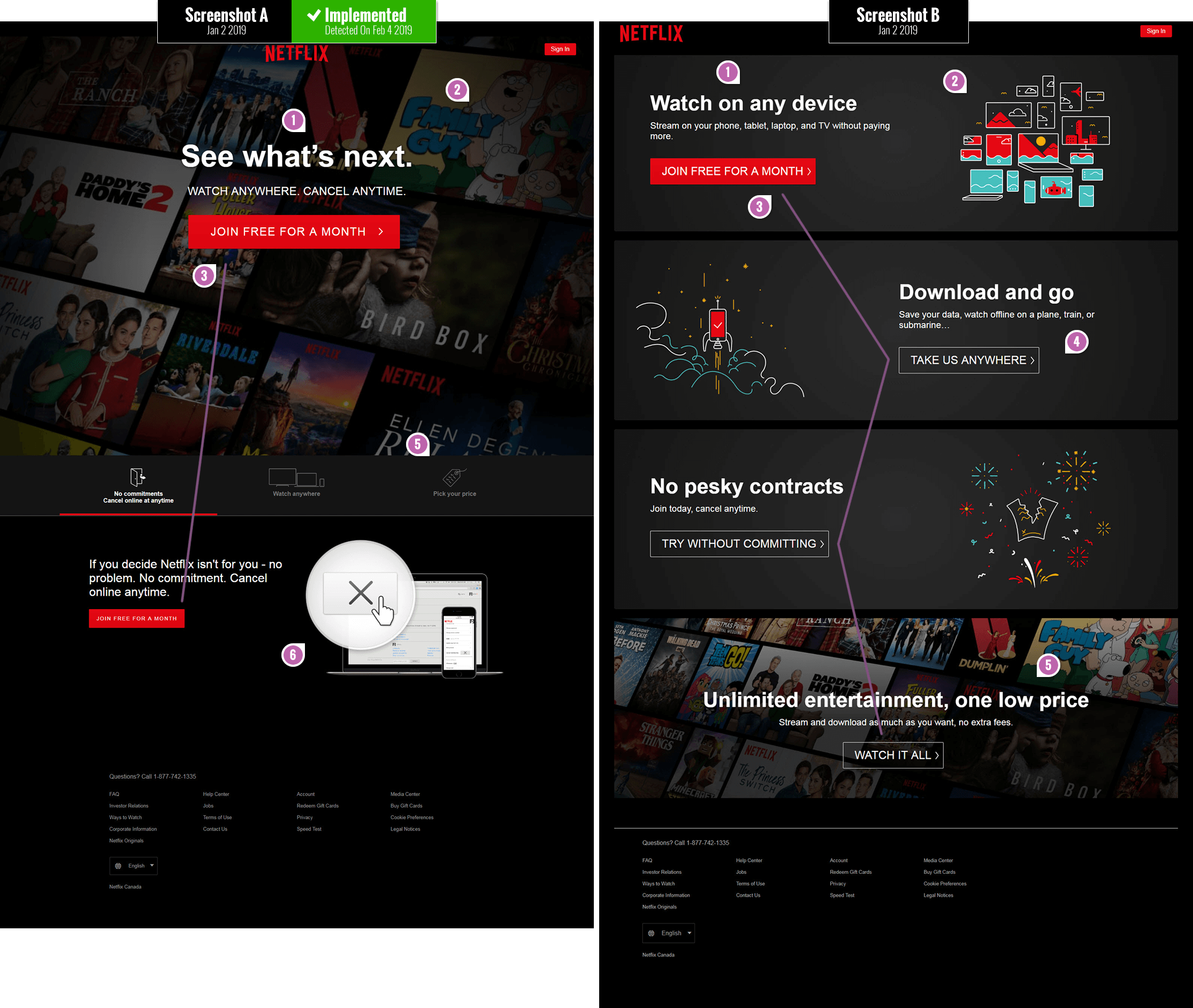
The Changes
One word of caution before jumping to conclusions about all of the attributes of version A being positive. Let's keep in mind that although leap experiments such as these are very valuable (they often have a bigger effect potential for better or for worse), they do suffer from diluting causation by merging multiple variables together. In the end we can't really tell which of these individual changes were truly flat, positive or negative because they were all grouped together. To know more about the concrete effects of individual changes they need to be tested in isolation - and that's why track individual patterns. Having said this, here is why I think version A might have been implemented by Netflix, with B being rejected.
- Headline: Watching Latest Movies Vs. Watching Anywhere
The headline or value proposition on the A version promises viewers to "See what's next" as opposed to "Watching on any device". Given that A was implemented, this might be a subtle signal in favor of new or latest content being more valued over how and where something is watched. Viewers might also be already expecting to watch anywhere with or without Netflix telling them so. We are tracking a series of headline patterns right here. - Visible Movie Preview Thumbnails - Similar to Pattern #95
One of the first dramatic difference between both versions is that the A (control) has more visible movie thumbnails. The movie thumbnails are higher up and take up more space than in B variant where they are positioned lower down. Using realistic imagery to reinforce the value proposition ("Seeing what's next") might be more powerful than abstraction in this case. - Consistent Vs. Varied Calls To Action
The A version shows 2 consistent instances of the primary call to action as "Join free for a month". The B variant on the other hand shows 4 instances of the primary call to action with 4 diverse messages. Retroactively I suspect that such diversity of messages might raise a the level of uncertainty: does clicking separate buttons have different consequences for the user (could users somehow subconsciously feel that "joining for a free month" is mutually exclusive to "trying without committing")? I think this would be a great followup experiment on its own. - Ghost Buttons
All I'm going to say is that we started to track the effects of ghost buttons as a separate pattern. - Answering Price Questions VS. Raising Price Concerns
Although the A version does not show the price immediately, it does make it accessible within 1 click on the "Pick your price" tab. The B version mentions "one low fee" but does not really provide an answer - leaves users in a state of anxious uncertainty. We started a collection of pricing patterns to begin answering related questions. - Cancellation How-To Visual
I love the way the A version reinforced how and where in the UI users can cancel easily - whenever they like. This makes the low barrier to entry ultra low and trustworthy. I will definitely be turning this into a unique pattern on its own to inspire future experiments.
Share Your Thoughts
Do you think there is anything else between these two variations that might have played a key role in A leading the way? Share your thoughts. Oh and of course, if you are interested in learning about what patterns tend to win or lose, please see the wealth of evidence-based work we are actively publishing for your use.
Posted by  Jakub Linowski on Feb 07, 2019
Comments
Johnson 6 years ago ↑0↓0
Great stuff.
Possible to see the impact of these tests?
Eg, how many more users did they get?
Revenue or anything like that as a result of these tests?
Let's be honest, we run test because we believe we can get a higher conversion of something,right?
I'd love to know.
Reply
Sajjan 6 years ago ↑0↓0
Same from my country.
Reply
Dennis W 6 years ago ↑0↓0
Here's what it looks like in Germany as of today:
https://www.dropbox.com/s/tbza60ux658rmib/netflix-20190502.png?dl=0
Reply
Adam Lee 6 years ago ↑0↓0
I wonder if they were running these 2 pages side by side at the same time because last month a lot of media outlets were running stories about the cost of service going up.
Reply
Scott Madore 6 years ago ↑1↓0
Here is what it looks like in Canada.
https://www.dropbox.com/s/h0foptgk0luhb5a/netflix.com_ca_2019-02-13.png?dl=0
Zig Zag is back. Ghost buttons.
Reply
Alexander Bickov 6 years ago ↑0↓0
@scott The same in Europe
Reply
jakub 6 years ago ↑0↓0
Yes, that's a new experiment. :)
Reply
Bryce 6 years ago ↑0↓1
I think it might actually be their new homepage. I am seeing it as well. The images are animated showing different shows etc.
Reply
Bryce 6 years ago ↑0↓0
I think it might actually be their new homepage. I am seeing it as well. The images are animated showing different shows etc.
Reply
Refiloe Digoamaye 6 years ago ↑1↓1
Interesting take wrt to experiment B. NNG found that the zig-zag pattern layout for images is poor for usability purposes so I guess that's one reason they canned the idea: https://www.nngroup.com/articles/zigzag-page-layout/
Reply
Artis 6 years ago ↑1↓0
This is how the landing page looks in Chrome for me: https://imgur.com/a/hzEdmde. In the image below is captured extra container which is shown on Safari. Adblock in Chrome was disabled, so it's not because of that why it's not in the first image.
Reply
jakub 6 years ago ↑0↓0
Looks like you just discovered the next set of variations from the next experiment. :) Confirmed. Thank You.
Reply
Artis 6 years ago ↑0↓0
I had a thought that it's a variation for a specific region. In this case it's Latvia. Maybe that's why it's more detailed hypothesis being that people in this region are not that exposed to what Netflix is. But it might be miles off considering that internet has no boundaries and other restrictions physical world has.
Reply
Deity 6 years ago ↑0↓0
I've got a landing page with slightly different order of these content blocks on Chrome in Taiwan: https://imgur.com/a/oFmU2gy.
Reply
jakub 6 years ago ↑0↓0
Yup. There is an active experiment and you're taking part in it. :)
Reply
Wm 6 years ago ↑0↓0
Netflix homepage should take the example of Tubi's home page, as far as comsumer visuals and navigation goes. Plus, who wants to see a trailer while trying to do a visual search across the thumbnails? At present Netflix gets 4 stars out of 10.
Reply
Becky 6 years ago ↑1↓0
Agree there's a whole lot going on. I notice "Bird Box" is more prominent in A. Given its prevalence on social media lately that could be a meaningful element in terms of displaying product offerings. And, a bit cliche, but the button on A is simply bigger and more prominent. Overall the visual design of A invokes "movies" while visual design of B is just vague and generic until you get close to the bottom.
Reply
Joris 6 years ago ↑1↓0
Nice article Jakub. I agree with Becky. Design is about recognition; design A breathes movies, while B can be confusing at the first glance. The illustrations look good but don't really reference "movies", but rather "features".
Reply
jakub 6 years ago ↑0↓0
All great comments. Thanks for sharing! :)
Reply
Lisanne van Hooff 6 years ago ↑1↓0
Super cool finding Jakub. Thanks for sharing!
Not only the design and data-results of this specific page decide which version stays live.
One other reason why they might have chosen the winner: Business goals or user needs that are accomplished outside this page can influence the decisions for this page.
And one more other reason might be that the mobile design is technically related to this that influenced the decision for this desktop design.
Did not yet dive into the design process at Netflix. The Design Genome Project at InVision studied several design processes at companies like Netflix, Slack, Pinterest, Shopify. More about Netflix design process: https://www.invisionapp.com/enterprise/design-genome/report/netflix
Keep up the good work Jakub!
Best regards, Lisanne
Reply
Alexander Shvets 6 years ago ↑1↓0
From a developer perspective, B looks like a glitched-out carousel of 4 banners. I can't help by wonder, whether there were any JS errors on that page at that time.
Reply
Vlad Malik 6 years ago ↑1↓0
I'd also consider the layout itself. A has more of a welcome/intro. It says "Here's what we want you to do". B says "There are a bunch of things". It's less focused on the action. It's like a book without a cover.
Reply