6 Signup Form UI Changes With +17% More Signups For Thomasnet.com
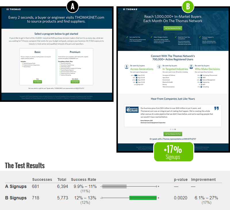
In this very simple signup screen "redesign" project we combined a handful of evidence-based patterns into a single variation which was then a/b tested. As predicted, the positive probability patterns combined together for a positive impact. Here are the 6 key changes:
The Changes
- Empowering Headline - Predicted By Pattern #22
The first change was based on our goto headline pattern where a benefit is related using an empowering verb and promise (ex: "Reach ..." ). The control version only mentioned a generic statement about the volume of visitors to the web site. - Above The Fold Call To Action - Predicted By Pattern #49
Placing buttons higher and more visibly is another pattern inspired by a series of already positive test results. Whereas the control version had the button(s) further down, possibly below the fold.
The button label was also adjusted to "List Your Business For Free" instead of "Get Started" - something we have less data on and which arguably we could have isolated. - Benefit Bar - Predicted By Pattern #45
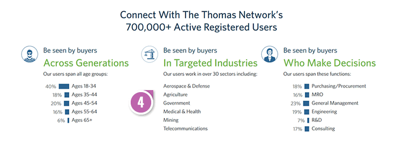
Some of the key objections, questions and selling points were addressed high up on the page - largely influenced by Viljo's (CXL) pattern. - Supporting Content
The idea with this section was to support the headline and provide some examples of how someone could "reach buyers" or "be seen". The closest pattern that might somewhat be similar to this idea are product previews. Providing supporting examples helps people better understand and imagine what they are about to receive. - Testimonials - Predicted By Pattern #4
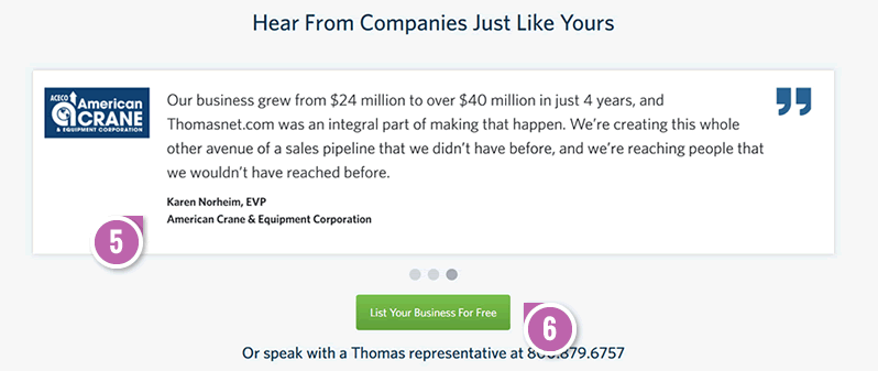
A handful of testimonials were added from past clients. - Repeated Call To Action - Predicted By Pattern #60
Since the screen slightly grew in length, an additional bottom call to action was added as a reminder and a nudge.

How Do We Know What To Include Or Exclude In A Leap Experiment?
As we actively accumulate more evidence in favor or against selected patterns, this type of design and optimization work actually becomes easier. To determine which changes are included in such "leap" experiments, we simply group as many net positive patterns into a single design concept. The more frequently a particular pattern has performed with a positive effect, the more likely it's also going to work again in the future - we call this repeatability (or reproducibility). At the same time we also avoid any patterns that have a negative probability.
Typically what happens with such a strategy is that it maximizes the probability of impact as effects from multiple changes add up (more likely than not). It's a great way to kick start a larger improvement of unoptimized screens with a lot of upside. Anyone can do this as well and all that is needed is access to past test results. :)
In this very simple signup screen "redesign" project we combined a handful of evidence-based patterns into a single variation which was then a/b tested. As predicted, the positive probability patterns combined together for a positive impact. Here are the 6 key changes:
The Changes
- Empowering Headline - Predicted By Pattern #22
The first change was based on our goto headline pattern where a benefit is related using an empowering verb and promise (ex: "Reach ..." ). The control version only mentioned a generic statement about the volume of visitors to the web site. - Above The Fold Call To Action - Predicted By Pattern #49
Placing buttons higher and more visibly is another pattern inspired by a series of already positive test results. Whereas the control version had the button(s) further down, possibly below the fold.
The button label was also adjusted to "List Your Business For Free" instead of "Get Started" - something we have less data on and which arguably we could have isolated. - Benefit Bar - Predicted By Pattern #45
Some of the key objections, questions and selling points were addressed high up on the page - largely influenced by Viljo's (CXL) pattern. - Supporting Content
The idea with this section was to support the headline and provide some examples of how someone could "reach buyers" or "be seen". The closest pattern that might somewhat be similar to this idea are product previews. Providing supporting examples helps people better understand and imagine what they are about to receive. - Testimonials - Predicted By Pattern #4
A handful of testimonials were added from past clients. - Repeated Call To Action - Predicted By Pattern #60
Since the screen slightly grew in length, an additional bottom call to action was added as a reminder and a nudge.
How Do We Know What To Include Or Exclude In A Leap Experiment?
As we actively accumulate more evidence in favor or against selected patterns, this type of design and optimization work actually becomes easier. To determine which changes are included in such "leap" experiments, we simply group as many net positive patterns into a single design concept. The more frequently a particular pattern has performed with a positive effect, the more likely it's also going to work again in the future - we call this repeatability (or reproducibility). At the same time we also avoid any patterns that have a negative probability.
Typically what happens with such a strategy is that it maximizes the probability of impact as effects from multiple changes add up (more likely than not). It's a great way to kick start a larger improvement of unoptimized screens with a lot of upside. Anyone can do this as well and all that is needed is access to past test results. :)
Posted by  Jakub Linowski on Jul 26, 2019
Comments