12 Landing Page Patterns For 42% More Leads On KensingtonTours.com
Earlier in the year we kicked off a Leap experiment project with Kensington Tours focused on optimizing their travel landing pages. Today I'm super excited to share 12 of the evidence-based patterns which told us what to change in order to achieve a successful 42% increase in leads. Yes, this pretty much means we took what already worked for other companies to come up with a best concept with multiple changes. I hope that this inspires others to tap into the predictive power of evidence-based patterns.
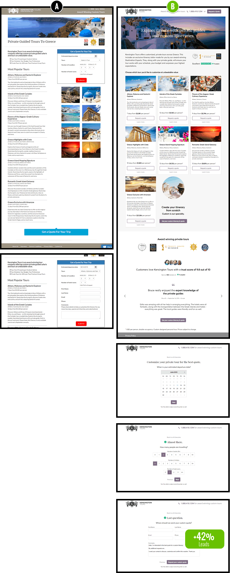
The Changes
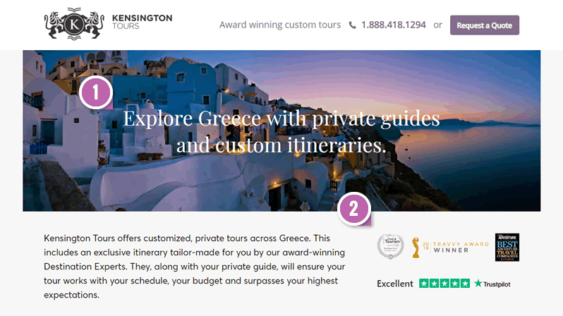
- Empowering Headline - Predicted By Pattern #22
At the time of writing, this was a headline pattern with the most probability. It told us to start off with an empowering verb, such as "Explore", to tie the value proposition closer with the reader. - Customer Reviews - Predicted By Pattern #6
Additional customer reviews and awards were also shown more visibly in the variation. - Sticky Call To Action - Predicted By Pattern #41
The B variation floated the "Request a Quote" button for additional visibility. This is standard procedure by now on longer pages. :) - Exposed Options - Predicted By Pattern #14
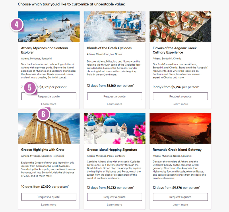
The B version exposed the trip selection as the first and most important action on this page, while getting rid of the pull down menus on the right. In the control version users could also see the same trips, however they were only presented as content, requiring a disconnected pull down selection. From this change, it became clear which first choice we wanted visitors to make. - Action Buttons - Predicted By Pattern #88
Although the trip title along with the photo were clickable, for each tile we also added an explicit action button ("Request a Quote"). This was done to encourage further action. - Learn More Links - Predicted By Pattern #29
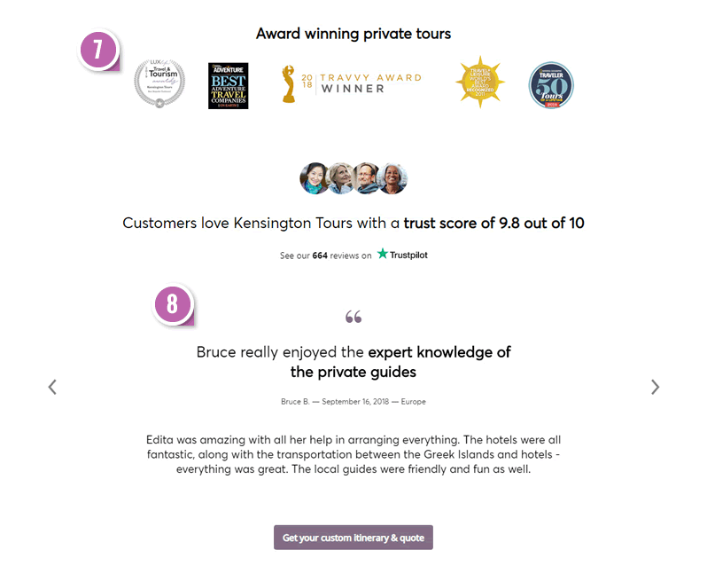
Should we have "Learn More" links to detailed pages with repeated calls to action, or not? This question is being actively asked and answered with this surfaced content pattern. Based on the test results so far, it was decided to introduce the "Learn More" links in the B variation. - More Social Proof: Awards & Customer Ratings - Predicted By Pattern #6
In this section we showed additional awards with an increased size as well as repeated the customer ratings. - More Social Proof: Testimonials - Predicted By Pattern #4
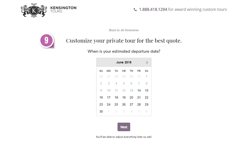
Similarly, customer testimonials were appended here. - Multiple Steps - Predicted By Pattern #9
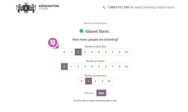
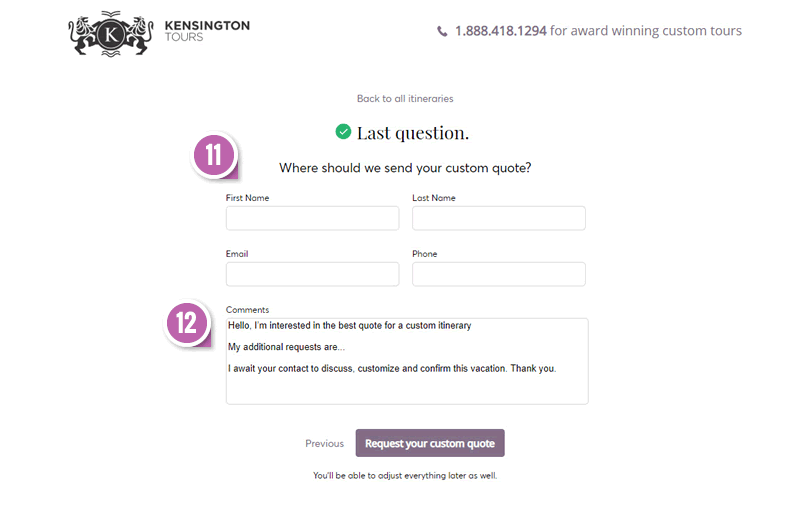
Notice how in the control, clicking the Submit button just inline expands the form with additional fields. In the B variation we applied the Multiple Step pattern to break up the process into more steps with fewer questions per screen. Hence the departure date, number of travelers, and contact details were broken into separate screens. - Exposed Options - Predicted By Pattern #14
All those traveler and room pull down menus were exposed as clickable choices to minimize friction. - Top Aligned Labels - Predicted By Pattern #5
Instead of left-aligning the labels (with a big gap between the label and the field), the labels were top aligned closer with the fields. - Canned Response - Predicted By Pattern #20
And finally, a canned message was added to summarize the request and reassure of a response.

The Results
 The B variation with all these grouped changes was built out as a separate landing page version. This was then setup up as a split a/b test powered by paid traffic. The primary measure were successful leads that completely filled out the form by reaching a thank you page. The measured effect was a relative 42% increase to leads.
A Big Thanks To Kensington Tours
A big thank you to the awesome Marketing, Design and Technical teams at Kensington Tours that made this possible. They are the ones that entrusted the evidence and did the hard work of turning the concept into design iterations, code and measurable results! And of course an even bigger thanks for sharing the results publicly!
How Do We Know What To Include Or Exclude In A Leap Experiment?
As we actively accumulate more evidence in favor or against selected patterns, this type of design and optimization work actually becomes easier. To determine which changes are included in such "leap" experiments, we simply group as many net positive patterns into a single design concept. The more frequently a particular pattern has performed with a positive effect, the more likely it's also going to work again in the future - we call this repeatability (or reproducibility). At the same time we also avoid any patterns that have a negative probability.
 Jakub Linowski on Aug 19, 2019
Comments