Netflix Designs Their Button A Little Too Big
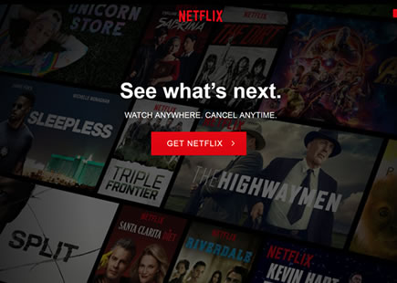
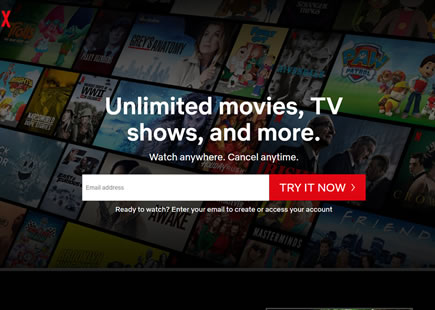
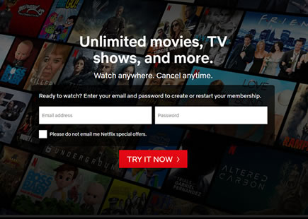
Sooner or later design properties should reach optimums for their given contexts. That is, UI elements will become just right - not too big and not too small, or not too high and not to low, etc. In this leak, it seems that Netflix has approached such an optimum when they tested various button sizes on their landing page. Given that form elements and buttons should generally be bigger, it was inevitable for this new evidence to appear as an example of a button being simply too big - as seen in this beautiful experiment. :)
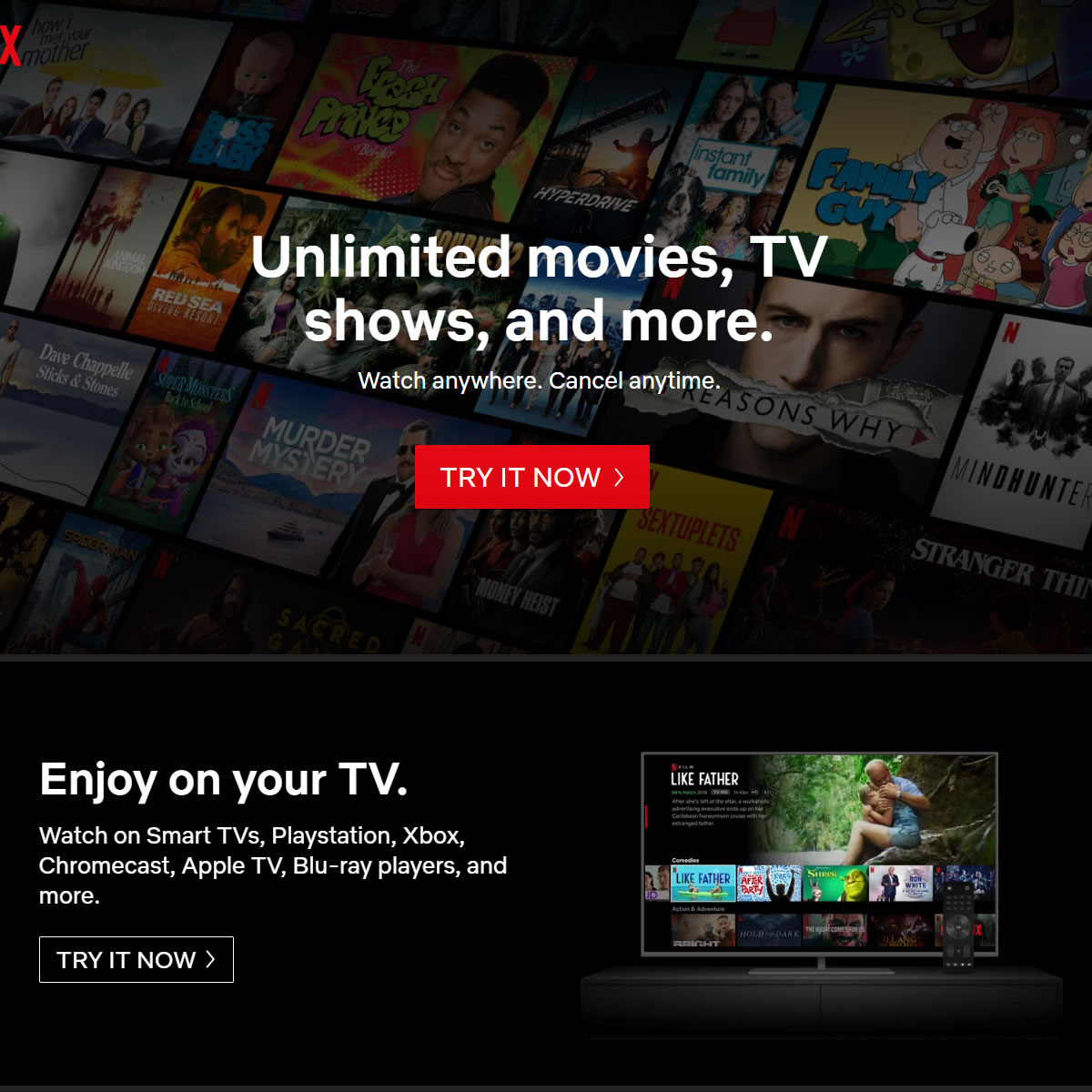
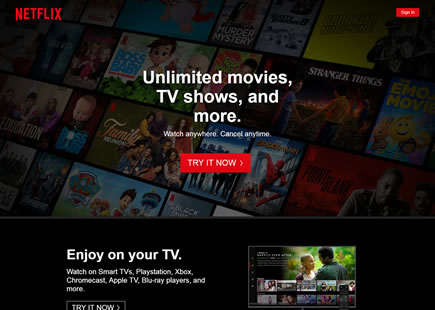
B - Sep 1, 2019 Screenshot
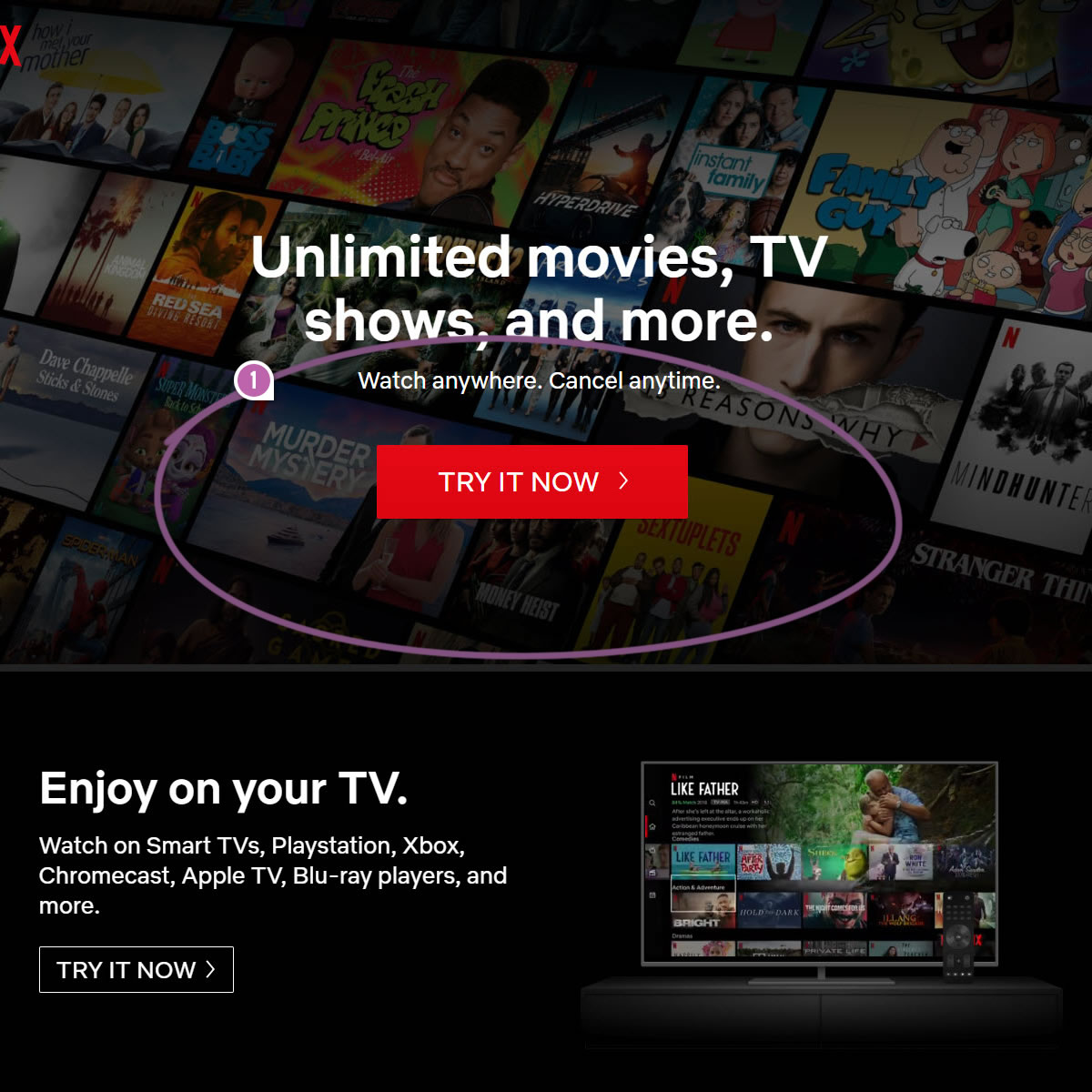
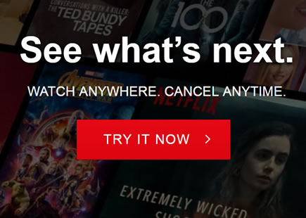
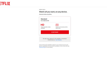
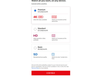
C - Sep 1, 2019 Screenshot
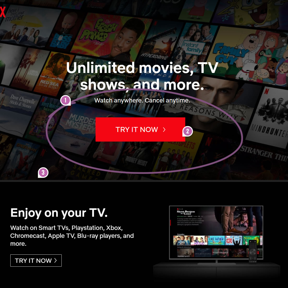
Highlighted UI Changes From This Leak
-
Bigger Buttons
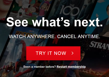
Clearly, this a beautiful intensity experiment where button size is a key variable that has been increased gradually across A-B-C. Two months later both B and C were rejected in favor of the A version hinting that the original button size was good enough.
-0.5 Repeatability has been assigned to Pattern #97: Bigger Form Fields as evidence that it's getting worse
Repeatability is a net count of evidence for or against a pattern. It’s how we can predict which patterns are better than others. :)
-
Color Change
Although this experiment looks very isolated with a single variable, there are additional subtle design changes that have been introduced for some reason. If you look very closely, Netflix also decided to slightly adjust the color of the buttons in both B and C (making it slightly brighter). I'm not sure why they did this - it's almost too bad.
-
Pushed Down Content
Finally, as a result of the increased margin on the button, you might also notice that the rest of the page was slightly pushed down. This is almost negligible, but if we want to be precise then this might be another little variable that might or might not have played a role.
Comments