Walmart Ran This Big Navigation A/B Test With 8 Confounded UI Changes - Rejecting It
Walmart ran a larger redesign experiment of their navigation. If I observed correctly after triple checking, it was a leap variation with at least 8 changes grouped together. Unfortunately, as of this month it seems that the experiment has stopped with no sight of the variation - hinting at a rejection for whatever reason. In retrospect, I do have some ideas along with my personal and mixed bets on these UI changes. All in all, I suspect a possible confounding situation with some negative changes cancelling out the positive. Perhaps one day Walmart re-runs some of these positive-only bets in a future iteration?
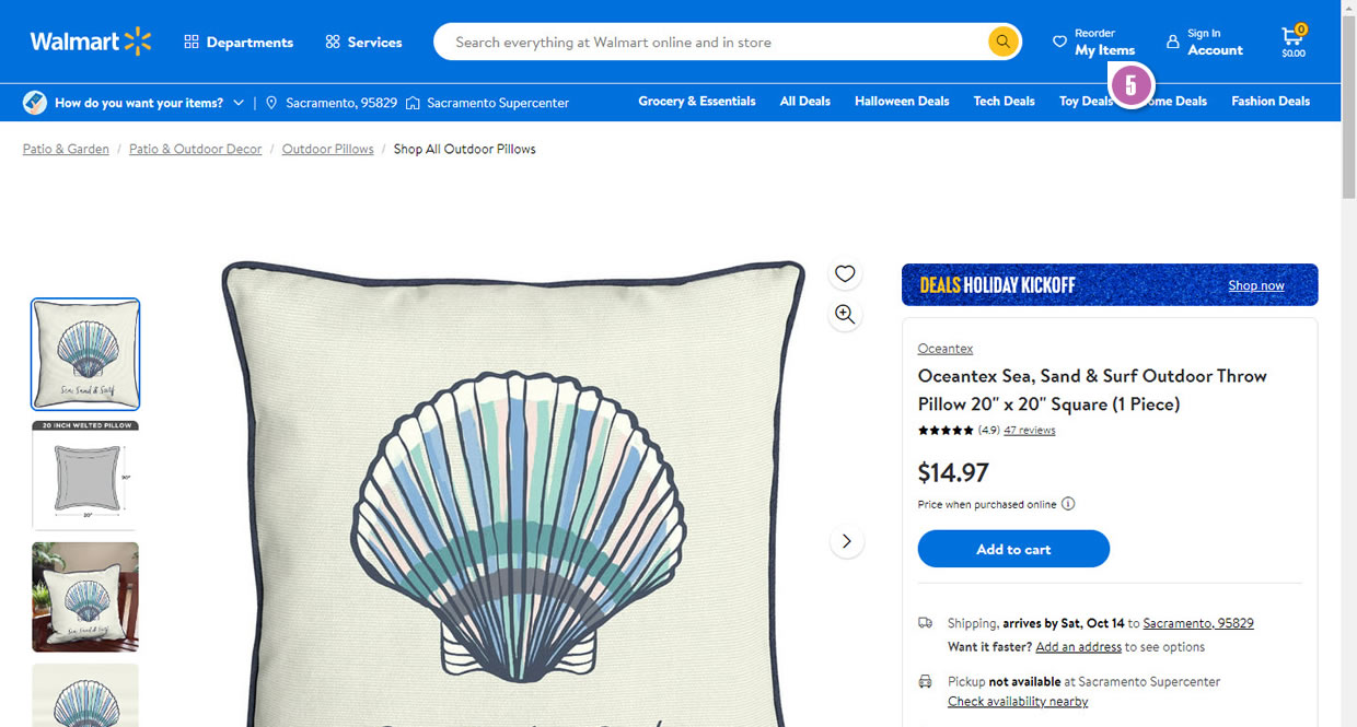
B - Oct 12, 2023 Screenshot
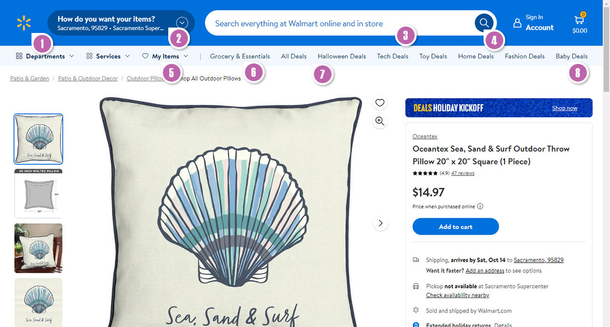
Highlighted UI Changes From This Leak
-
Branding: Logo Without Walmart Name - My Bet: UNKNOWN
I didn't specialize in branding when I studies graphic design, but this logo change in the variation to me seems like such a huge question mark in terms of its potential effect. If it were up to me I'd mark this as a big unknown probably worthy of isolation in a separate single change experiment.
(One could argue even to give this change a negative bet on the grounds of icons with labels having some positive signal.)
-
Prominent: How Would You Like Your Items - My Bet: NEGATIVE
The second visible change in the variation is the emphasis given to the "how would you like your item" component. This component had a fly out that provided users with the option to adjust whether they would like their items: shipped, delivered or pickup themselves.
There are two possible problems with this componment and the extra emphasis it gained: 1) The difference between shipping and delivery might be ambigous and confusing. 2) In my case the auto detected location of Sacramento, US (instead of Toronto, Canada) is thousands of kilometers off. Perhaps giving this additional attention in its current implementation isn't helping. And so this change gets a negative bet from me.
-
Larger Search Bar - My Bet: POSITIVE
A larger and more visible search bar? Probably a good thing.
This is very similar to Pattern #94: Visible Search
-
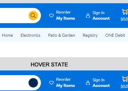
A Less Complementary Color - My Bet: NEGATIVE
Interestingly, the search button lost its high contrast complementary yellow color as it was replaced with a blue hue. I'm going to bet that this decreased its visibility - therefore a negative bet with a decrease to searches.
-
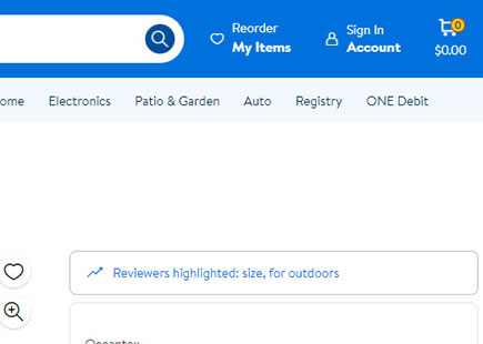
Changed Position And Label Of "Reorder My Items" - My Bet: UNKNOWN
In the variation we can see that "Reorder My Items" moved from the top right towards the second navigation level as "My Items". I think "reorder" is a bit more powerful along with the top right position (perhaps somewhat similar to Amazon?). I'll tag this as an unknown bet (as I'm refraining myself from a negative one).
-
Larger Font Size For Category Links - My Bet: POSITIVE
We can see that the variation increased the font size of the listed categories which may be a good thing. In past experiments I've seen additional search triggers increase various effects - and so this gets my positive bet.
This is very similar to Pattern #79: Product Highlights
-
Navigation Color Change - My Bet: UNKNOWN
We can also see a shift from a darker blue background to a lighter one (barely different from a white background). Something tells me that the darker blue color with white text links is more visible than the inverse. But I'll tag this as an unknown.
-
An Extra Category: Baby Deals - My Bet: POSITIVE
Last but not least, a new Baby Deals category showed up. Possibly a good thing (as hinted with the more search triggers pattern).
This is very similar to Pattern #79: Product Highlights
Comments