Walmart A/B Tested This Winning Homepage
Walmart a/b tested a new version of their homepage which I managed to capture screenshots of. Generally speaking, the new variation is basically longer with more types of products, more results, and a greater distinction between products and categories. After waiting a few weeks, we can also confirm that the new version was implemented - suggesting a possible improvement. And so I thought it might be fun to break down some of these changes and connect them to some of our patterns. Aside of this, I also turned the winning variation into an editable Figma wireframe template (as a free download) in case anyone wishes to use it as a starting point for further design exploration.

B - Aug 16, 2021 Screenshot

Highlighted UI Changes From This Leak
-
Top Nav And Search Bar With More Descriptive Copy
The top navigation gained some additional descriptive copy. This is visible in the search bar that further explains which items will be searched (in stores and online). Also extra copy was added to some sections with additional labels such as "reorder" and "sign in", etc. "Departments" was also called out as a clickable section.
This is very similar to Pattern #2: Icon Labels
-
More Seasonal Products and Categories
The variation has shifted more in the direction of triggering people with actual products and categories instead of showing tertiary offers such as credit cards or memberships. Perhaps such offers are better suited later in the purchase funnel?
This is very similar to Pattern #79: Product Highlights
-
Products Placed Higher
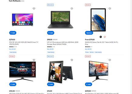
Top selling product selections have been raised higher (in the variation) while competing for the same space with the more general product categories (in the control). Many ecommerce sites actually display a mix of both specific products and product categories and I think this particular change could be interesting to retest as a follow up experiment.
-
Additional Shortcut Buttons - Adds To Cart
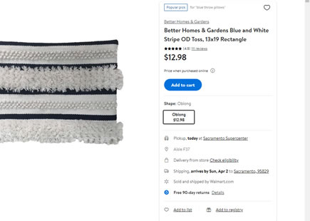
The variation also has more visible shortcut buttons that fast track customers into the shopping cart process, as well as the button styles move away from ghost buttons.
This is very similar to Pattern #77: Filled Or Ghost Buttons
This is very similar to Pattern #51: Shortcut Buttons
-
Unique Styling For Product Categories
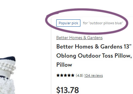
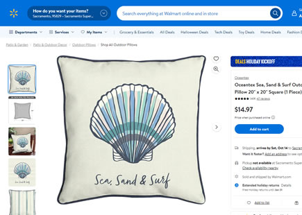
Interestingly, there has been some stylistic adjustments to the general product categories in order to differentiation them from specific products. In the control version both of these look similar as both use realistic product photography. In the variation however, the product categories rely more on abstract illustrations and therefore stand out more.
-
More Product Results
Further on the homepage we see more sets of products being displayed - in line with our own findings in favor of showing more results.
This is very similar to Pattern #36: Fewer Or More Results
-
More Collection Pages
Last but not least, we can see more collection pages (categories) being surfaced with new styling. I would say this might be another example of triggering searches in diverse ways - inline with what we typically see in similar a/b tests.
Comments