Pattern #115: Pricing Comparison Table

Pattern #115  Tested 5 timesFirst tested by Arthur Sparks Recently tested by Daria Kurchinskaia on Mar 25, 2023

Based on 5 Tests, Members See How Likely Version B Wins Or Loses And By How Much

LOSSES
-5
-4
-3
-2
-1
FLAT
+1
+2
+3
+4
+5
WINS

Measured by the sum of negative and positive tests.

A B
Pricing Comparison Table (Variant A) Pricing Comparison Table (Variant B)

Expected Median Effects Of B

?

Progression

(2 tests)

?

Leads

(1 tests)

?

Signups

(1 tests)

-

Engagement

?

Sales

(3 tests)

?

Revenue

(1 tests)

-

Retention

-

Referrals

?

ANY PRIMARY

(5 tests)

Tests

Pattern #115: Pricing Comparison Table
Was Tested On Volders.de by Daria Kurchinskaia

Replaced

Isolated

Test # 463 on Volders.de by $conducted_test->test->user_->first_name . ' ' . $conducted_test->test->user_->last_name Daria Kurchinskaia    Mar 25, 2023 Test link

Find Out How It Did With 23,336 Visitors

  • Measured by completed transactions

This experiment explored a pricing layout that enabled more feature comparisons. It also conveyed more clearly which features were missing between plans. The test has been inspired by this Netflix experiment. Impact on sales was measured.

Get Access To See The Test Results

The Same Pattern Was Also Tested Here

Added

Isolated

Test # 451 on Fluke.com by $conducted_test->test->user_->first_name . ' ' . $conducted_test->test->user_->last_name Marika Francisco    Jan 25, 2023 Test link

Find Out How It Did With 52,560 Visitors

  • Measured by adds to cart

  • Measured by completed transactions

In this experiment, a product comparison table was added in the middle of a product detail page. The comparison table contained products from the same class or family of products. Clicking on the photo thumbnails also allowed customers to visit the specific detail page. Impact on adds to cart and transactions was measured.

Get Access To See The Test Results

Replaced

Isolated

Test # 420 on Designlab.com by $conducted_test->test->user_->first_name . ' ' . $conducted_test->test->user_->last_name Daniel Shapiro    Jul 12, 2022 Test link

Find Out How It Did With 9,521 Visitors

  • Measured by program applications

  • Measured by syllabus or webinars signups

In this experiment, pricing plans were laid out horizontally for easier comparison. In the variation, most of the plan benefits, features and differences were also referenced using a single lable that was left-aligned. The idea was to make the variables aligned and therefore more comparable.

This pricing table appeared at the bottom of a long design program landing page. Impact on leads and applications was measured.

Get Access To See The Test Results

Replaced

Isolated

Test # 294 on Umbraco.com by $conducted_test->test->user_->first_name . ' ' . $conducted_test->test->user_->last_name Lars Skjold Iversen    Apr 23, 2020 Test link

Find Out How It Did With 18,623 Visitors

  • Measured by clicks on any purchase button

In this experiment, plan properties on a pricing page were horizontally aligned (for easier comparison). More so, labels and values were also broken on separate lines.

Get Access To See The Test Results

Replaced

Isolated

Test # 277 on Prepagent.com by $conducted_test->test->user_->first_name . ' ' . $conducted_test->test->user_->last_name Arthur Sparks    Jan 03, 2020 Test link

Find Out How It Did

  • Measured by total sales

  • Measured by total revenue

In this experiment, side-by-side plan features were aligned and changed to a comparison table with checkmarks for easier comparison.

Get Access To See The Test Results

Leaks

Leak #40 from Netflix.com   |   Jan 10, 2020 Pricing

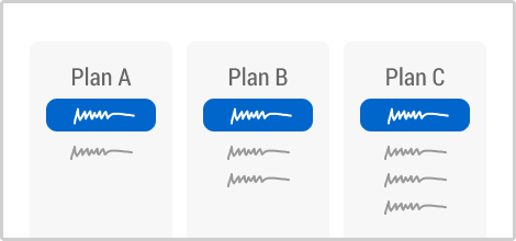
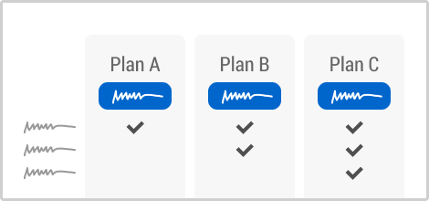
Netflix Keeps Its Older Price Comparison Table And Rejects Their New Layout In This A/B Test

Netflix has been experimenting with the layout of their pricing plans. Challenging the more traditional pricing comparison table, instead they a/b tested three self-contained pricing plan tiles. This newer version however ended up being rejected as we noticed. View Leak

+0.5 Evidence

For each pattern, we measure three key data points derived from related tests:

REPEATABILITY - this is a measure of how often a given pattern has generated a positive or negative effect. The higher this number, the more likely the pattern will continue to repeat.

SHALLOW MEDIAN - this is a median effect measured with low intent actions such as initiating the first step of a lengthier process

DEEP MEDIAN - this is derived from the highest intent metrics that we have for a given test such as fully completed signups or sales.