Booking Fails To Replicate Airbnb's Signup, This Experiment Suggests
It seems to me that Booking may have attempted a replication or imitation of one of their competitors - I'll let you be the judge. More specifically, I detected an interesting experiment on the Booking join page that was similar enough or comparable to the leading Airbnb host a home page. Some weeks later however, it now looks like the experiment variant was rejected and here are my thoughts as to why it possibly lost. Although I clearly believe that the act of copying leaders is an optimal strategy (especially if they take part in rational and optimizing processes as with controlled experimentation), I still believe Booking could have done a better job at their implementation. Details matter.

B - Oct 28, 2019 Screenshot

Highlighted UI Changes From This Leak
-
Shallow Vs Deep Promise Headline
Booking shifted their headline in this experiment from: (A) creating a listing to the (B) discovery of how much one could make from listing their home. This seems like a good direction, however Booking might have also mistakenly "delivered" on their promise right on the same screen. Notice how they actually provide the answer to that question by showing a dollar amount.
Comparing this to Airbnb, I'm going to make a hypothesis that Booking's headline is rather shallow. Airbnb on the other hand makes a deeper promise of actually earning money. Comparatively, the value is demonstrated but not delivered just yet (it requires more action first).
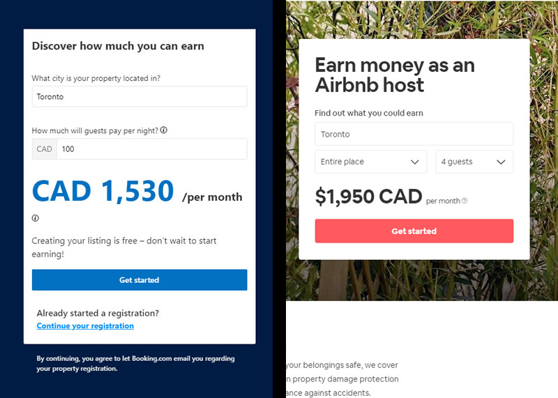
Booking's vs Airbnb's Price Discoverability Signups This is very similar to Pattern #22: Empowering Headline
-
Artificial Vs Useful Questions
In the variant (B), Booking then shows a city field which plays a role in affecting the promised dollar amount that a landlord could generate on a monthly basis. And then, Booking also asks potential landlords how much they would like to charge their guests per night. I suspect this to be the root cause of why the experiment might have broke down for two reasons:
1) Showing the day rate ($100) and the monthly earning potential ($1500) together might hint at questions. If someone does some rapid math ($100 day rate x 30 days = $3000), then this simple calculation might make it seem that Booking takes 50% of the revenue. This of course is not true, but it could be subtly implied.
2) More so, asking users about their desired day rates and then using that to project monthly income, doesn't feel like users are being educated about their potential. Instead, this feels like the calculation itself is really on the user to figure out on her/his own.
Comparing this to Airbnb, they ask about 3 critical factors that influence the projected price: location, the type of apartment (room, full, shared, etc) and number of guests. Using this, they provide a more realistic price range. Airbnb educates potential landlords, without raising eye brows over how big of a cut they will take. To me thats's a solid approach.
This is very similar to Pattern #11: Gradual Reassurance
-
Orphaned Elements
Here I just wanted to criticize the quality of the implementation - orphaned elements. We can see two unnecessary and wasteful line breaks before elements that could be tighter (the "?" tooltip, and the word "earning"). Such orphaned elements may hint at a subtle sloppiness to some picky designers, but more specifically they may also push the call to action lower. Could this have played some microscopic role in the measured effect?
-
Subtle Next Step
Finally, in the B variation, Booking swapped the first price discoverability component with the next step of the registration process - containing the name and email fields. From what I remember about the experiment, there might not have been any way to move back (if someone wished to adjust anything for whatever reason). Such an inline change also raises questions about "perceived progress" - do users really see that they went to step 2 after submitting a form? Not sure.
What we do know comparatively, is that Airbnb uses a clearer and more dramatic modal for their next step. This might have the added benefit of 1) being able to collapse ihe model and move back a step, as well as 2) hinting about progress more visibly. Here is what the step 2 modal looks like on their site:
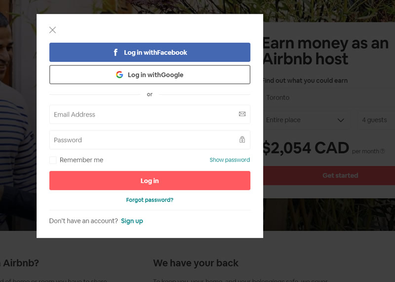
Airbnb's Step 2 Modal


Hats Off For Imitation
I'm going to repeat this one more time because I think it's important: I believe it noble of companies to attempt replicating each other success. Hopefully my write up here hasn't suggested otherwise nor is perceived as shameful in any way. If/when we attempt to copy each other, we are being human, we're social, and we are attempting to learn from each other. :) I personally look up to leaders everyday, including both Airbnb and Booking. Both companies have detected some really interesting and intelligent UI improvements through experimentation. With that, I really hope that Booking.com attempts this experiment one more time - perhaps with some of the above suggestions in mind? I feel there is more upside to be copied. :)


Comments
John Ostrowski 7 years ago ↑0↓0
Hello from Poland Jakub!
Great detective work here, I really appreciate the effort on the details as well as finding all references for supporting the idea from GoodUi's database.
I reached the same conclusion as mentioned by AB above prior to reading the comment. Based on the suggested visual hierarchy of Booking's test, it seems like they were testing the framing of front loading with the monetary benefit (a risk-taking strategy?). The first element I've noticed on the page was "CAD" which framed my experience to "money here".
On the other hand, my experience feels more natural and smooth with the more balanced AirBnB version, I read the headline and then noticed the money, it tells a better story that's for sure.
I just can't assume that it was a bad set-up from Booking's team, but a hypothesis specific direction.
Keep the team motivated to bring more findings for us Jakub, enjoy holidays!
John :)
Reply
AB 7 years ago ↑0↓0
The first time I saw the "CAD 1,530", I thought it was inserted text into the screenshot. It's way too big compared to other text on the page. If you see Airbnb almost matched the text size to their title "Earn money as an Airbnb host" so it doesn't look out of place. Maybe Booking.com should try different variants for this before giving up?
Reply