Booking.com A/B Tested Single Vs. Multiple Line Search Forms
It's now clear that Booking ran somewhat of a larger leap experiment of two very diverse search layouts on their Apartments landing page. I'm glad we discovered this one as we now know for sure their awesome team doesn't only run microscopic single change experiments. Unfortunately the B variant was rejected in favor of A, as we learned a few weeks later. Here are some of the possible differences that may have contributed to some observed effect (unknown to us) and Booking's decision (known):
A - Feb 4, 2019 Screenshot
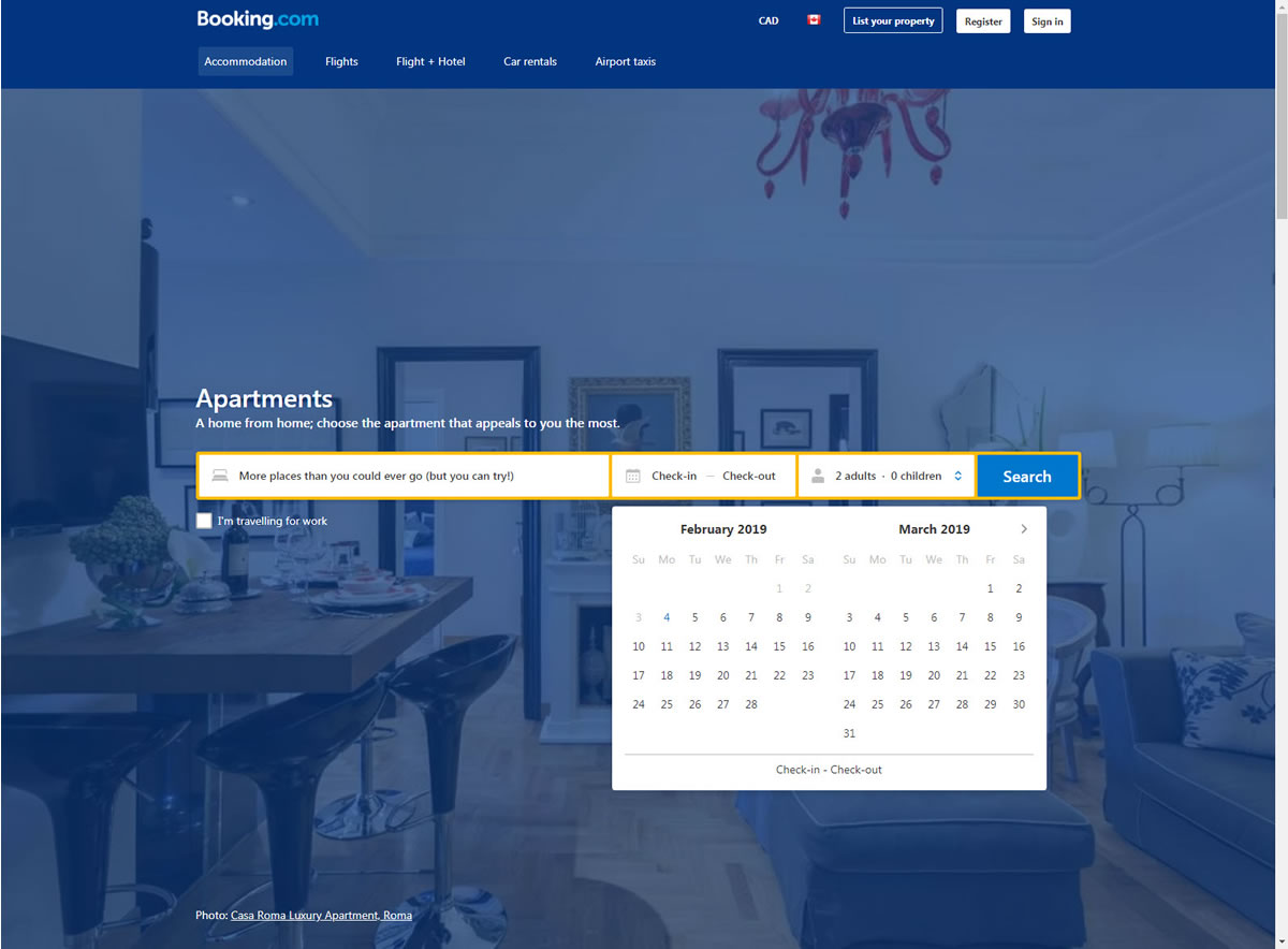
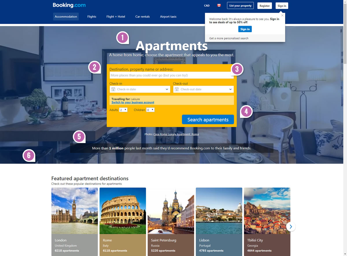
Highlighted UI Changes From This Leak
-
Bigger And Higher Headline
Clearly the B variant had a larger, more central and higher positioned headline or title.
-
Single Vs. Classic Multiline Search Box
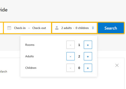
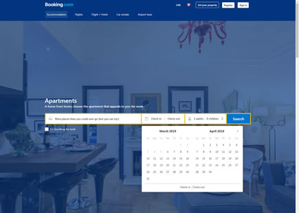
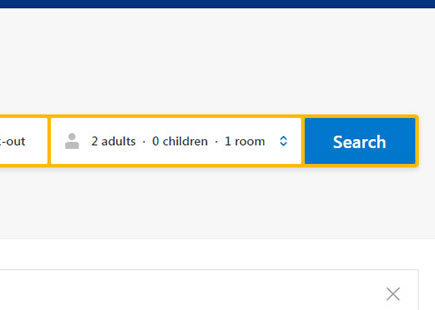
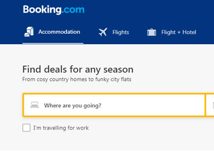
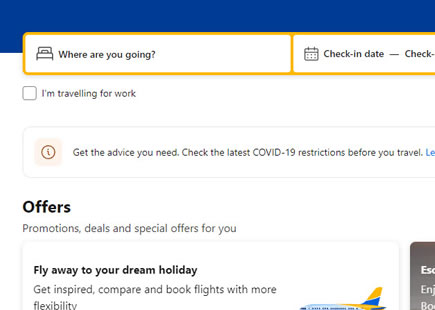
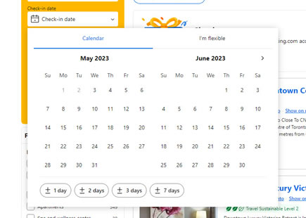
This is arguably one of the more visible and drastic UI changes. The B variation displayed a classic search component with various form fields separated and broken onto multiple lines. Due to heavy padding, the yellow background color also stood out more visibly. Whereas, the A version rendered the full search input across a single horizontal line, while minimizing the padding between each field. Interestingly, this wider set of form fields (A) allowed the calendar picker to expand without overlapping the main search button (more on this later).
-
Smaller Form Fields
Comparing the A and B versions, the latter had slightly smaller form fields sizes.
This is very similar to Pattern #97: Bigger Form Fields
-
Different Button Labels
The main buttons also differed slightly in size due to the label change from "Search" to "Search apartments".
-
Social Proof In Numbers
The B variant displayed a subtle social proof element claiming that over 1 million people have recommended Booking.com in the last month.
This is very similar to Pattern #7: Social Counts
-
False Bottom
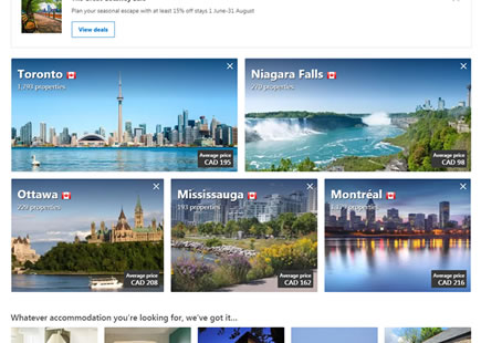
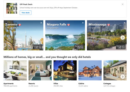
Last but not least, the B variant avoided a false bottom by showing additional content sections underneath without pushing them artificially downwards (as in A). The A version's layout stretched the search container to evoke a false bottom and therefore provided more focus to the search action as opposed to the content below (which was also present, except not visible in the screenshot).
This is very similar to Pattern #58: Full Height False Bottom

Comments
Ivan Burmistrov 6 years ago ↑0↓0
ThomasCook.com tested absolutely the same in June 2016 and they decided to keep multiline search box: https://www.interux.com/misc/ThomasCook-Test-2016.png
Also, Expedia – who conducts thousands A/B-tests per year – still keep their classic multiline search box.
As an online travel expert, I am sure that multiline search boxes work better than horizontal ones.
Reply
Jakub 6 years ago ↑1↓0
Ivan, I appreciate your examples. Let's keep in mind that there are multiple variables at play here. And the best evidence for / against multiple line forms would be an isolated or controlled experiment.
The cropped ThomasCook screenshots with different dates tell us very little. How do you know they ran an a/b test? Were there other changes being tested in that experiment? It could be an interesting counter example, or perhaps it was just a business decision of some sort. I'm not too familiar with the experimentation culture of Thomas Cook.
Same with Expedia. Just because they run a/b tests, doesn't mean they actually tested this isolated change. Would be interesting to see a specific example of such a real experiment, with real numbers. Until then, I'm holding off on such strong conclusions and would encourage to maintain uncertainty..
Reply
Ivan Burmistrov 6 years ago ↑0↓0
Thank you for your reply.
I can only notice that Thomas Cook used multiline design before June 2016, they tested horizontal design in June 2016, and they returned to multiline in July 2016 and keep it up to the present day.
Expedia tests everything microscopically, but I can’t present the evidence that they actually tested multiline vs horizontal design.
In all your “leaks” you factor out a very important factor: higher management decisions. Higher managers systematically ignore results of any testing in favor of their “opinions”. In case of Booking.com test a higher manager might say: “We must follow the trend – horizontal design”. And this is the final design decision.
Reply
Vahur Metsala 6 years ago ↑0↓0
Interesting,
The implemented version looks very much like the airbnb form that they had for a while (the background was a full page "life at destination" clip).
I would guess the implemented version was chosen because of it's lesser visual "weight"? Maybe users would think that since the perceived "weight" was less then also the effort needed for a search would be less and they would more likely perform a search? Plus there is just less noise, only the bare minimum shown.
It would be very interesting to know what the data behind it was.. :D
Reply
Gabriel Lopez 6 years ago ↑0↓0
Jakub,
Was this intended to say:
Unfortunately the B variant was rejected in favor of A
Instead of what is written:
Unfortunately the B variant was rejected in favor of B
Thanks for the great work you do!
Reply
jakub 6 years ago ↑0↓0
Yes. You're right. Corrected :)
Reply