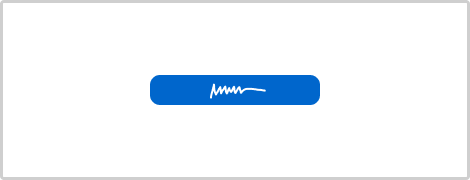
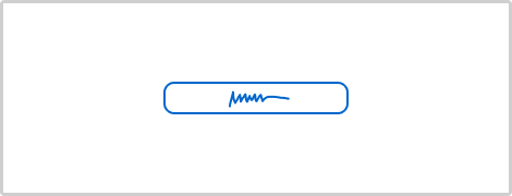
Pattern #77: Filled Or Ghost Buttons
Pattern #77 Tested 7 timesFirst tested by  Luke Hay Recently tested by
  Andrey Andreev on Mar 22, 2025
With A Total Of 4 Evidence For Version B It Is Very Likely Worse
Measured by the sum of negative and positive tests.
Expected Median Effects Of B
-9.6%
Progression
(7 tests)
-
Leads
-
Signups
-
Engagement
0.3%
Sales
(4 tests)
-
Revenue
-
Retention
-
Referrals
-1.1%
ANY PRIMARY
(7 tests)
Tests
Sorted by:
Pattern #77: Filled Or Ghost Buttons
Was Tested
On Online.metro-cc.ru
by
Andrey Andreev
Variation B Was Worse
-
Measured by completed searches | p-val 0.00000001
-
Measured by completed purchases | p-val 0.01390546
- 45.0% (201591 successes out of 447656 visits)
- 0.8% (3691 successes out of 447656 visits)
- 40.7% (182583 successes out of 448353 visits)
- 0.8% (3489 successes out of 448353 visits)
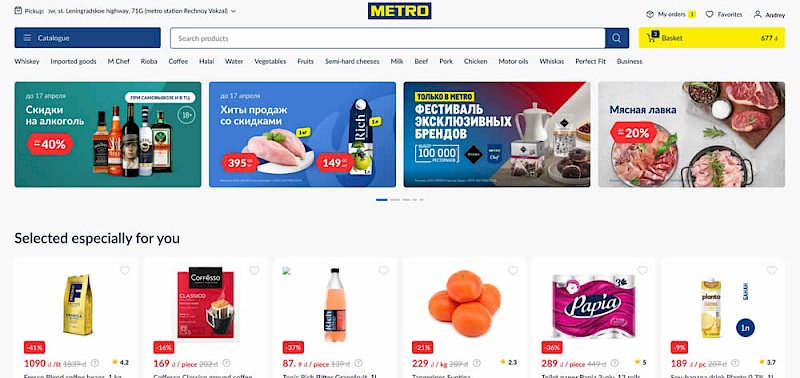
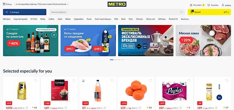

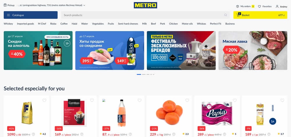
In this experiment, a higher contrast search bar with a blue border and a filled blue button style was tested against a more feint style. Impact on searches and purchases was measured. (A/B test was inverted to B/A in order to fit the filled-vs-ghost button pattern).
Variation B Was Insignificant
-
Measured by adds to cart | p-val 0.00000001
-
Measured by completed sales | p-val 0.26761044
- 65.9% (409735 successes out of 621571 visits)
- 1.3% (7979 successes out of 621571 visits)
- 64.4% (399731 successes out of 620899 visits)
- 1.3% (8110 successes out of 620899 visits)
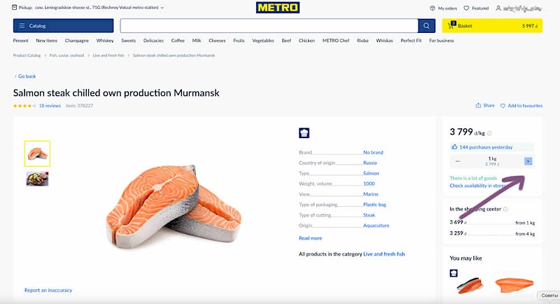
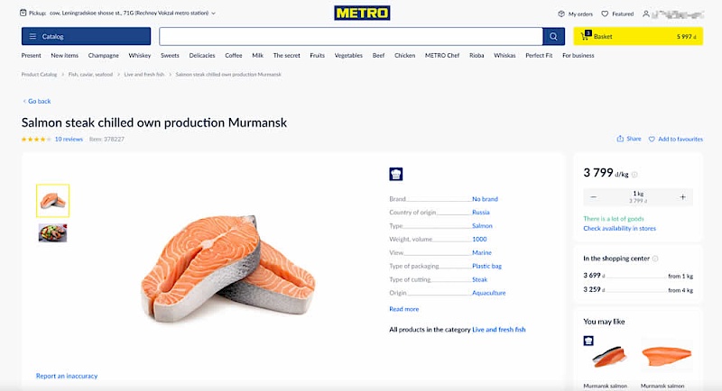
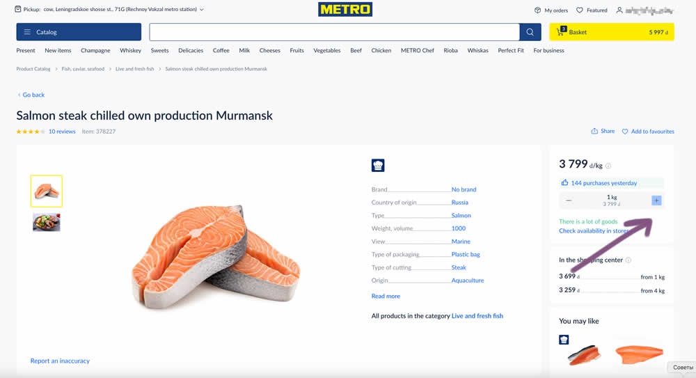

In this experiment, the plus and minus quantity icons near the add to cart button were tested with different contrasts. The control had a higher contrast from a solid background color, and the variant was lower contrast. Impact on add to cart and sales was measured. (A/B test was inverted to B/A in order to fit the pattern).
Variation B Was Insignificant
-
Measured by clicks on checkbox | p-val 0.04084492
-
Measured by completed purchases | p-val 0.31060228
- 45.0% (12619 successes out of 28032 visits)
- 41.2% (11542 successes out of 28032 visits)
- 44.2% (12361 successes out of 27993 visits)
- 40.8% (11408 successes out of 27993 visits)

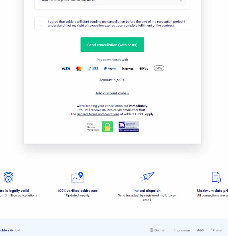
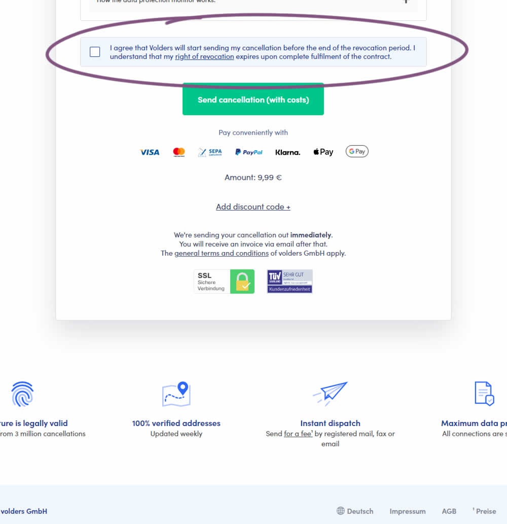
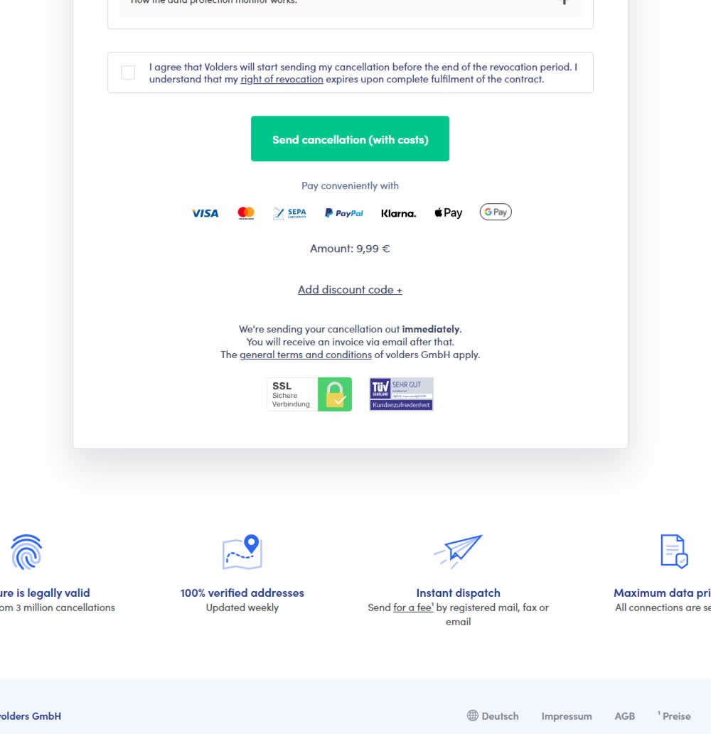
In this experiment, a less visible (ghost button style) legal confirmation box, was tested against a more visible one (filled state with higher contrast). Impact on error rates (from submitting an incomplete form) and sales was measured.
Variation B Was Insignificant
-
Measured by visits to a detail page | p-val 0.00000001
-
Measured by membership sales | p-val 0.68327197
- 12.7% (37853 successes out of 298012 visits)
- 0.4% (1233 successes out of 298012 visits)
- 9.4% (27929 successes out of 296985 visits)
- 0.4% (1249 successes out of 296985 visits)
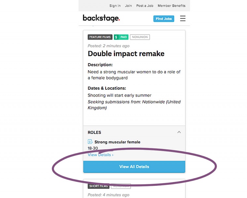


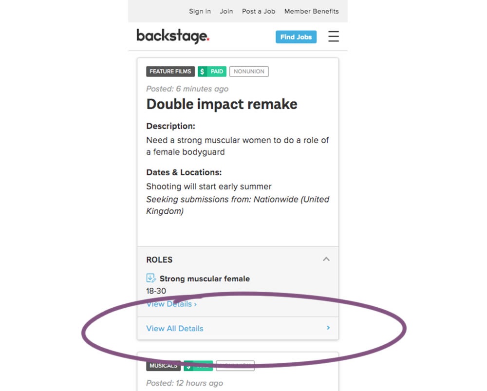
In this experiment, the style of a button leading to view detailed casting calls on a listing page was changed. In the A version the style was a filled high contrast blue background, and the B variation had a feint "ghost button" style.
Variation B Was Worse
-
Measured by clicks on the secondary button | p-val 0.00000001
- 8.4% (2273 successes out of 27167 visits)
- 6.5% (1724 successes out of 26451 visits)
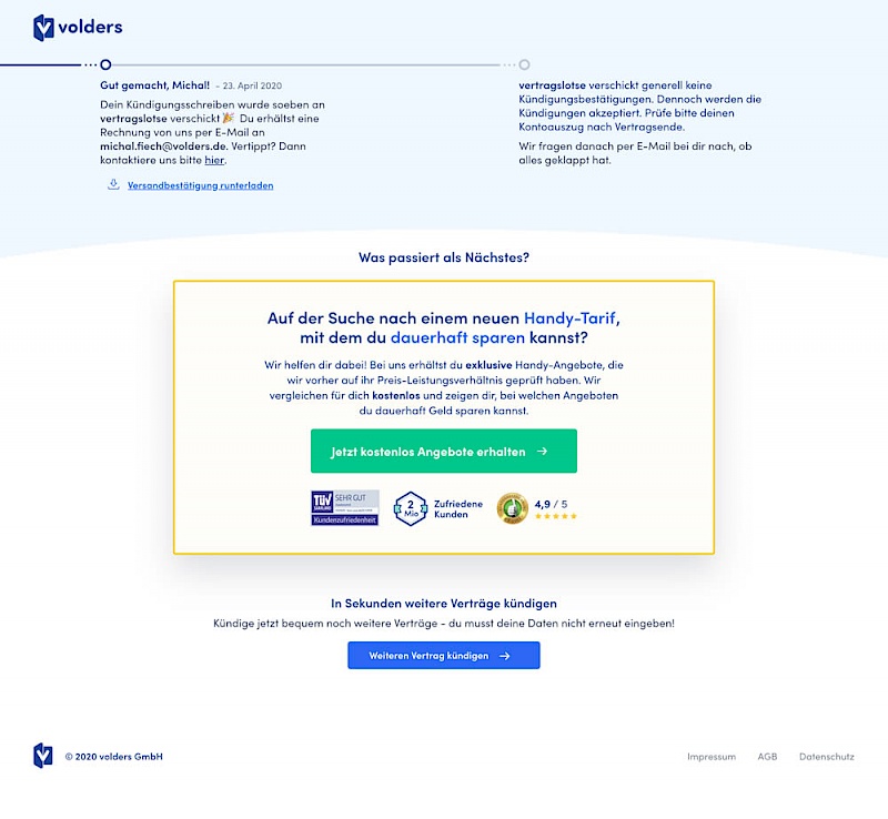
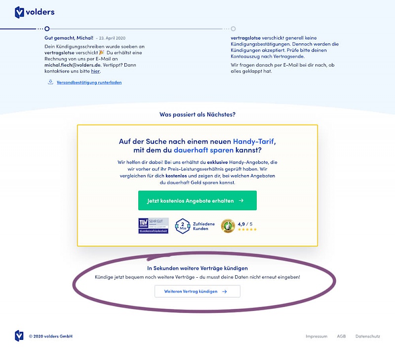
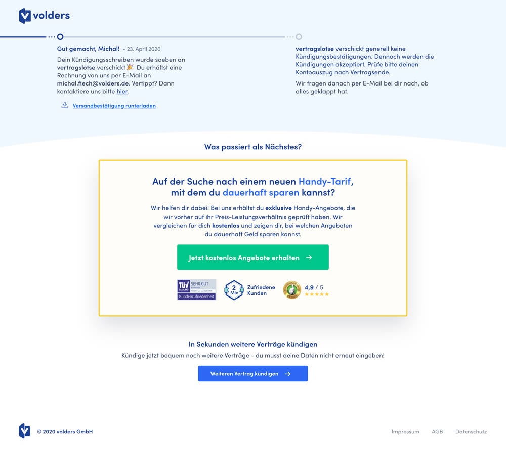
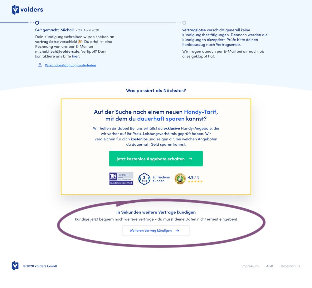
This experiment measured a shallow click goal on a button that would encourage to repeated the action that was just completed (in this case a contract cancellation). In the control version (A) a thank-you screen shows a filled button style, and the variant (B) there was a ghost button. As a note, I also flipped the A-B in this experiment for the purpose of matching it to our ghost button pattern, which means that Volders in fact was starting out with a ghost button to begin with.
Variation B Was Insignificant
-
Measured by visits to pricing page | p-val 0.78386322
- 8.4% (1053 successes out of 12493 visits)
- 8.3% (1046 successes out of 12553 visits)
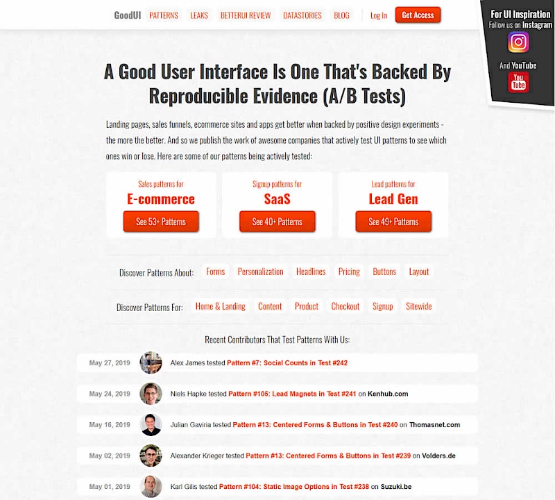
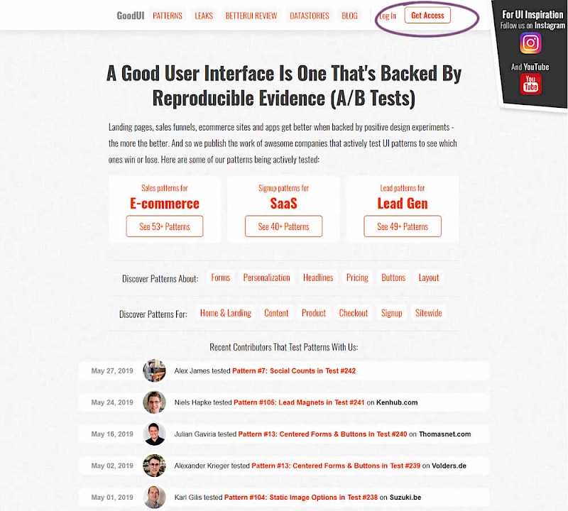

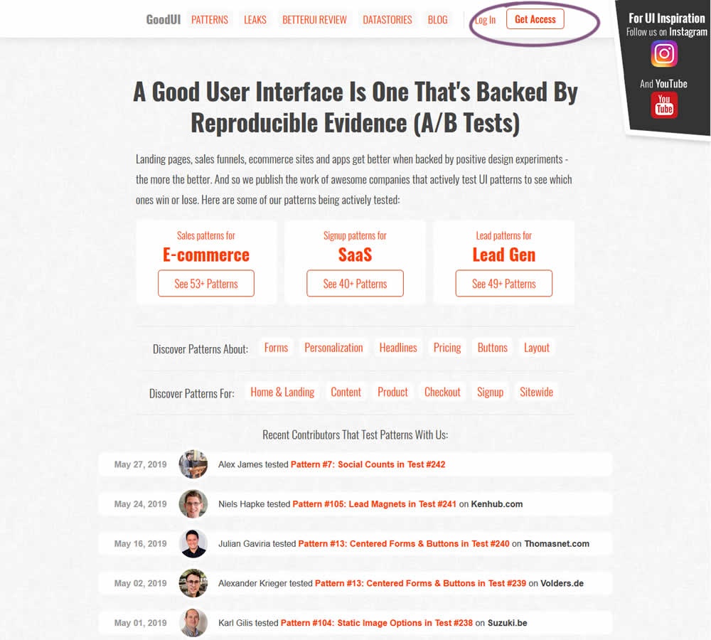
In this experiment, full red background buttons were changed to ghost buttons (red outline and transparent fill)
Variation B Was Worse
-
Measured by clicks on any of the primary buttons

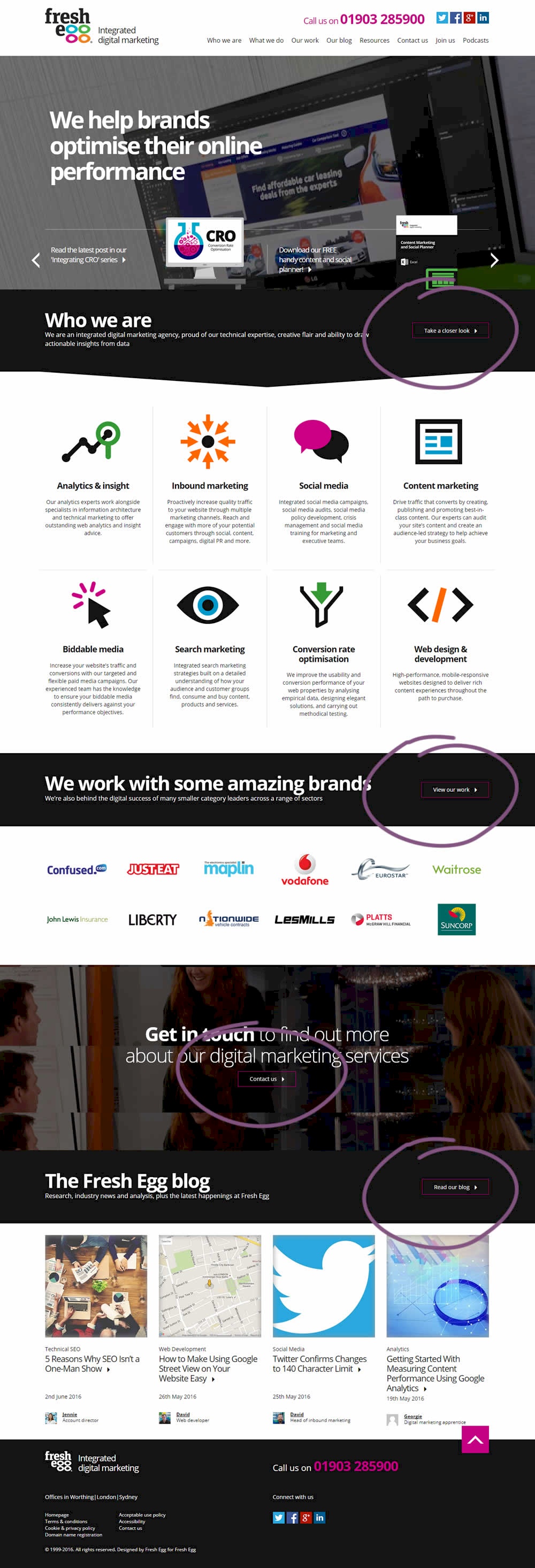
In this experiment, standard (filled) buttons were tested against ghost buttons.
Leaks
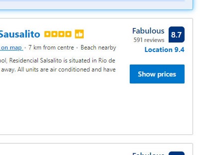
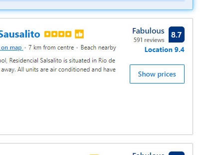
Booking A/B Tests Ghost Buttons, But Their Hopes Fade Away As Predicted
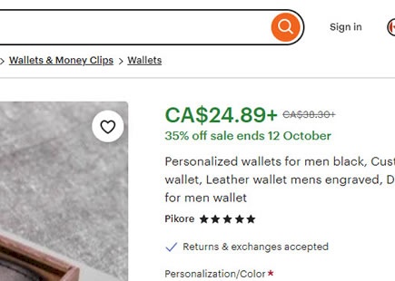
Ghosts buttons. We know that this style of buttons is net negative based on this evidence-based pattern. So when Booking ran this experiment, it's no surpirse that it was eventually rejected - a predictable replication. View Leak
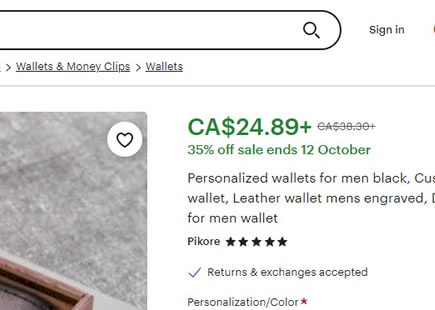
Etsy A/B Tests This High Contrast Button Style
Etsy ran a little A/B test where they probably tried to encourage more searches with the help of a stronger visual cue in their search bar. Instead of using a ghost-like icon only approach for the primary search, they stylized it as a high contrast button. Fast forward a few months and it now looks like the variation was implemented. View Leak
For each pattern, we measure three key data points derived from related tests:
REPEATABILITY - this is a measure of how often a given pattern has generated a positive or negative effect. The higher this number, the more likely the pattern will continue to repeat.
SHALLOW MEDIAN - this is a median effect measured with low intent actions such as initiating the first step of a lengthier process
DEEP MEDIAN - this is derived from the highest intent metrics that we have for a given test such as fully completed signups or sales.


