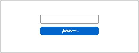
Pattern #97: Bigger Form Fields
Pattern #97 Tested 4 timesTested by  Stanley Zuo on Jan 24, 2024
Based on 4 Tests, Members See How Likely Version B Wins Or Loses And By How Much
Measured by the sum of negative and positive tests.

Expected Median Effects Of B
X.X%
Progression
(4 tests)
X.X%
Leads
(1 tests)
X.X%
Signups
(1 tests)
-
Engagement
X.X%
Sales
(1 tests)
-
Revenue
-
Retention
-
Referrals
X.X%
ANY PRIMARY
(4 tests)
All 4 tests meta-analyzed: combined effect (p-val X.XXXX)
40.3% of 90% cumulative power target at 2% MDE from 4 tests Help replicate this with an A/B test


Leaks
Airbnb Switched To A Bigger Button After Running This Design Experiment


Here is a perfectly simple optimization of a "Get started" button on Airbnb's host signup landing page. Airbnb ran an experiment of a smaller vs larger button size. I know because I managed to capture two diverse screenshots with the same date stamp. :) More so, a few months later Airbnb rolled out the later button to 100% of their traffic - hinting at a successful experiment outcome. View Leak
Zalando Rejects A/B Tested Company Logos And A Smaller Add-To-Cart Button


Zalando (Germany) has been experimenting with at least two interesting cascade variations on their product page. Both of these variations seem to have been rejected which is consistent with other evidence in favor of larger buttons. View Leak
Netflix Designs Their Button A Little Too Big


Sooner or later design properties should reach optimums for their given contexts. That is, UI elements will become just right - not too big and not too small, or not too high and not to low, etc. In this leak, it seems that Netflix has approached such an optimum when they tested various button sizes on their landing page. Given that form elements and buttons should generally be bigger, it was inevitable for this new evidence to appear as an example of a button being simply too big - as seen in this beautiful experiment. :) View Leak
Etsy Discovers A Better, Padded And Wider Search Bar In This A/B/C Test


Etsy just completed a cascade experiment with 3 version of their global search bar. Interestingly the cascaded version with all inherited changes, took the lead. View Leak
Bol A/B Tested A More Padded Button


Last year I captured this button experiment from Bol (a leading online retailer in the Netherlands). They tested a smaller button with less padding against a slightly more bloated one. It's now clear that the variation was rolled out completely - consistent with the bigger form fields and buttons pattern. View Leak
Bol A/B Tests A Bigger Add-To-Cart Button That Is Rejected


After detecting some success with a more padded button, Bol continued their a/b test iteration. The Dutch online retailer ran an experiment with an even wider add-to-cart button on their product pages. View Leak
Amazon A/B Tests Wider Buy Boxes On Their Product Pages


Amazon was noticed A/B/C testing at least 2 wider buy box variations on multiple product detail pages. This was an interesting "intensity" experiment where the same hypothesis (related to layout column widths) was varied with 2 intensities. View Leak
For each pattern, we measure three key data points derived from related tests:
REPEATABILITY - this is a measure of how often a given pattern has generated a positive or negative effect. The higher this number, the more likely the pattern will continue to repeat.
SHALLOW MEDIAN - this is a median effect measured with low intent actions such as initiating the first step of a lengthier process
DEEP MEDIAN - this is derived from the highest intent metrics that we have for a given test such as fully completed signups or sales.