Amazon A/B Tests Wider Buy Boxes On Their Product Pages
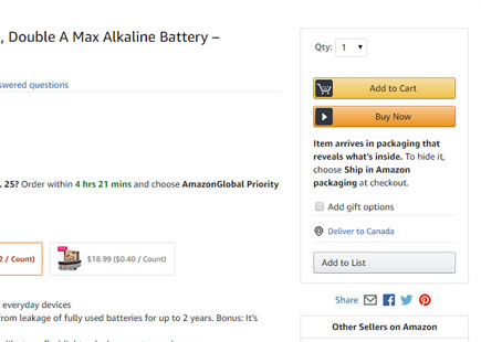
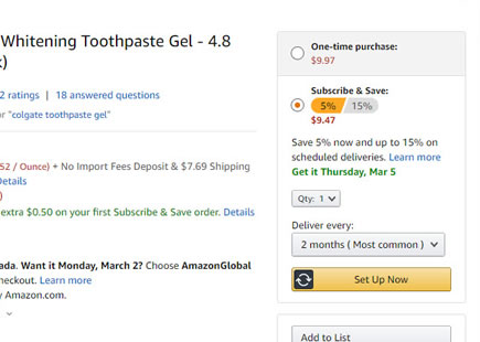
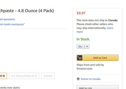
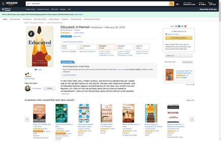
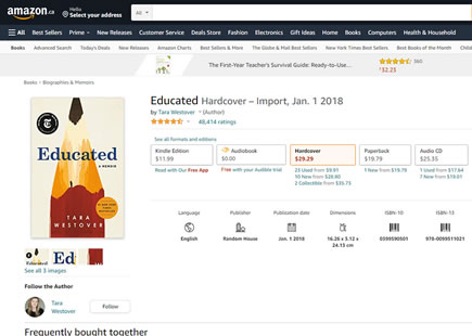
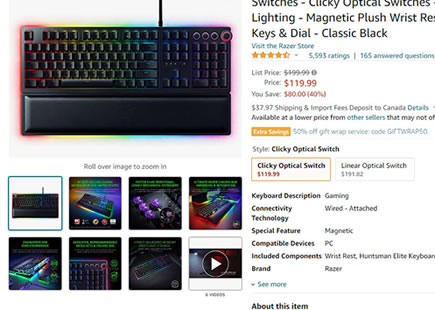
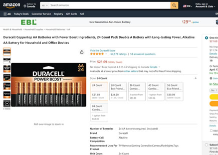
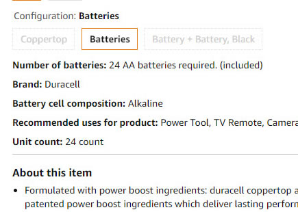
Amazon was noticed A/B/C testing at least 2 wider buy box variations on multiple product detail pages. This was an interesting "intensity" experiment where the same hypothesis (related to column widths) was varied with 2 intensities. If my observation is correct, the experiment may have completed with both B and C variations being rejected. Although let's check back on this again in the future as the experiment still feels fresh - with a possible iteration or decision lag.
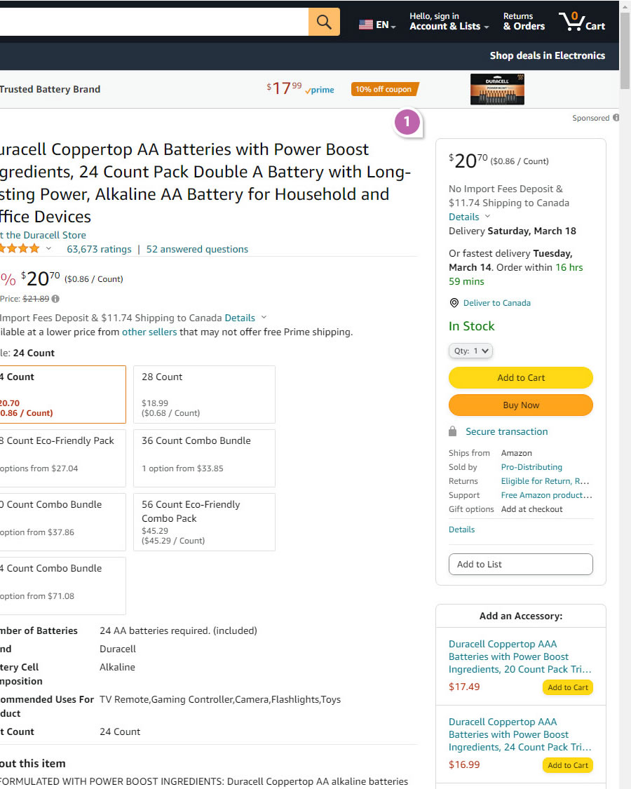
B - Mar 9, 2023 Screenshot
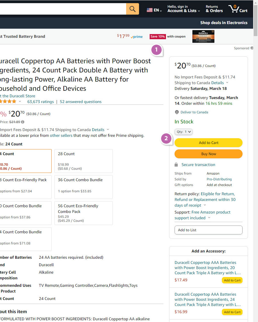
C - Mar 9, 2023 Screenshot
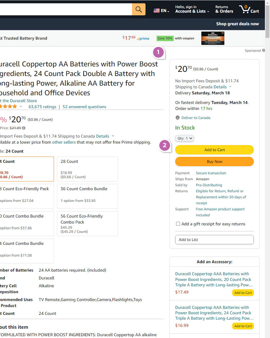
Highlighted UI Changes From This Leak
-
Wider Right Column Buy Box
The B variation contained a wider buy box, condensing the middle body column (with product descriptions) as a result. The C variation intensified this change ever further by widening the buy box even more.
-
Wider Add-To-Cart And Buy Buttons
Perhaps also worth a mention that the primary calls to action were also filling in the widening buy box. Hence in both B and C variations we can see a widening of buttons - typically a good thing - yet in this experiment, perhaps were offset by other negative effects. Or perhaps the buttons were already visible enough.
-0.5 Repeatability has been assigned to Pattern #97: Bigger Form Fields as evidence that it's getting worse
Repeatability is a net count of evidence for or against a pattern. It’s how we can predict which patterns are better than others. :)
Comments
Ivan Burmistrov 3 years ago ↑1↓0
I am afraid it’s time to reconsider the pattern “bigger CTA buttons work better”, because already three leaks – from Netflix, Bol and now Amazon – bear evidence in favor of “CTA buttons must have an optimal size (not too small, not too big)” principle. (Another Bol leak, “Bol A/B tested a more padded button”, is perhaps about changing CTA button color, not only its size.)
Reply