Amazon Discovers A Better Product Option Selector In This A/B Test
Amazon has been experimenting with different formatting of product choice selections. Think of books being customized as hardcover, audio or paperback. Think of product quantities and colors. I've been observing Amazon run a sequence of such similar tests over the last few months and here is one such experiment with at least 3 properties that now have been implemented - hinting at higher optimality.

B - Oct 26, 2021 Screenshot

Highlighted UI Changes From This Leak
-
Wider Rectangular Buttons
The first visible change is a shift towards a more button shaped choice. It looks like rectangular or wider buttons seem to be better than smaller squares. Could this be because of a bigger button size?
-
Details Inside
Secondly, we can see that the price or labels of the selection have moved inside the button in the variation. I haven't checked if in the control, the labels were clickable or not as sometimes larger hit/click areas could have a positive effect on making selections easier.
-
Contrast Between Selected / Unselected Options
Finally, we can also see that a higher visual contrast between unselected and selection options. More concretely, the variation has gray prices on unselected options and darker prices on the selected choice to reinforce this.
Has This Also Worked In Other Products?
Amazon is a beast of a company and often we can find differences in the UI between product groups. Luckily I managed to capture the same experiment on another product - like this pair of headphones.


Here we can see both the control and variation screenshots with the latter also being eventually implemented.
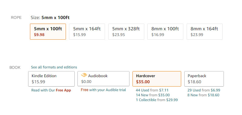
Should Option Labels Be Repeated Inside The Button?
Thinking further about these selector formats while glancing over other products, more questions started to surface. Specifically, is it better to include a choice label (ex: the color name, the quantity amounts, etc) inside the button or leave them outside as a subheadline? Although the referenced experiment did not control for this change (both the control and variation only used image thumbnails), I did find other products (outside this experiment) that did show labels inside the buttons. These included: book formats and product dimensions. I'll leave this as a a question, but am subtly leaning or hypothesizing that labels might be good.
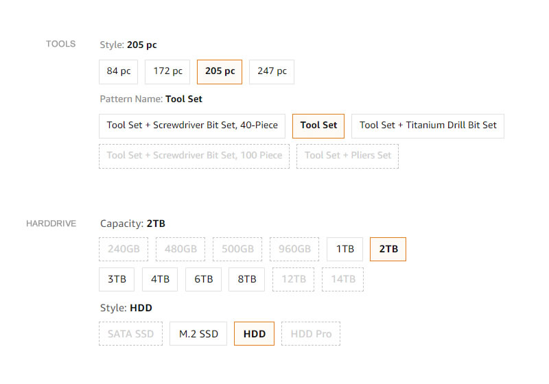
What About Multiple Options?
Finally, looking through more products, I did notice another set of more complex products with at least 2 dimensions of choices. Usually in these more complex situations, the products did not show the prices. Hypothetically, it might be that showing too many conflicting prices is too confusing in such contexts. A better approach might be to simply show one price total in this case. Although it would be more interesting to see an actual experiment like this.


Comments