Booking's vs. Airbnb's Mobile Homepage UI
There are some interesting differences in how Booking and Airbnb have designed (and optimized) their starting home screens on mobile. I've compared the screenshots of both in order to surface some of the more interesting UI design questions - and where possible linked to actively tested UI patterns.
Starting Screens

- Mobile App Or Not
The first difference is that Booking makes their app download the first visible element. Airbnb doesn't. Should mobile versions push app downloads or not? If so, then how prominently? Or is this something best reserved for later on in the process after some initial interactions? - Logo Or Not
Booking then indicates it's actually Booking by displaying it's own logo in a conventional approach. Airbnb doesn't - raising the question whether logos are necessary on mobile? - Hamburger Menu Or Not
Booking shows a typical hamburger menu. Airbnb doesn't. Does Airbnb know something about encouraging search and removing distractions? :) - Search Categories Or Personalized Functions
Further down, Booking continues to show a menu with categories that enable a browse experience. Airbnb doesn't show this upfront, but rather has a more extensive list of destination categories at the very bottom of their long page (seen on the longer screenshot). Instead, Airbnb also shows and floats three options of a higher level: explore, saved and login. Generally speaking, we did observe that providing more options as well as floating some elements both have positive signal. - Functional Headline Or A Timely One
Booking's largest copy is "Search". Airbnb shows "Go Near". I'm interpreting this second headline as one that ties in closer to what has been happening in 2020-21 - with travelers not travelling that far. - Multiple Upfront Form Fields Or A Single One
Booking then asks for a lot of fields upfront including check-in dates, number of guests, and their long-lived "travelling for work" checkbox. Airbnb only asks for a single destination input form and encourages input of the remaining options further in the process. Interestingly we have a few patterns supporting this latter approach. These include breaking actions down into multiple steps, or asking for fewer form fields altogether. - Secondary Browse Experience
With all the empty space, Airbnb shows a secondary action button, linking to an exploratory browse experience. - Teasing With Nearby Destination
Airbnb has some extra remaining above the fold space to tease with nearby destinations - further letting people know that they can browse by location. Something tells me that they remembered to avoid false bottoms from a previous experiment and made these appear partially on purpose. :) - Not Sticky Or Sticky Elements
It looks like Booking doesn't have any scrolled state with all of their elements being static. Airbnb on the other hand floats their search input at the very top at all times. Perhaps it makes sense to do this when you have a powerful search experience. Either way we're tracking floating elements here as well as making search more visible as two separate patterns. - Labels With Placeholders Or Simpler Placeholder Only Inputs
Once users focus on the search input, both Booking and Airbnb take over the screen with a full height custom search screen. One difference is that Booking has this two part input field where they show a top-aligned label followed by the actual input with some placeholder copy. Airbnb merges these two into a simpler placeholder-only form field. I'm not sure which one is better but years ago we started tracking a similar pattern here. - Generic Text Only Categories Or Categories With Images
Booking does show some icons nearby their destination suggestions. Airbnb however takes it one step further and introduces more visual (and more attention grabbing) full color illustrations. And we're starting to see the potential in this approach that uses images along side category links. - Encouraging Exploration And Sign In
Airbnb here is clearly offering a more visible option to browse more extensively or sign in for a better experience. Interesting. :)Expanded Search - Logged In
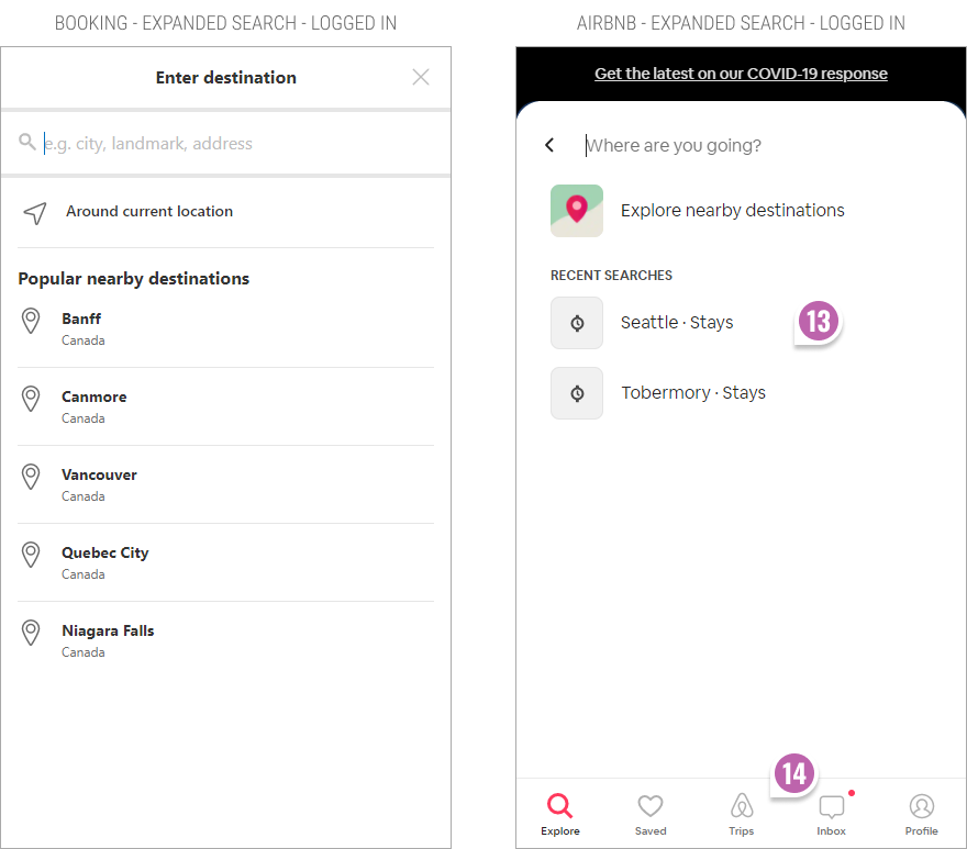
- Personalized Recent Searches
I'm surprised that Booking doesn't show any personalized searches after having logged in (unless I haven't recently searched for anything). Airbnb does show my recent interest in search queries (Seattle and Tobermory) and surfaces those for higher relevancy. - Personalized Bottom Navigation
For logged in users, Airbnb surfaces an even more personalized sticky navigation encouraging interactions such as: exploration, looking up saved properties, trips, messages and account profile settings. This latter approach feels like it has more potential although I could be wrong.Full Screenshot
- More Search Triggers
The complete screenshots probably has a lot more little differences. One thing I'm just seeing generally, is that the Airbnb screen is longer and offers more ways to search. I'm confident that Airbnb's approach has more probability in generating more interactions as observed from patterns like here and there.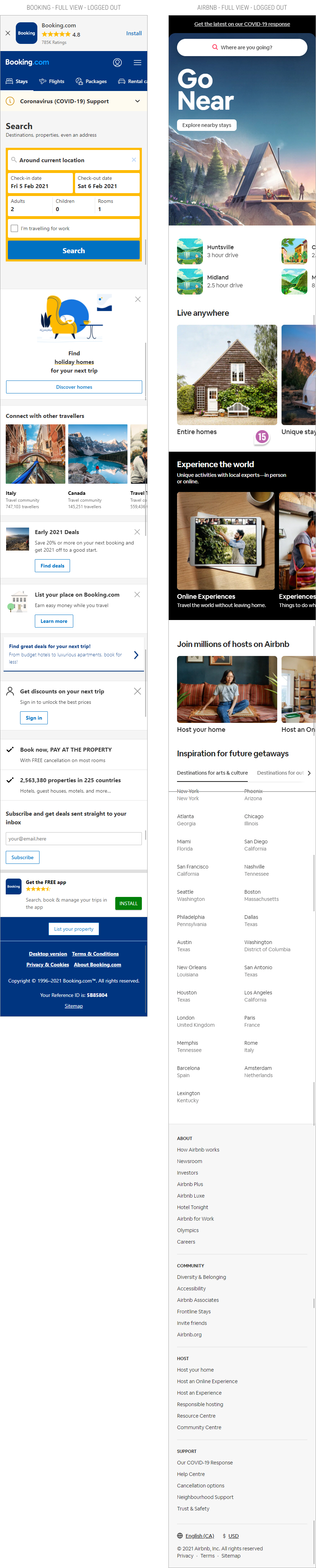
The Scrolled State

Expanded Search - Logged Out


Posted by  Jakub Linowski on Feb 05, 2021
Comments