Booking A/B Tests A Highly Prominent Deals Page And Possibly Rejects It
Booking ran a very prominent header experiment on their homepage. In this experiment they directed more traffic towards a dedicated deals page. They've done this by changing the top elements (header, adding a button, etc.). From distance of time however, it doesn't look like the variation has survived the experiment other than the less prominent and secondary deal section (outside of this experiment). Interestingly, we started tracking similar experiments under this pattern.
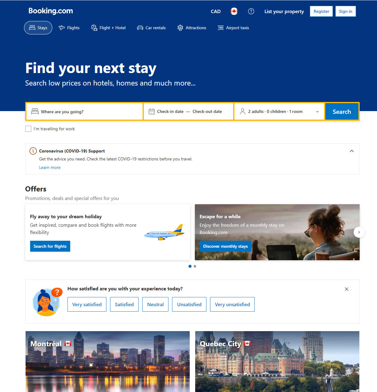
B - Apr 12, 2023 Screenshot
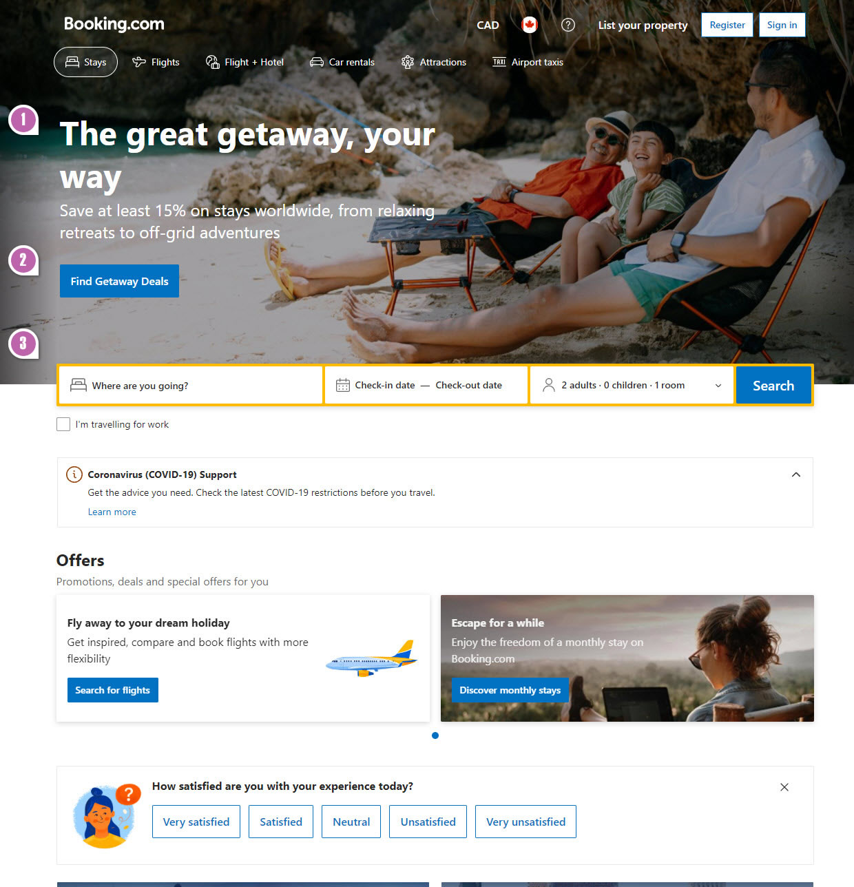
Highlighted UI Changes From This Leak
-
Headline Change
One of the more visible changes in the variation starts with the headline change as it was swapped to "The great getaway, your way".
I doubt the outcome would have been any different, but the orphaned "way" after the line break probably doesn't help here.
-
Additional Primary Button
Secondly, and probably the highest effect, came from adding the "Find Getaway Deals" button right in the header. It lead users to a dedicated page with additional deals (see screenshot below).
0.5 Repeatability has been assigned to Pattern #130: Less Or More Visible Offer Pages as evidence that it's getting better
Repeatability is a net count of evidence for or against a pattern. It’s how we can predict which patterns are better than others. :)
-
De-emphasized Primary Search
As a result of the above changes, the primary search has shifted downwards - also probably not helping.
The Deals Page
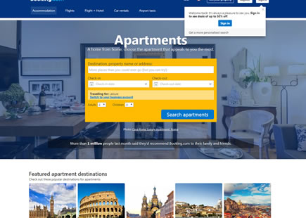
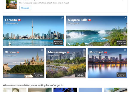
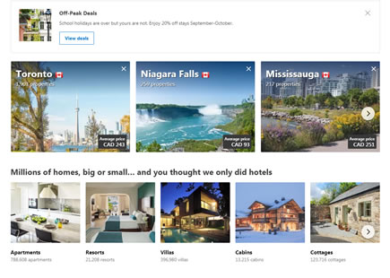
Upon clicking "Find Getaway Deals" users would land on this deals page with city-based deal categories. (I should have taken a longer screenshot, I know.)

Comments