Booking A/B Tests Rounded Corners On Multiple Elements
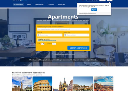
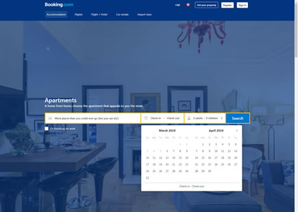
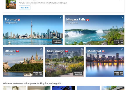
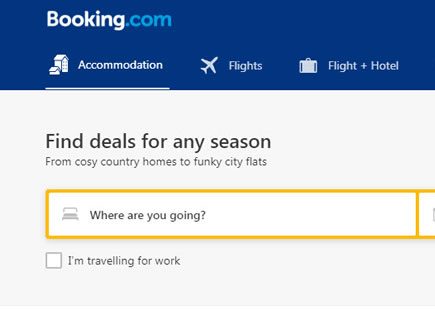
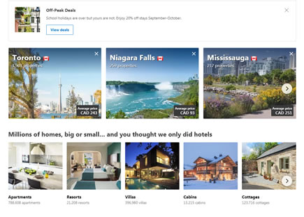
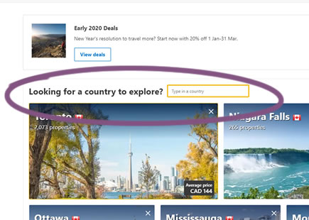
So this little big Booking experiment finally happened: sharp edges vs softer and rounded ones. I managed to detect it a few months ago and it finally looks like the rounded corners made it through after the a/b test completed. The experiment was first noticed on Booking's homepage but also stretched onto listing pages at the very least.

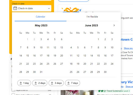
B - Mar 31, 2023 Screenshot

Highlighted UI Changes From This Leak
-
Rounded Corners
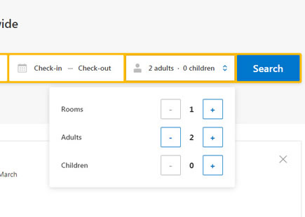
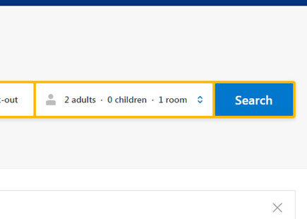
We can see somewhat subtle rounded corners and multiple UI elements, including: input forms, buttons, category thumbnails, listing thumbnails (detected on listing pages), etc.
But Did It Have A Positive Effect?
The big question of course (which there is no way for me to answer) is whether this really had a big impact on any primary metrics or was it simply a non-inferiority experiment? Was it simply accepted for stylistic reason without hurting any guardrails, or did it truly have positive impacts on some key metrics? Only looking at this from the public side and without access to actual data, we can only speculate.
If I had to guess however, I wouldn't attach big numbers to any estimates for this (I could be wrong of course).

Comments