One Modal Too Far: Booking's Rejected Destination Overlay Experiment
Booking.com really likes to use popups, overlays and nudges of various shapes and sizes. Hey why don't you sign in? Why don't you pick your travel dates? Look, someone is about to rent out the room you're looking at. One of their recent destination listing experiments however hints that a particular modal was simply too much when it was eventually rejected. My best guess as to why this was so is that the modal was too aggressive in obstructing specific property information, while surfacing too much (useless) generic information. Included below is a wider breakdown of the key changes I noticed in this larger experiment.
That's not too say that all modal interaction have negative results. Years ago we a/b tested a similar (but different) and successful nagging pattern on a listing page of New Zealand's largest dating site. :)

B - Feb 4, 2019 Screenshot
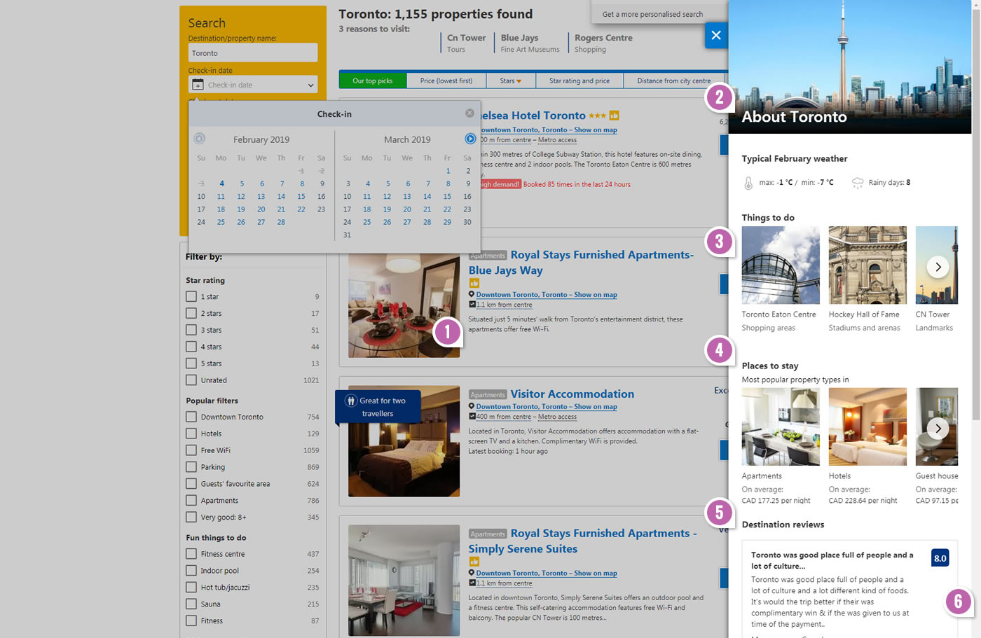
Highlighted UI Changes From This Leak
-
Disabling Overlay
When the page first loaded, the B variation injected a mid-opacity overlay on top of the results screen. In retrospect, Booking choosing to disable user interactions on the listing page seems rather aggressive.
-
About Destination Overlay
The active overlay appeared on the right side and included a range of generic information about the destination, such as: city photo and typical monthly weather. Could all of this have been too abstract to be of any use?
-
Things To Do
The next content block of the overlay contained links to things to do activities.
-
Places To Stay
Further on the modal, we see a snippet of property types such as: apartments, and hotels, etc.
-
Destination Reviews
Even further, at least 2 destination reviews (about Toronto) were shown. Could people's experiences and reviews of the city be so unpredictable and generic that they lose their value to others?
-
Average Prices (Scrolled Down)
Finally, I should also add that the scroll bar scrolled the modal window to show additional content with Average Prices for food, drinks, and getting around. This of course means that the scroll bar for the listings in the center screen was taken over. Quite aggressive? I think so. :)

Comments