Amazon A/B Tests This Floating Product Page Navigation That Is Accepted
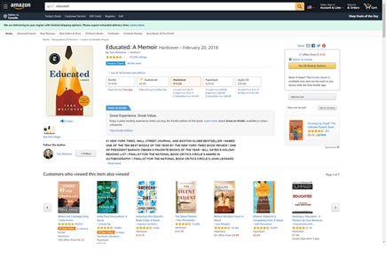
Around October of 2023, Amazon was noticed running product page experiments which involved adding a floating navigation. Given that many of their product detail pages are quite long, I am guessing they wanted to encourage more people to discover more of the product details. On the other hand, the control did not have any such floating elements. Initially I captured two variations - with the second now seeming to have been implemented.
For other floating or sticky navigation A/B tests we have a growing collection under this pattern.
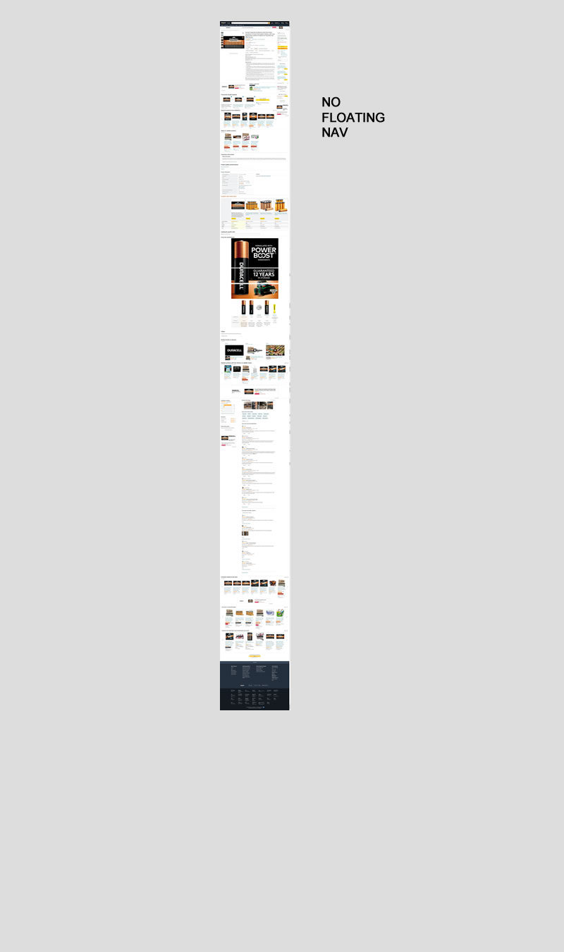
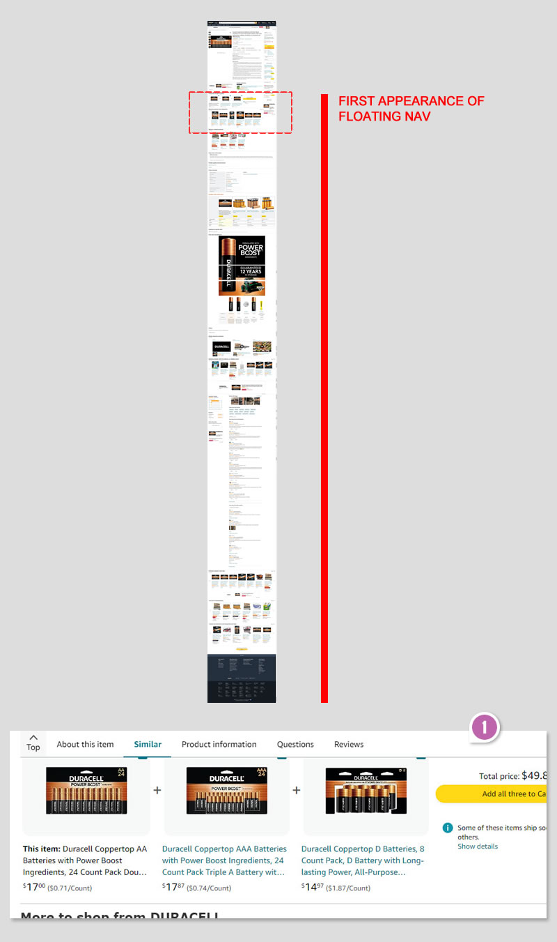
C - Oct 5, 2023 Screenshot
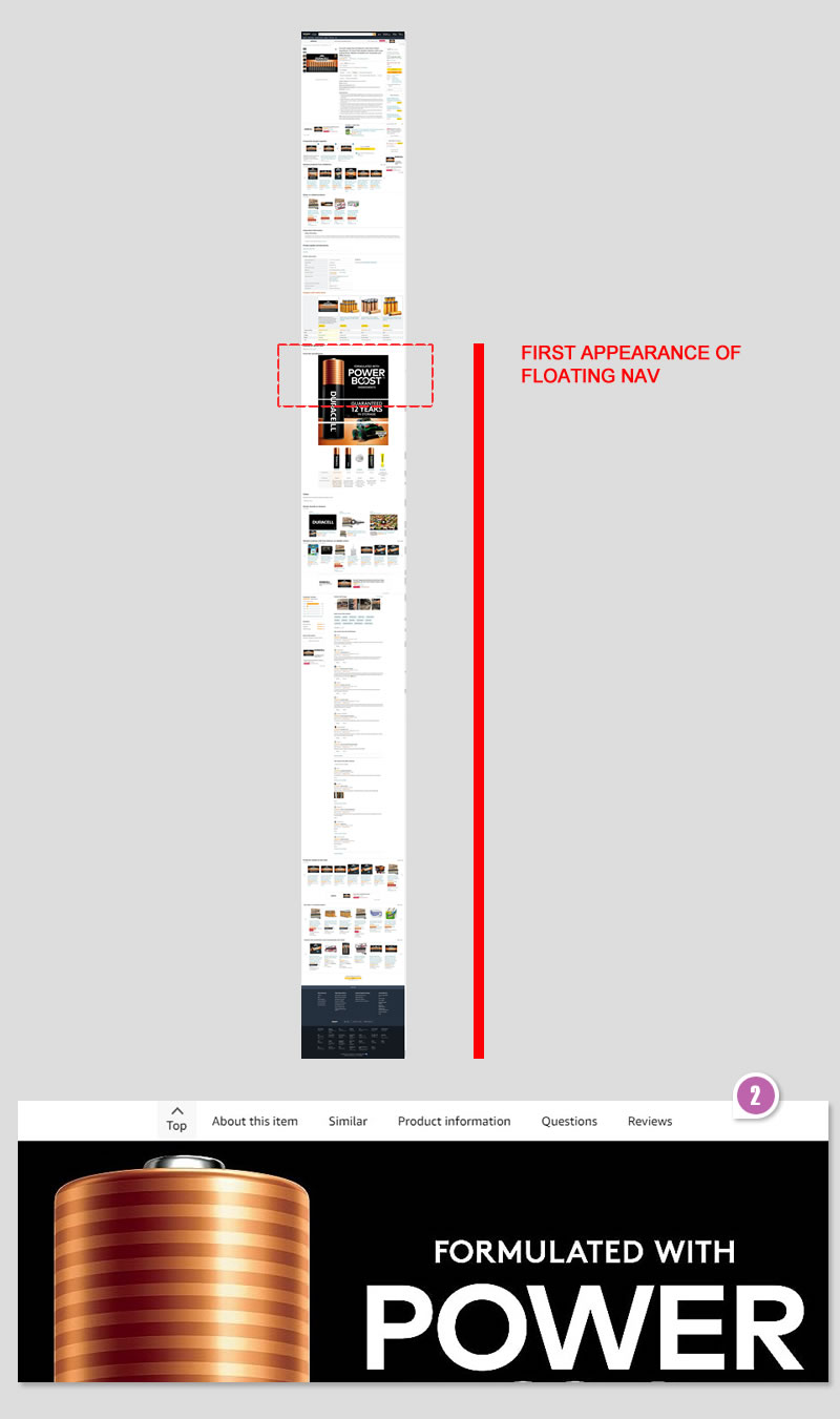
Highlighted UI Changes From This Leak
-
Left Floating Navigation / Highest Position
This variation added a left aligned floating nav which appeared the fastest after scrolling a short distance from the top of the page. It included such links as: Top, About This Item, Similar, Product Information, Questions and Reviews. The navigation also highlighted the section someone was on - inlcuding as users scrolled up or down.
-
Centered Floating Navigation / Lower Position
The second variation centered the links horizontally and also appeared a little further down on the page (~ approximately 1/3 of the screen height down, although I haven't looked at the Javascript nor CSS to determine the logic).
0.5 Repeatability has been assigned to Pattern #139: Page Level Navigation as evidence that it's getting better
Repeatability is a net count of evidence for or against a pattern. It’s how we can predict which patterns are better than others. :)
Comments